Why Abstract Wall Art Matters More Than You Think
Abstract wall art is often dismissed as "just shapes and colors," yet it may be the element that most quietly directs how a room feels. Because it does not depict a specific object or scene, abstract art operates more like music than like a photograph. It works in rhythm, tone, and tempo. Your eye becomes the listener.
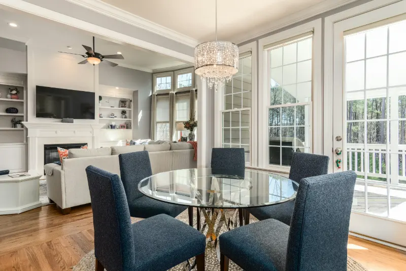
In a home, this matters. Most interiors are built from a predictable vocabulary: sofa, table, rug, lamp. Abstract art becomes the punctuation, the pause, even the exclamation. It can soften a room that feels too strict, or clarify a room that feels vague and scattered. When chosen with intention, it creates a visual center of gravity that ties together colors, materials, and mood.
To understand how to choose the right piece, it helps to think less like a shopper and more like a curator. Instead of asking "What matches my sofa?" consider what role you want the art to play. Should it energize or calm? Should it quietly blend into the architecture or insist on being noticed? These questions move you from reacting to pictures on a wall to shaping the atmosphere of your home.
There is also a liberating honesty to abstract work. With no faces to flatter, no landscapes to idealize, you are left with line, texture, and color. You are choosing how you want to feel rather than what you want to look at. In a culture that prizes images of recognizable things, that can be disorienting. But it is precisely this open-endedness that gives abstract wall art its long, slow burn. A good piece will not fully reveal itself in a single glance. It will shift slightly as the light changes, as your mood does, as your life rearranges itself around it.
One useful mindset is to see abstract art as a conversation between what is on the canvas and what is already in your space. Walls, ceilings, floors, furniture, windows, even the way light falls in the late afternoon: all of these are collaborators. Your role is to listen to that conversation and decide whether you want to amplify it or interrupt it, soothe it or complicate it.
Reading a Room: Scale, Placement, and Mood
Before you look at a single piece of art, stand in the room where it will live. Notice where your eye goes when you enter. In many homes, the focal point is accidental: a television, a cluttered bookshelf, a bright window. Abstract wall art gives you the chance to redirect that instinct. You want the focal point to feel intentional, not bossy.
Scale is the most underappreciated tool. A common mistake is choosing art that is too small. If you have a sofa that is seven feet long and you hang a modest print above it, the wall will read as unfinished, no matter how beautiful the image. As a loose rule, aim for art that is roughly two-thirds the width of the furniture beneath it, or build a grouping that collectively reaches that proportion. Oversized works, on the other hand, can lend a gallery-like serenity, but only if the surrounding furnishings are simple enough to support the drama.
Placement determines how the piece interacts with your body as you move. In a living room, center the work at eye level when standing, but consider how it feels when you are seated for most of the evening. In a dining room, your eye line is lower; art slightly dropped on the wall can make conversations feel more intimate. Hallways, with their compressed perspective, often benefit from narrower pieces that pull you forward rather than wide canvases that stop you abruptly.
Then there is mood. Abstract wall art speaks mostly through color, gesture, and density. Broad, sweeping strokes in muted tones tend to calm a space. Tight, angular marks and high contrast colors generate tension and energy. Imagine how that will feel at 11 p.m., when the rest of the house is quiet and only a lamp is on. Will the painting whisper or buzz?
You can test this mentally. Picture your room in black and white, removing the specific hues and leaving only value: lights and darks. If your space already has sharp contrasts in furniture and architecture, a piece with softer transitions can keep the eye from fatiguing. If everything is beige and flat, a work with bolder darks and lights becomes a necessary counterpoint, a kind of visual spice.
Color, Emotion, and Choosing a Piece You Will Actually Live With
Color is where most people start, but it is more productive to think in terms of emotional temperature rather than "matching." Warm tones such as ochres, terracottas, and muted reds tend to draw walls closer, making a large room feel more contained. Cool blues and greens can create a sense of distance and air, especially when paired with natural light and pale floors. Neither is inherently better; it depends on whether your home needs coziness or breathing room.
Instead of replicating the exact shade of your sofa in the art, look for neighbors on the color wheel. A deep forest green sofa, for example, might be complemented by a painting with blue-greens, grays, and a trace of peach. This slight misalignment keeps the room from feeling overly coordinated. It introduces the visual equivalent of a human pause in a sentence, a small, interesting hesitation.
Pay attention, too, to texture. Even in abstract work printed on paper, you can sense the implied weight of the medium. Thick, gestural paint implies movement and risk. Thin washes of color feel more like memory or weather. In a space full of sleek, reflective surfaces, a heavily textured canvas can add the softness that textiles alone cannot provide. In a room already rich with pattern and grain, a smoother, more restrained piece may create a necessary clearing.
The most important question remains personal: can you sit with this piece on a quiet day and feel comfortable in its presence? A work that dazzles on a gallery wall or screen might feel exhausting over your dining table. Try to imagine it not on the perfect white wall of a showroom, but in the soft chaos of your actual life, surrounded by books, coffee cups, and the unmade bed in the next room.
When in doubt, trust your second reaction more than your first. Initial attraction can be about novelty; the second look is closer to recognition. Does the piece still intrigue you when the surprise fades? Do you notice new relationships between colors, new paths for your eye to follow? If so, you are likely in the territory of art that will grow with you rather than shrink over time.
Ultimately, choosing the right abstract wall art is less about decoding high culture and more about learning to read your own space. The walls are already talking. The art you bring in should not silence them, but rather help them say, with a little more clarity and grace, what you have been trying to say about home all along.