The quiet psychology of balanced walls
Symmetry and asymmetry in wall art layouts are less about rules of decor and more about how your eyes and nervous system process a room. When you hang two prints perfectly centered over a sofa, your brain registers order before it even understands the subject of the images. When a single large canvas drifts slightly off center, or a cluster of small frames pulls your gaze to one corner, your brain feels movement.Designers lean on this subtle psychology all the time. Symmetry tends to feel formal, calm and predictable. It has the tidy energy of a made bed or a perfectly set dining table. Asymmetry feels more like conversation: slightly improvised, dynamic, and human. The tension between the two is where interesting rooms live.
Start by noticing what you are trying to correct or amplify in your space. A room with a low ceiling, heavy sofa and centered window already has a strong axial feeling. Doubling down with perfectly mirrored art can make it serene, or it can make it stiff. A long, blank hallway or an off center radiator may crave asymmetry to distract from its awkwardness. Before you even choose frames, look at the existing architecture as if it were already an unfinished composition. Doorways, windows, radiators, switches and even the television are visual weights that your art either echoes or counterbalances.
Underlying both symmetry and asymmetry is the idea of visual weight. A small black frame can feel heavier than a larger pale canvas. A single bold photograph might outweigh three delicate line drawings. When people say a gallery wall feels wrong, they are often reacting to an imbalance of these weights rather than to the specific positions of each piece. Thinking in terms of weight also frees you to mix media. A woven wall hanging can balance a framed etching if their perceived weights line up, even if their outlines do not.
This is where you begin to see why rigid prescriptions rarely work. A sofa with an eight foot back does not automatically demand an eight foot artwork above it. What matters instead is a quiet sense of alignment, either literal or implied. A symmetrical layout will underline the structural center line of a room. An asymmetrical one may introduce a new center line, slightly to the left or right, that still feels intentional. Your job is not to obey an imaginary middle, but to decide where the visual center should be and arrange around that choice.
When symmetry soothes a room
Symmetric wall art layouts rely on mirroring around a central axis. Two identical frames on either side of a fireplace, three evenly spaced prints above a headboard, a gridded series of photographs over a console: each of these builds a predictable rhythm. The eye can rest because it knows what comes next.At home, this is powerful in rooms that are already emotionally charged or busy with activity. Over a bed, symmetry can act as visual white noise, softening whatever chaos the day delivered. Matching lamps and framed prints on either side of the headboard are a classic not because they are clever, but because they are kind. They propose that this is a place for sleep, not for drama.
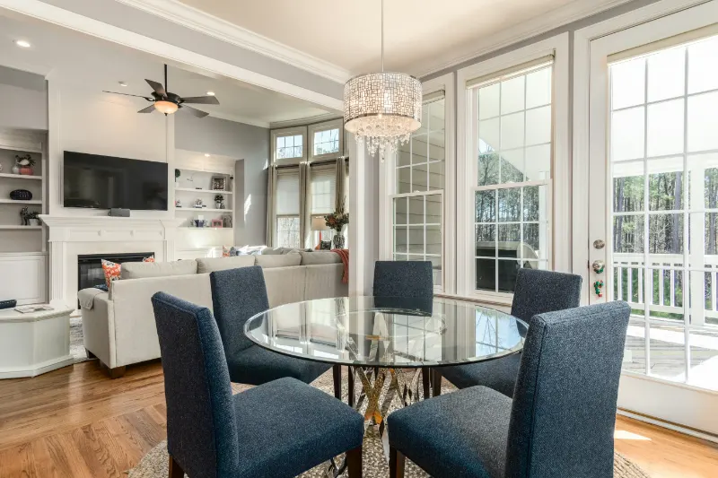
In a dining room, a centered piece over a credenza, flanked by two smaller works or sconces, quietly supports the ritual of gathering. The layout says that the table is the main event and everything else is supporting cast. Symmetry in these contexts can feel almost ceremonial, which is why it suits spaces meant for repeated, shared routines.
Yet the danger of symmetry is that it can slip into stiffness. Perfectly matched frames, equal spacing and centered alignment can make a living room feel more like a hotel lobby than a home. To keep things alive, you can soften the symmetry without abandoning it. Consider using the same frame style on either side of a sofa, but vary the art inside them. Or create a grid of prints, then introduce one small, sculptural object on a nearby shelf that breaks the perfection just slightly.
Another way to humanize symmetry is through scale. Instead of two identical pieces flanking a mirror, try a large work paired with a smaller but visually dense partner whose color or texture balances the size difference. The outline may not be perfectly mirrored, but the underlying balance remains. Your eye reads it as symmetric enough to soothe, but complex enough to stay interesting.
In older apartments or asymmetrical rooms, strategic symmetry can also act as a corrective. If a window sits uncomfortably off center behind a sofa, a pair of works hung to acknowledge a more pleasing central axis over the sofa can visually re anchor the room. You are, in effect, negotiating between the architect and the furniture, and symmetrical art can be your mediator.
Letting asymmetry add movement and character
Asymmetrical wall art layouts do not abandon balance; they relocate it. Instead of mirroring around a middle, they distribute weight along invisible diagonals and arcs. A large piece might sit slightly to one side of a console, with a smaller frame and a tall vase on the other side completing the composition. The eye travels in a loop rather than locking onto a spine.This is especially helpful in casual living rooms, home offices and hallways, where you may want the space to feel more like an evolving studio than a finished tableau. A loosely arranged gallery wall that climbs upward from the back of a chair can draw the eye vertically, lending height to a low room. If the heaviest pieces are placed lower and toward one side, while lighter works drift upward and outward, the effect can be playful yet grounded.
The risk, of course, is chaos. Asymmetry without a quiet structure can read as visual noise. To avoid this, give yourself at least one stabilizing element. It might be a consistent bottom line for a row of frames above a credenza. It could be a shared color that appears across several pieces and ties them together, even as they jump around the wall. Or it might be a single oversized work that clearly anchors the group while smaller pieces orbit it like satellites.
A useful mental trick is to imagine tracing a shape through your layout. Symmetric arrangements almost always describe a cross or rectangle. Asymmetric ones often describe triangles, arcs or loose spirals. If you can see that implied shape, your asymmetry probably has enough structure. If you cannot, you may simply need to edit. Removing one loud piece from a crowded wall often restores balance more effectively than adding another.
Asymmetry is also kinder to real life. It accommodates the off center thermostat, the inherited armchair, the television that cannot move. Instead of pretending these elements are invisible, you can use art to lean into them. A cluster of small works might sidle up to the TV, visually integrating it into the composition rather than leaving it adrift as a black rectangle. A single painting hung lower than tradition dictates can acknowledge the seated eye level on a favorite reading chair.
In the end, symmetry and asymmetry are not opposing camps but tools for tuning the emotional temperature of your home. Symmetry offers reassurance; asymmetry offers curiosity. Most satisfying walls contain a little of both, the way most satisfying people do. When a layout feels off, ask whether your room needs more calm or more movement, then adjust the balance rather than searching for a perfect formula. Your walls will begin to feel less decorated and more composed, in the musical sense of the word, as if each piece truly belongs in the rhythm of your daily life.