The quiet logic behind 145 cm
Walk into a gallery and you might notice something you cannot immediately name. Paintings seem to float along an invisible horizon, neither too high nor too low, and the room feels unexpectedly calm. That hidden line is often around 145 cm from the floor to the center of the artwork, a “museum average” tuned to human bodies and human attention.
The 145 cm rule is deceptively simple. Measure 145 cm up from the finished floor and mark that point on the wall. That is where the center of your artwork should land. Instead of chasing the top edge of the frame or trying to match the height of doorways and windows, you are aligning the artwork’s heart to a consistent, human eye level. It is a small act of geometry in service of comfort.
Why 145 cm and not 150 or 160? It is a compromise between many bodies and many postures. Galleries are designed for people who are standing and moving slowly, their vision hovering roughly between 140 and 155 cm. Curators know that we do not truly look with our whole height, but with a more intimate band of sight that starts a little below the bridge of the nose and extends into a shallow vertical cone. They calibrate to that band, not the ceiling line.
At home, this same principle has a calming effect because it gives your walls a sense of order. When you align pieces by their centers, you create a visual rhythm that the brain reads as coherent. Art stops shouting for attention at random heights and instead begins conversing along a shared horizon. That is where the rule shifts from mere measurement into something closer to spatial etiquette.
Of course, human bodies vary. If you are significantly taller or shorter than average, 145 cm is a starting point, not a verdict. Think in terms of shared eye level, especially for the people who use the room most. In a household, aim for a compromise that feels natural when you stand back several paces and let your gaze rest without effort on the middle of the piece. If you find yourself tilting your head up or down, adjust a few centimeters at a time until the artwork feels encountered rather than hunted.
There is also the matter of how you move through a space. In a hallway where you mostly walk, 145 cm tends to feel right because you are upright and in motion. In a dining room where you are seated for long stretches, that same height might feel slightly lofty. The rule works best when you remember what it is really protecting: a comfortable relationship between the body and the image, tuned to the room’s primary posture.
Adapting the rule to real rooms
Very few homes resemble white-cube galleries. You live with sofas and radiators, television screens and windows that interrupt tidy lines. The 145 cm rule becomes most useful when you treat it as a stable reference you can bend around furniture, not a rigid commandment you obey at all costs.
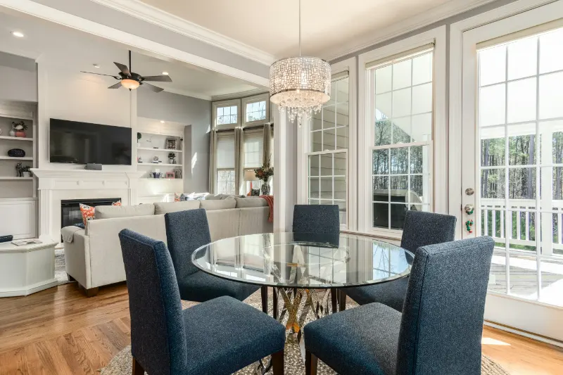
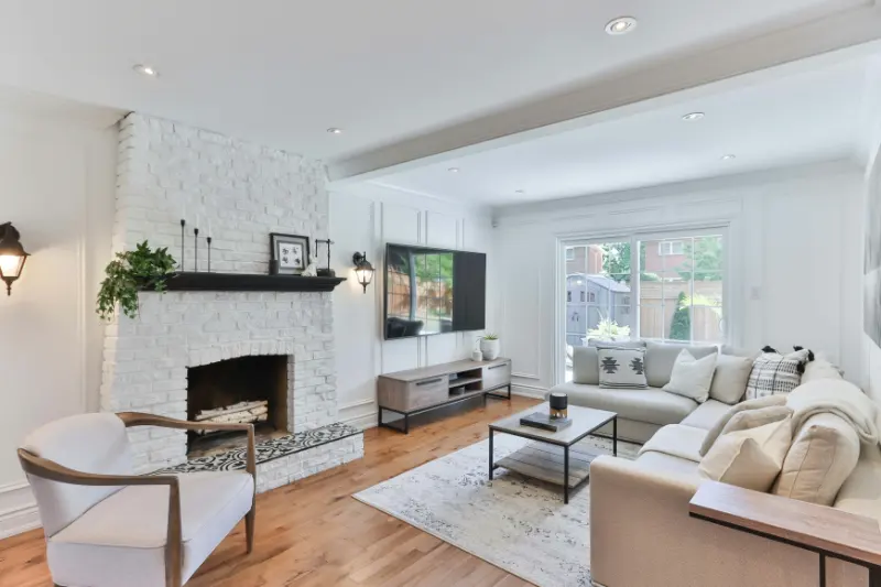
Imagine a living room where a large sofa anchors one wall. If you hang art with its center exactly at 145 cm, it may float awkwardly above the back cushions, creating a band of blank wall that disconnects the seating from the piece. In such a case, it is better to let the sofa dictate a second reference line. Lower the art so that the bottom edge sits roughly a hand’s span above the back of the sofa, then check where the center lands. If it is still within ten or fifteen centimeters of 145, you are keeping the spirit of the rule while respecting the reality of the room.
Over a low console or sideboard, the same principle applies. The art should feel visually connected to the furniture, like a thought rising from it, rather than drifting off alone. Start by testing 145 cm to center, then step back and see how the piece relates to the object below. If the gap feels like an empty paragraph, lower the work slightly until the two elements speak to each other without crowding.
Groups of artworks introduce another layer of complexity. When you build a gallery wall, it is tempting to trace the grid by the outer edges of the frames. Instead, choose one or two anchor pieces and position their centers at roughly 145 cm. Then grow the arrangement around them, letting smaller works nestle above and below. The ensemble will still read as grounded because the eye instinctively locks onto those central anchors, even if the overall outline climbs higher or dips lower.
Ceiling height also matters. In a room with unusually tall ceilings, homeowners often push art upward, trying to chase the void. The result is a band of pictures hovering in the upper half of the wall, marooned from the furniture and from daily life. Counterintuitively, keeping the center near 145 cm is what restores intimacy. The empty space above becomes a quiet margin rather than an accusation. In a very low-ceilinged room, you may compress slightly, but the key is still to relate art to the human body first and the architecture second.
When and how to break the rule
Some rooms argue persuasively for disobedience. A bedroom, for instance, is experienced mostly lying down or seated on the bed. A large piece hung at 145 cm to center above a high headboard may feel like it belongs to someone standing in the doorway rather than to the person actually using the room. In that case, treat the headboard as a horizon and hang the artwork closer to it, letting the center drop below the usual mark so it nestles into your field of view when you are reclining.
Children’s rooms are another deliberate exception. Here the relevant eye level is dramatically lower. Placing art at a conventional adult height sends a quiet message about who the room is for. Lowering the center to meet a child’s gaze dignifies their scale and invites them into a direct relationship with the images. The 145 cm rule can still be present conceptually, but it shifts downward, reanchored to a smaller body.
There are also times when drama outweighs comfort. A very tall, narrow piece in an entry hall can be hung slightly higher than 145 cm so that it amplifies the vertical pull of the space, turning the wall into a kind of visual exclamation point. The trade-off is intentional: you sacrifice a little ergonomic ease in favor of theatrical impact. The important distinction is that you know you are breaking the rule and why.
When you experiment, move slowly. Adjust in small increments, living with each change for a moment rather than reacting to the novelty of a new position. The brain quickly normalizes whatever it sees; a painting that felt awkwardly low one day can feel completely natural the next once the rest of the room has mentally settled around it. Pay attention not only to how the piece looks on the wall, but to how your body behaves in front of it. If you find yourself lingering, exhaling, noticing details you had overlooked, the height is probably right, whether or not the tape measure registers a perfect 145.
In the end, the rule is less about centimeters than about courtesy. It is a way of acknowledging that art is meant to meet you where you are, not loom above you like a distant authority. By starting with a shared standard and then bending it to the rhythms of your own home, you allow your walls to feel considered but not constrained, ordered yet still unmistakably yours.