The quiet architecture behind a gallery wall
Designers talk about gallery walls as if they simply appear: a confident sweep of frames, a few well-placed family photos, maybe a postcard from a trip to Kyoto. In reality, the most effortless-looking gallery walls are quietly architectural. Behind every arrangement is a skeleton of lines, weights and rhythms that determines whether the wall feels like a composed story or a pile of visual noise.
The seven classic gallery wall layouts are less like strict rules and more like scales for a musician. Once you understand them, you can improvise. Each layout carries a mood. The tight grid whispers order and calm. The organic cluster feels like a conversation spilling across plaster. The linear hang behaves like a piece of punctuation running through the room. Choosing among them is less about what is objectively best and more about what kind of energy you want humming in the background of your life.
Before looking at specific layouts, it helps to think about two invisible forces that shape any gallery wall. First is the notional center line, usually somewhere between 56 and 60 inches from the floor, around natural eye level for most adults. When you’re lost, return to that band; it is your visual horizon. Second is overall silhouette. If you squint at a gallery wall and blur the details, the outline you see — a rectangle, a cloud, a staircase — is what the room registers from across the space. The seven classic arrangements are really seven different ways of drawing that outline.
For a home that feels intentional rather than manicured, it also helps to loosen the idea of perfection. A successful gallery wall is less about every frame being straight and more about the relationship among pieces: the way a heavy black frame steadies a row of airy sketches, or how a single round mirror interrupts a field of rectangles. Think of it as composing a paragraph on your wall. Punctuation marks are allowed. So are breaths.
Seven classic layouts, and where they belong
Imagine these seven arrangements as characters you can cast into different rooms. They share a visual vocabulary — central lines, margins around furniture, consistent spacing — but each behaves differently in space.
The first, the "classic grid," is the most disciplined. Identical or nearly identical frames are aligned in rows and columns, creating a quiet, architectural rectangle. The effect is almost textile-like, a woven surface of repeated shapes. It works beautifully in dining rooms and home offices, spaces that benefit from a sense of structure. The grid is also forgiving if you like to rotate what’s inside the frames; the exterior order holds even when the internal images change from black-and-white photographs to children’s drawings. The limitation is its formality. In a room that is already rigid — sharp furniture, severe lighting — a grid can tip into sterility.
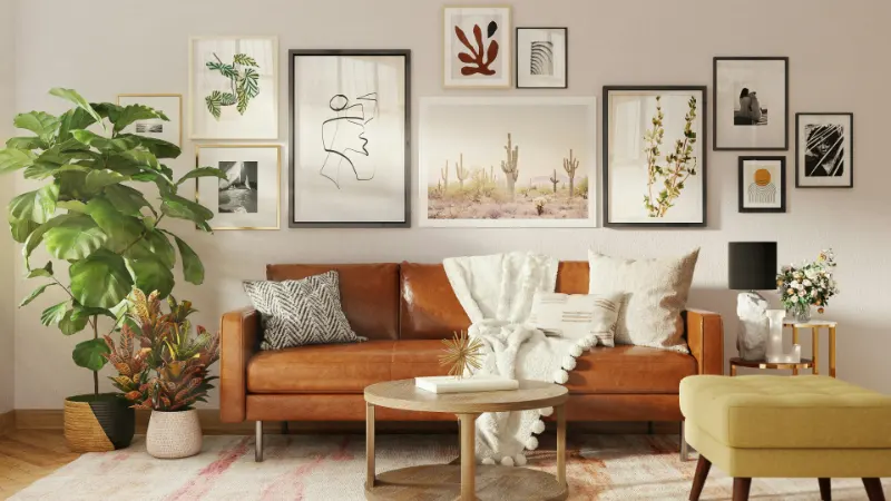
The "salon wall" is the grid’s wild cousin, descended from the 19th-century practice of hanging paintings from baseboard to cornice. On a modern wall, it becomes a dense cluster of frames in many sizes, loosely orbiting an invisible center. The salon wall excels in living rooms and long hallways where you want to tell a layered story: travel prints next to grandparents’ portraits next to a child’s watercolor. The danger is chaos. To keep it coherent, let one or two elements repeat quietly: similar frame colors, a dominant palette in the art, or a shared subject matter. Your eye needs anchors, even in apparent disorder.
The "row" and the "rail" layouts are linear by nature. A single horizontal row of frames, usually aligned at the top or center, plays well over a sofa or headboard. It behaves like a visual shelf, grounding the furniture and reinforcing the architecture of the room. The rail takes that idea further, often literally using a picture ledge. Frames lean rather than hang, overlapping slightly, inviting rotation. Both layouts bring calm, but they ask different things of you. The row is a commitment: once it is measured and installed, you will live with that line for a while. The rail is more like a sketchbook that can be rewritten whenever the room’s mood shifts.
The "stair-step" layout acknowledges the architecture directly. Frames climb the angle of a staircase, roughly echoing the pitch of the treads. When it works, it turns a transitional space into something cinematic, a sequence of images unfolding as you rise or descend. The trick is to decide whether the primary organizing line is the handrail, the nose of the steps, or an imagined diagonal between floors, and then to let at least one edge of each frame touch or hover near that path. You are effectively drawing a line with frames instead of ink.
Two more arrangements are quieter but powerful. The "central anchor" layout begins with a single dominant piece, often the largest work, placed at or slightly above eye level. Smaller pieces then gather around it like satellites, respecting a loose rectangular boundary but not filling it completely. This is ideal when you own one artwork that deserves to be the star, yet you still want a supporting cast. Finally, the "organic cluster" is the least formal: pieces gather in a looser shape, often irregular, with more breathing room between them. It feels relaxed, even bohemian, good for bedrooms or reading corners where softness matters more than precision. Here, negative space is crucial. The blank areas are part of the composition, the pauses between notes.
Choosing for your room, not for the algorithm
Selecting a gallery wall layout is less about copying an image from a feed and more about listening to the room itself. Scale is the first conversation. A long, uninterrupted wall in a loft can swallow a small organic cluster; it may ask for the gravitas of a substantial grid or a wide rail. A compact entryway, by contrast, might be overwhelmed by a salon wall that reaches the ceiling, and instead feel balanced with a modest central anchor arrangement that leaves space for breath on all sides.
Light is the next negotiator. A wall that swims in afternoon sun will treat glossy frames and glass differently than a dim, north-facing corner. Reflective glare can fracture an otherwise beautiful salon wall into a constellation of hot spots. In that case, layouts that keep frames flatter to the viewer, like rows or rails, are easier to control, and matte frames or non-reflective glass become part of the design strategy. In darker corners, dense clusters can feel cave-like; a more open cluster with generous negative space can invite what little light there is to move more freely.
There is also your threshold for visual busyness. Some people rest best in rooms that feel like composed sentences, not run-on paragraphs. For them, a tight grid or a simple row may offer the necessary quiet. Others find blank walls slightly anxious, and take comfort in the narrative density of a salon wall. The point is not to adopt the layout currently trending, but to choose the one that supports how you actually live and decompress.
It can help to begin physically, not digitally. Painter’s tape on the wall, or kraft paper cut to frame sizes and temporarily tacked in place, gives your body a sense of how the arrangement will feel as you walk past it. You may discover that the confident salon wall you drew on a screen compresses the room in real space, or that the grid you thought would be too formal actually calms a busy bookshelf nearby. Be willing to adjust. Designing a gallery wall is less like hanging a single artwork and more like tuning an instrument in context with the whole ensemble of the room.
In the end, the best gallery wall layout is the one that makes you linger for a moment, maybe on your way to make coffee, noticing how a photograph catches morning light or how a child’s drawing now sits next to a vintage print you once thought too precious. The wall becomes not just decoration, but a living archive of your days, arranged with just enough structure to let them sing.