Reframing Minimalism: Less, But Not Less Than Enough
Minimalist posters can be puzzling when you first live with them. On screen, a single line or a soft color block feels calming. On your wall, the same design can suddenly seem like “nothing,” a visual shrug hovering over the sofa. The difference is not the art itself, but how it relates to your space, your habits, and your eye.The key is to shift your goal. You are not looking for a poster that fills blank space. You are looking for one that clarifies it. A minimalist piece works when it feels like an intentional pause in the room, not a void. That requires a conversation between poster, wall, and furniture.
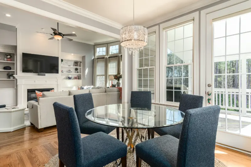
Start with scale. Many people choose minimalist art that is too small, hoping subtlety will be safer. In reality, a small, quiet print can easily look like a lonely stamp floating in acres of drywall. Minimalism needs presence. If your sofa is long and low, a horizontal poster that spans at least two thirds of its width will read as “anchored.” In a dining area, a tall, narrow piece can echo the verticality of a window or doorway, making the room feel composed rather than empty.
Then consider distance. Minimalist work often uses fine lines, soft gradients, or negative space that reward close looking. It should hang where people can approach it, not only see it from across the room. A poster in a hallway, near a reading chair, or above a console invites you to witness its subtleties, which keeps it from feeling like mere background.
Finally, remember that minimalism is an editing philosophy, not a style of deprivation. A good minimalist poster removes what is unnecessary so what remains can breathe. When you ask “Does this look empty?” you might also ask “What is being given room to matter here?” If you can answer that clearly, you are closer to the right piece.
Color, Line, and Mood: Why Some Simple Posters Feel Rich
When a minimalist poster feels empty, it is often because its visual hierarchy is vague. Your eye does not know where to land first. To avoid that, pay attention to how color, line, and shape direct attention.Color is the easiest lever to adjust. Rather than matching your wall perfectly, look for a poster that shifts the room’s temperature slightly. In a cool, gray space, a warm beige field with a single rust line can act like a small hearth, giving the room a quiet focal heat. In a room full of warm woods, a pale cool-blue block can introduce a long exhale. The print does not have to be loud, but its color should alter the room’s mood by a degree or two.
Contrast matters more than saturation. A nearly white shape on an off-white background can be gorgeous in a room that already has depth in texture: plaster walls, linen upholstery, woven rugs. In a new build with flat walls and smooth surfaces, the same poster may flatten the space. There, a bolder contrast between background and form will keep the piece from dissolving into the paint.
Line and shape carry their own emotional weight. Vertical lines feel like “standing up,” suggesting alertness or growth. Horizontal lines feel like “lying down,” suggesting rest and horizon. Arches, circles, and soft curves read as forgiving and human; sharp diagonals and fractured shapes feel kinetic, sometimes anxious. When a poster feels empty, it may actually be emotionally ambiguous, not clearly calm or energetic.
Try pairing the poster’s mood with how you want the room to function. For a bedroom, a composition dominated by horizontal bands or circular forms will usually read as soothing. In a workspace, one or two decisive diagonal elements can inject momentum without visual noise. This is how a simple arrangement of shapes becomes “enough”: it aligns with how you hope to inhabit the room.
Also look for a subtle tension in the composition. In many strong minimalist posters, one element is slightly off-center, or a line stops just before the edge of the page. That near-miss is what keeps the image alive. Perfect symmetry can be serene, but it can also feel static, like pattern wallpaper rather than art. Asymmetry, handled gently, gives your eye something to travel toward.
Meaning, Placement, and the Quiet Story on Your Wall
Minimalist art does not shout its meaning, but it works best when it still carries one. That meaning can be as simple as “this reminds me of the coast I grew up near” or “this curve echoes the loop in my handwriting.” Without that personal connection, even the most elegant print can feel like a placeholder from a staging catalog.Before buying, sit with the image for a moment and ask yourself what it suggests beyond its shapes. Does that single line feel like a path, a horizon, a wave, a roofline, a spine? Does the color evoke a time of day or a place you know? Minimalism often operates like a “half-finished sentence” that the viewer completes. If you feel nothing to complete, the print may never fully belong to you.
Placement will either deepen this sense of belonging or drain it. A minimalist poster over a mantel, partially mirrored in glass or competing with television glare, may lose its softness. The same piece at the end of a hallway, where you meet it as you move through the house, can feel like a visual punctuation mark in your day.
Surroundings also matter. If your room is already visually busy, a single quiet poster can act as a resting place for the eye. In a very spare room, one minimalist poster might need companions: not more art, but texture. A woven throw, a vase with a single branch, the shadow from a nearby lamp. These details do not compete with the art; they form a “soft chorus” that keeps the overall space from feeling barren.
Framing is the final, often overlooked layer. For minimalist work, the frame is almost part of the composition. A narrow black or dark wood frame sharpens the edges and increases contrast, which can make a light, airy print feel more assertive and architectural. A pale wood or white frame softens the boundary, letting the image feel more like a gentle pause on the wall. When a poster feels empty, sometimes it is the frame that is wrong, either too heavy for a delicate print or too insubstantial for a strong graphic.
In the end, a minimalist poster that does not feel empty is one that is in proportion to your furniture, in dialogue with your colors, and in step with your inner life. It will not answer every question about your space, but it should ask one that you are glad to keep returning to. In a well-considered room, that single, quiet surface on the wall can become a small, daily practice in seeing: not a void, but a carefully chosen pause.