Seeing the Wall as a Room Within the Room
Designing a gallery wall is less about hanging pictures and more about shaping how a room feels. The wall becomes a kind of stage set, a concentrated version of your taste and memories. Before you touch a hammer, pause and look at the wall as if it were a small room of its own. Where is its floor, its ceiling, its center of gravity?
A reliable starting point is the line that runs roughly through the middle of your body. Museums favor hanging art so its center is about 57 to 60 inches from the floor. For a gallery wall, imagine that invisible horizon continuing across the room. If your sofa is low and sleek, the center of your grouping can dip slightly; with taller furniture, you may need to lift the whole field of art so it does not feel as if it is sliding behind a backrest or sideboard.
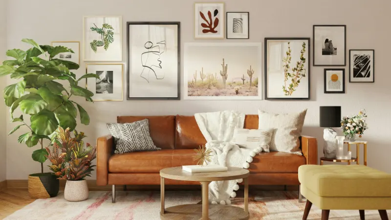
It also helps to choose a "main character" for the wall. This might be the largest piece you own, or simply the one you care about most. Place it close to that eye-level line and slightly off center, the way a good photograph resists perfect symmetry. Around it, every other piece will either support or counterbalance its weight. Without this anchor, your arrangement often feels like a collection of postcards instead of a composed statement.
Color and frame style act like lighting cues on this stage. Dark frames, highly saturated art or heavy textures visually weigh more than airy drawings, pale photographs or simple white frames. When you mix them, imagine you are distributing visual weight across a seesaw. Two smaller dark frames can balance a single large pale one across the wall. If everything dark settles on one side, the wall will feel as if it is tilting, even if each piece is technically level.
Finally, consider the architecture that already exists. A doorway, a window, even a radiator can serve as a boundary line for your composition. Instead of fighting these elements, treat them as neighbors. Let the edge of the gallery echo the height of a window trim or line up with the side of a console table. This small act of alignment creates a sense that the art belongs to the room rather than floating above it.
Three Simple Layout Templates That Actually Work
Behind most successful gallery walls is a surprisingly simple diagram. Thinking in templates does not make your space generic; it frees you to personalize within a structure. On the floor, or on a large table, lay out your art as if you were arranging a puzzle, and try on a few of these patterns before committing to the wall.
One forgiving approach might be called the "soft grid." Imagine a rectangle drawn lightly on the wall, its edges parallel to the ceiling and the furniture below. Inside that rectangle, pieces line up in rough rows, but their sizes vary and the gaps between them are not perfectly equal. This layout brings calm to a collection of mismatched frames because your eye reads the overall silhouette first. To try it, set your largest piece near the center of the rectangle, then add pieces above, below and to either side, keeping their outer edges loosely aligned. Step back often; if a piece pokes awkwardly beyond the imagined border, either move it in or decide to redraw the border to include it, the way you would let a plant grow over the edge of a pot on purpose, not by accident.
Another template is the "salon cluster," which abandons most grid discipline in favor of a dense, organic composition. Historically, this style came from European salons, where paintings stacked from chair rail to ceiling. At home, you can echo that exuberance without chaos by starting from your anchor piece and spiraling out. Each new work should either tuck neatly into a corner formed by two others or create a deliberate step outward. Where the soft grid emphasizes outer edges, the salon cluster cares more about the relationships between neighbors. Look for small repeated rhythms: a vertical piece that rhymes with another across the way, or a diagonal line that links three frames. The effect, when done slowly, is of a living collage that can grow over time.
For narrow spaces like hallways, a "linear band" can be both practical and serene. Here, you fix a single horizontal axis at eye level and let pieces ride along it, their centers or top edges aligned. Heights and widths may vary, but the band provides continuity, the way a chair rail does in traditional interiors. This is especially helpful when your art is mostly similar in format, like black and white photographs or travel sketches, because the predictability feels intentional rather than monotonous. Within this band, you can play subtly with rhythm, grouping two small frames near one larger one or allowing a gap to create a breath between stories.
Whichever template you favor, treat it as scaffolding, not law. Lay out your works on the floor in the same proportions as your wall, photograph a few variations, and study them as if viewing someone else’s home. Often, the best arrangement is the one where a small imperfection—a slightly wandering frame, a playful outlier—keeps the whole composition from feeling too stiff.
From Tape and Paper to Holes and Harmony
Once the design feels right on the floor, translating it to the wall becomes an exercise in patience more than skill. One gentle method uses paper stand-ins. Trace each frame onto kraft paper or old newsprint, cut out the shapes, and label them. Tape these to the wall with removable tape, using your chosen template as a guide. This low-tech rehearsal lets you fine-tune heights and spacing without committing to a single nail. Live with the paper wall for a day if you can. See how it looks in morning light, in lamplight, from across the room and from the sofa where you will actually sit and look at it.
As you refine, think about the negative space as carefully as the art itself. The white gaps between pieces act like silence between notes in music. Too tight, and the wall becomes noisy; too far apart, and each frame seems to drift alone. Many designers aim for roughly the width of two fingers between frames for a coherent grouping, adjusting slightly for very large or very small pieces. Still, it is the felt sense that matters. Stand back, narrow your eyes and notice: does one gap feel like a shout compared to the others? That is where to adjust.
With placement fixed, measure the hanging points on each frame relative to its paper template. Mark the hook positions on the wall through the paper, then remove the paper and install your hardware. A small investment in sturdier hooks or wall anchors is a kind of respect paid to the work you are hanging and to the wall itself. Level each piece individually, then step back and read the composition as a whole. If one frame insists on tilting, a discreet adhesive strip at the bottom edge can keep it steady without another hole.
Perhaps the most overlooked step comes after everything is up: editing. A gallery wall should not be a permanent census of every print you own. It is a living arrangement that can change with seasons, moves and moods. Over time, you might swap in a child’s new drawing, a postcard from a trip, or a photograph that suddenly matters more than it did. When you approach the wall as an evolving installation rather than a fixed achievement, the small irregularities and shifts become part of its charm. Your gallery then is not only a layout solved with templates and tips, but an ongoing portrait of the life unfolding in front of it.