Start with a Story, Not the Hammer
A gallery wall succeeds or fails long before you drive a single nail into the plaster. It starts with a story. The most compelling walls feel less like decoration and more like a visual diary: a mix of art, photographs, textures and fragments of your life that reward a second look.
Instead of asking what you should hang, begin by asking what you want the wall to say. Is this about travel, family, color, calm, or energy. Naming that intention quietly influences every decision that follows, from frame choices to spacing. A hallway might invite a linear narrative of family photographs, while a living room wall can handle bolder work that opens conversations.
Once you have a loose narrative, gather more than you think you will need. Pull out prints you bought years ago and never framed, postcards from museums, a child’s drawing, a fabric swatch, maybe a small sculptural object that could sit on a tiny shelf within the arrangement. Lay everything on the floor near the intended wall, so you can read them together rather than as isolated pieces.
Pay attention to three quiet anchors: scale, color and mood. Scale keeps your wall from feeling jittery. You need at least one or two larger works to ground the smaller pieces; without them, the whole composition can read as visual noise. Color sets the emotional temperature of the room. A gallery wall in mostly cool blues and soft neutrals will support a more serene interior, while saturated reds and yellows might energize a dining area. Mood is subtler: a wall of high-contrast black-and-white photography feels very different from loose watercolors or gestural abstracts. Aim for coherence without conformity, the way a group of friends can look different yet clearly belong together.
Frames and mats are the next layer of this story. Interior stylists often reach for a restrained palette of frame finishes—perhaps black, white and light wood—because it lets the art breathe. This does not mean everything must match. Consistency in “temperature” matters more than precision: warm-toned woods together, or all cool metallics. Mats can create necessary pauses. A generous white mat around a small image enlarges its presence and lets the eye rest between more intricate works. If you are mixing personal photographs with fine art prints, similar matting can elevate snapshots and reduce the hierarchy between them.
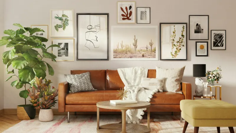
Before you commit, hold each piece roughly where it might live on the wall and step back. You are not checking the exact position yet, but the emotional conversation between the artwork and the furniture. Art should relate to what is beneath it; a gallery wall floating too high above a sofa or console table can feel disconnected. As a loose rule, aim for the center of the overall arrangement to sit near standard eye level, adjusted for the way you actually live in the room—seated in a living room, standing in a hallway, moving through a dining space.
Map the Composition on the Floor
Once your cast of characters is chosen, shift the play to the floor. This horizontal rehearsal is where deep reasoning about proportion and rhythm pays off, and it will save your walls from unnecessary holes. Lay out a rough rectangle on the floor that mirrors the width of your intended wall or the furniture beneath it. You can mark the boundaries with painter’s tape for clarity.
Place your largest piece first. Think of it as the anchor of a constellation. It does not have to sit in the exact center, but it should feel like the composition could balance around it. From there, add the next two or three medium-sized works, keeping a consistent gap between frames. Many designers start with a spacing of about two inches, adjusting slightly for character and breathing room. A tighter grid suggests order and formality; more space and gentle irregularity feel relaxed and domestic.
As you add smaller pieces, watch the negative space as closely as the art itself. The empty shapes between frames are as important as what you hang. If one gap feels uncomfortably large or a corner looks heavy with dark frames, adjust before moving on. You are seeking a delicate equilibrium: visual weight distributed across the arrangement so that no single corner pulls all the attention unless you want it to.
Balance is not the same as symmetry. In fact, many of the most interesting gallery walls rely on asymmetry that still feels considered. A tall vertical piece on one side might be countered by two smaller horizontals stacked on the other. A dark, high-contrast print can be echoed by a smaller, equally dark element elsewhere, so the eye moves in a soft zigzag rather than slamming into a visual dead end.
When the arrangement feels right, live with it for a few minutes. Walk around it, look from different angles, even sit where you would normally inhabit the room. If certain frames keep stealing your attention in a way that feels tiring, it may be a sign to move them slightly or separate two competing pieces. This quiet editing phase is where the wall shifts from a collection to a composition.
If you want extra confidence before drilling, transfer this floor layout to the wall using painter’s tape or paper templates. Trace around each frame on craft paper, cut out the shapes and tape them to the wall in the same configuration, marking the picture hook positions on the paper. It looks fussy, but it allows you to refine height and spacing with almost no risk. Adjust the templates until everything feels coherent with the architecture, furniture and the way light moves through the room.
Commit to the Wall and Let It Evolve
With your map in place, you can finally introduce the hammer. Start hanging from the visual anchor and work outward. This prevents the arrangement from drifting off its intended center. Use a level for the first few pieces; the eye forgives slight eccentricity, but it notices when two frames meant to align are just off. In plaster or older walls, appropriate hooks and anchors will keep your design from sagging over time.
As the wall fills, keep stepping back. The experience of the gallery wall at six feet away matters more than the millimeter precision you see up close. Tiny inconsistencies can even bring a human softness to the composition, signaling that this is a lived-in space rather than a showroom.
What you create now is not a fixed monument. The most interesting gallery walls evolve. Over months, you might replace a print, add a small frame to the edge, or introduce a dimensional object, like a ceramic plate or a shallow shelf with a single sculpture. When you travel, you may find work that naturally joins the existing story. This slow layering prevents the gallery from feeling like a one-time decorating project and instead turns it into a living archive.
Finally, consider the rest of the room as a supporting cast. A lamp placed near the wall will introduce subtle shadows and warmth at night, softening sharp contrasts. A muted rug or throw on the nearby sofa can echo one of the wall’s dominant colors, tying the vertical field of art to the horizontal surfaces you actually touch. Even the decision to keep adjacent surfaces calm and uncluttered can give your new gallery wall the quiet it needs to speak clearly.
Designing a gallery wall step-by-step is less about following rigid rules than about careful looking and patient adjustment. When you honor the story you want to tell and give the pieces room to breathe, the wall stops being just decoration. It becomes the place your eye returns to when you enter the room, a composed but evolving reminder of what you value enough to live with every day.