Seeing Your Walls as a Whole, Not a Blank
Walk into any room and resist the urge to stare at the emptiest wall first. Instead, pause in the doorway. Your eye is already drafting a quiet blueprint: where the light comes from, which furniture commands attention, where color gathers, where it thins. Visual balance with wall art begins long before a single nail meets plaster; it starts with this slow reading of the room.
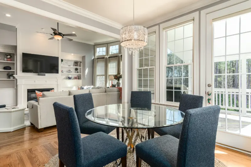
Designers talk about "visual weight" as if objects could step onto a scale. A dark sofa, a tall bookcase, a fireplace mantel, even a lush plant all carry more weight than a pale rug or a narrow side table. When a wall feels bare or restless, it is usually because the visual weight in the room is tipping too far to one side. Wall art is your way to redistribute that weight, to counterbalance a heavy corner or to give a quiet stretch of wall just enough presence to join the conversation without shouting.
To understand how to create visual balance with wall art, begin by sketching the room’s existing composition in your mind. You have three primary tools: scale, placement and color. Large pieces stabilize; small ones refine. High placements lift the eye; lower ones ground it. Strong color pushes forward; soft color recedes. You do not need a formal art education to use these tools, only a willingness to notice where your eye feels pulled, and where it seems to skip past too quickly.
Stand at different points in the space and trace the path your gaze naturally follows. Does it slam into a large television and stop there. Drift up to a lonely high painting while everything at human height feels vacant. Hover in a brightly colored corner while the opposite wall fades into indifference. These are clues. Your wall art does not need to "fill every gap"; it needs to calm these abrupt stops and long pauses so that the room can be read as a continuous, gentle sentence rather than a sequence of exclamation points and ellipses.
The temptation is usually to center every piece on a wall, treating the wall as a blank that needs a single, centered answer. Real balance is less literal. Often, the true center of a composition is not the middle of the wall but the area anchored by furniture below it: the back of a sofa, the top of a console, the headboard of a bed. Align your thinking with those anchors rather than the drywall. Wall art then becomes part of a vertical ensemble instead of a floating punctuation mark, and the room gains a sense of quiet intention.
Arranging Art: Symmetry, Asymmetry and the Quiet Center
Once you have read the room, the question becomes how to hang. Symmetry is the familiar instinct: two matching pieces flanking a mirror, a pair of frames hovering like bookends above a credenza. Symmetry offers instant calm because our brains recognize the pattern and can relax. It works especially well in formal spaces or areas already dominated by strong symmetrical elements, such as a centered fireplace or a bed with matching nightstands. When symmetry rules, keep frames, matting and subject matter closely related; the power comes from their near-mirror-like relationship.
Yet an overreliance on perfect symmetry can flatten a room, making it feel too ceremonial for everyday life. Asymmetry, when handled thoughtfully, brings energy without chaos. Think of one substantial piece of art balanced by a cluster of smaller works, or a tall, narrow frame on one side of a sideboard offset by a sculptural lamp and low stack of books on the other. The key is not randomness but equivalence: different elements that together feel similar in total weight, like two sides of a scale using different coins to reach the same sum.
A helpful way to experiment is to treat your wall as a grid and imagine your arrangement as a shape within it. A gallery wall, for instance, can read as a loose rectangle whose edges are implied rather than strict. If you keep the outer boundaries relatively clear and let variety happen inside that invisible frame, the composition feels intentional. Frames can differ, art can range from drawings to textiles, but the shared outline acts as the quiet center that holds their diversity in place.
Height, too, is a form of balance. Artwork hung too high drifts away from the room; hung too low, it drags the gaze downward and can make ceilings feel lower. A practical guideline is to align the center of key pieces near typical eye level while also acknowledging the furniture beneath. Above a sofa or console, leaving a band of air between the top of the furniture and the bottom of the art makes the assembly feel like a single thought, not two ideas separated by a question mark of empty drywall.
Color threads through all of this. A small but intensely colored painting can outweigh a larger, pale photograph. Repeating a hue from a rug or cushion in your wall art quiets its impact, folding it into the existing palette rather than introducing a new voice that demands explanation. This repetition creates what painters call "rhythm": the pleasurable experience of seeing a color reappear, changed slightly by context, as your eye moves around the room.
Personal Rhythm: Editing, Breathing Room and Living With It
Visual balance is not a final state; it is a conversation between you and your space. Once your art is on the wall, live with it for a few days. Notice whether your eye keeps snagging on a particular corner, or whether one side of the room feels relentlessly busy while another seems to vanish at night. That slight discomfort is information. You can lower a frame by two inches and suddenly the art and the furniture below begin to speak the same language. You can swap a dark print for a lighter piece and find that the whole wall exhales.
Editing is as important as acquiring. Not every piece you love has to be on display at once, and a room where every inch of wall is covered rarely feels balanced, only crowded. Leave intentional gaps where the eye can rest; blank space is not failure but part of the composition, the silence between notes that lets the melody of the artwork be heard. Rotating pieces seasonally can keep the room alive while protecting it from visual fatigue.
Most of all, allow your own habits to influence where art goes. The corners where you read, the table where you linger with coffee, the stretch of wall you face while tying your shoes: these are real centers of the home, and placing art there ensures that your arrangements serve daily life rather than only impressing in photographs. Balance, in this sense, is not just an optical trick but an emotional one. The room feels steadier because it matches the cadence of your days.
In the end, to create visual balance with wall art is to treat your home as a composition in progress, one that improves each time you look closely and make a small, conscious adjustment. You are not decorating so much as tuning: shifting weight, softening color, matching the height of a frame to the height of a moment. When the tuning feels right, you notice it not because the art shouts, but because the whole space grows quieter, more coherent, more like somewhere you can finally, simply, sit and stay.