The Quiet Power of the Right Height
Hanging art looks simple until you step back and realize something feels slightly off. The frame might be handsome, the print beautiful, the wall color carefully chosen, yet the composition still feels awkward. Almost always, the culprit is height.Our eyes are calibrated less by rules and more by how we naturally move through a room. When art floats too high, it feels aloof and untouchable. Too low, and it drags the room down. The sweet spot is where the work feels in conversation with you, as if it has joined the room rather than hovered above it.
Designers often use a straightforward guideline: the center of the artwork at about "57 inches" to "60 inches" from the floor, roughly at average eye level. Museums tend to cluster around this range, which is why galleries feel so effortlessly composed. But homes are not museums. Ceilings rise and fall, sofas slump, families include children and tall people and those who sit more than they stand. So height becomes less a fixed number and more an informed starting point.
Begin with the idea of shared eye level rather than your own. Stand in the room where the art will live, not pressed up against the wall but where you would naturally pause. This might be near the back of a living room, in the center of a hallway or just outside a dining table. Now imagine a horizontal band across the wall where your gaze settles most easily. That is the practical and emotional horizon you are trying to align your art with.
When you place the center of the piece along that horizon, the room starts to feel calmer. The wall stops shouting and begins to speak in a more measured tone. This is the essence of hanging art at the right height: you are not only measuring inches but negotiating how a piece participates in the space, how it greets you as you move through your day.
Balancing Art with Furniture and Architecture
Once you have a sense of this visual horizon, the next question is how the art relates to furniture and architectural lines. Walls are not blank canvases; they are already marked by door frames, window heads, headboards and mantels. These lines quietly organize the height of everything else.Over a sofa or console, the primary relationship is not between art and floor but between art and furniture. Instead of defaulting to that "57 inches" rule, imagine the furniture as a visual anchor. The art should feel tucked into that anchor, close enough to belong. A common mistake is leaving a tall gap between the top of a sofa and the bottom of the frame. The result is a feeling of disconnection, as if the art is hovering above the conversation rather than joining it.
Aim to keep the bottom of the artwork roughly "6 to 10 inches" above the back of the sofa or console. This squeezes the furniture and art into a single composition, giving the wall a sense of coherence and intention. If the piece is particularly large, allow it to sit even closer. The test is simple: if you visually feel the urge to lower the frame when you look at it, you probably can.
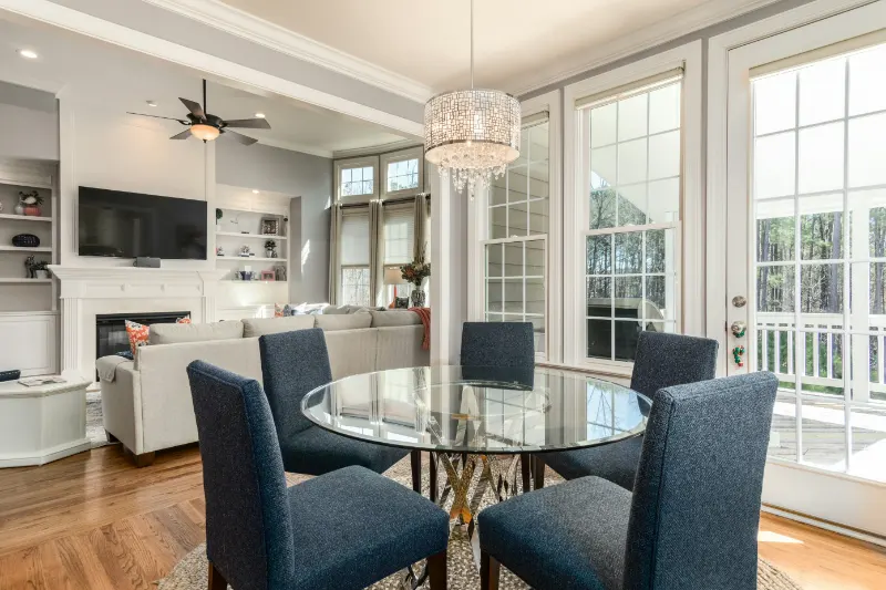
In dining rooms, you are usually seated rather than standing, which drops your working eye level. It can be more harmonious to lower art just slightly in these rooms, allowing the center of the piece to align with the eye level of someone sitting at the table. You want guests to be able to live with the artwork during a meal without craning their necks.
Hallways ask for a different kind of sensitivity. People move through them quickly, often upright and close to the wall. Art hung here can lean closer to the classic museum height, centered in that "57 to 60 inch" band, so it catches the eye without feeling like an obstacle. If the hallway is narrow, slightly higher placement prevents frames from feeling like they might brush your shoulder as you pass.
Architecture also gives subtle cues. A fireplace mantel, for example, creates a strong horizontal line. Rather than centering a frame between mantel and ceiling, consider the mantel as your base reference. Keep the artwork or grouping close to it so that mantel and art read as one composition rather than two distant parts of a vertical stack.
Reading the Room and Trusting Your Eye
However well intentioned, rules are simply tools. The right height is ultimately determined by how a piece behaves in the room. Before committing nails to plaster, experiment. Use low-tack tape to outline the size of the artwork on the wall, or prop the piece temporarily on furniture and live with it for a day. Notice whether your gaze settles comfortably on it as you walk by, or whether you feel compelled to tilt your head.Large artworks behave differently from small ones. A big canvas can tolerate being a bit lower because it fills more of your vertical field of vision. Several small works grouped together can be read as a single large shape, so treat the imaginary rectangle around the group as the object you are positioning. Place the center of that rectangle at your chosen eye level, then adjust the internal spacing.
Rooms with high ceilings invite a certain temptation to float art higher, as if you are required to "use" the vertical space. Resist this impulse. Height by itself is not sophistication. Leaving generous breathing room above a well placed piece can feel more luxurious than chasing the crown molding. Let the bulk of your art live in the human band of the room, where people actually exist.
Lighting can also nudge your decisions. If you have a picture light, sconces or directional spots, align the art so that light falls comfortably across the surface, not glaring into the glass. Sometimes this means adjusting height slightly to avoid reflections. In dimmer spaces, bringing art a little lower can make it feel more intimate and legible.
In the end, the right height is when the piece feels integrated, not isolated. When you enter the room and your eyes travel naturally from furniture to art to window without sudden jumps or awkward pauses, you have reached a kind of visual rhythm. You could call it "harmony" or "flow"; in more meditative terms, it is simply the room coming into alignment with how you move and feel.
Take the time to adjust, step back, and adjust again. Listen less to the wall and more to your own body in the space. When your shoulders drop, when your gaze meets the artwork without effort, when the piece feels not too high and not too low but quietly present, you will know you have found the right height for your home.