Reading the Room Before You Pick the Art
Before you fall in love with a piece of art, it helps to fall in love with the room itself. The quiet truth is that walls rarely misbehave on their own; they echo what the furniture, light and architecture are already saying. Matching art to your interior is less about rules and more about learning to read that conversation.Start with three elements: lines, color and mood. Lines are the shapes your room draws in space. A midcentury sofa with tapered legs, a low credenza and a slender floor lamp create a horizontal rhythm that feels calm and elongated. Above that, a wide landscape or a series of low, rectangular works tends to feel at home, extending the line the furniture has already drawn. In a room with taller bookshelves, high-backed chairs or dramatic curtains, vertical energy is stronger; a portrait-format canvas or a stacked pair of framed prints can echo that lift and make the space feel cohesive rather than scattered.
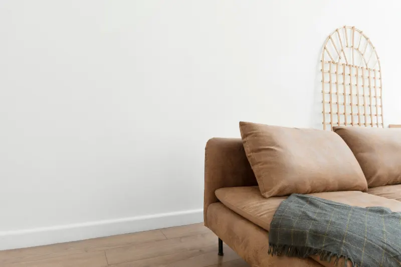
Color is usually the loudest part of the story, but it does not have to shout. Look at your dominant neutrals first: the undertone of your white walls, the warmth of your wood floor, the gray in your sofa. Cool spaces with blue-grays and crisp whites often welcome art with sharper contrasts and clear edges: black-and-white photography, graphic prints, bold typographic pieces. Warm rooms, with camel leather, linen and honey woods, tend to soften under art that has earth pigments, soft greens or muted reds. You do not need to match colors exactly; instead, think about repeating a note or two from the room in the art so the eye can bridge the gap.
Then there is mood, the hardest thing to name and the easiest to feel. A serene bedroom that leans on quiet textiles and low light will fight against highly kinetic art. In that space, a piece with open negative space, gentle brushstrokes or a subtle gradient can support the room’s instinct to slow you down. A kitchen with industrial stools, stainless counters and exposed brick can carry bolder, more graphic art; it is already awake. When you stand in the doorway of a room, ask yourself, without overthinking, whether it feels expansive or intimate, formal or relaxed, bright or cocooned. Choose art that pushes that feeling slightly further, rather than contradicting it.
This is where personal style and interior style begin to negotiate. Your love of abstract expressionism can live inside a minimal living room if you pay attention to scale and palette. A large, gestural canvas in three or four colors that already appear in the room becomes an anchor instead of an intruder. The secret is to let your taste be filtered through the architecture and furnishings you already live with, so the art feels less like an arrival and more like an evolution.
Translating Popular Interior Styles into Art Choices
Design language can be helpful, as long as it stays flexible. Many homes are not purely one style, but understanding the tendencies of a few familiar interiors can give you a starting map for your art decisions.In a modern minimalist space, furniture tends to be low, shapes are clean and color is restrained. Here, art has room to breathe. Large-scale pieces with simple geometry, monochrome photography or abstract works with a limited palette can feel powerful without overwhelming the room. Think of the art as a single carefully chosen sentence on a mostly blank page. The framing matters: thin black or natural wood frames keep the line clean, while ornate frames may feel like an unwanted accent mark.
Scandinavian-inspired interiors prioritize light, natural materials and quiet comfort. In these rooms, art often carries a soft optimism. Botanical line drawings, landscape photographs in misty palettes, or playful yet restrained graphic prints in gentle pastels work well. The key is to preserve the sense of air. Rather than filling every inch of wall, leave generous margins around each piece so the white space on the wall mirrors the white space on the paper or canvas.
A more traditional room, with paneled walls, heavier textiles and historic details, can hold richer, more layered art. Oil paintings, portraits and detailed drawings feel at home here, especially in frames with some depth. But contrast can also be useful. A single contemporary abstract above a carved mantel can make the traditional architecture feel newly alive, as though the room has learned a new word. The bridge between old and new is often color: a contemporary piece that quietly borrows the rug’s burgundy or the drapery’s green stitches the centuries together.
Bohemian or collected interiors, with patterned textiles, books and found objects, thrive on art that feels personal and worldly. Here, a salon-style wall of mismatched frames, travel sketches, textiles and small paintings can suit the room’s generosity. The risk is chaos, so give the eye an underlying order: align one horizontal line through the middle of the arrangement, or keep a consistent margin around the grouping. Even in the wildest wall, a hint of underlying structure lets the art feel like a story rather than static.
Industrial or loft spaces, with concrete, brick and metal, are naturally graphic. Large-format photography, bold typographic posters and street-art-inspired pieces hold their own against strong architectural bones. To keep the space from becoming cold, mix in at least one piece with visible handwork: a charcoal drawing with smudges, a canvas with layered paint, something that reminds you a human made it.
Ultimately, these style cues are there to support, not to confine. If you fall for a piece that seems off-style, treat it as a protagonist. Give it visual breathing room and let the surrounding decor gently adjust: a new throw pillow that echoes one of its colors, a slightly simpler lamp nearby, a cleared surface that frames its presence. Often what looks like a mismatch at first becomes the most alive corner in the house once the room learns to harmonize around it.
Scale, Placement and the Quiet Art of Living with Art
Even the perfect piece can feel wrong if its scale or placement is off. Most art is hung too high. In a living room, let the center of the artwork sit near eye level for someone seated, not standing. Above a sofa or console, imagine the art as part of the furniture silhouette, not floating above it; leave a hand’s breadth of space between frame and furniture so they speak as one.Scale is a form of respect. A tiny frame on a large blank wall can feel apologetic, while a massive canvas crammed between two windows feels restless. As a guide, art above a sofa usually looks balanced when it spans between half and two-thirds the width of the seat below it, whether as a single work or a grouping. When in doubt, err slightly larger; confident scale often reads as intentional design, even when other details are improvised.
Light, too, shapes how art lives in a room. Direct sunlight can bleach colors, but it also animates texture. If you hang a heavily textured painting or a rough textile, notice how the changing light over a day brings out its surface. In calmer spaces, like bedrooms, diffuse light can be kinder to photographs and delicate works on paper, letting them glow quietly rather than compete with glare.
Over time, the art on your walls becomes a kind of autobiography. Pieces you once chose solely for color may start to hold memories of the era when you could finally afford them, the people who were there when they were unwrapped and hung. When you add a new piece, you are not just decorating; you are editing the narrative of your home. Step back after each change and read the room again. Does it feel more like you, or less?
Matching wall art to your interior style, in the end, is not about perfection. It is about listening: to the lines of your furniture, the tones of your textiles, the moods you hope each room will hold. When the art and the space begin to answer each other, your home starts to feel composed in the best sense, like a piece of music you happen to live inside.