The quiet logic behind mixed poster walls
Mixing abstract art, nature photography and quote posters on one wall can feel like inviting three different guests to the same dinner party. Each brings its own mood: abstract pieces hum with energy, nature images promise calm, and quotes speak directly to the mind. When they are badly combined, the wall feels like an argument. When you get the balance right, though, the wall becomes a single, coherent thought expressed in several visual dialects.Instead of starting with what you like in isolation, begin with the feeling you want the room to hold. A living room might need a gentle sense of movement and warmth, while a bedroom usually asks for softness and quiet. Abstract art is your tool for rhythm, nature prints for grounding and breath, and quote posters for focus and narrative. Think less in terms of style labels and more in terms of these roles. If a piece does not contribute to the room’s emotional temperature, no amount of clever framing will make it belong.
Color is the first and most forgiving way to connect poster styles. Let one or two colors act as a through line. An abstract with terracotta strokes, a forest print at golden hour and a quote in dark rust ink can speak to one another because they share a palette. Even black and white pieces participate in this conversation: the depth of black, the temperature of the white and a touch of off white in the paper can echo each other across very different images.
Scale is the second, often overlooked, connector. If every poster shouts at the same volume, the wall becomes monotone noise. Try letting one larger abstract piece act as a visual anchor, with smaller nature images around it, and one or two compact quote posters tucked in where the eye wants to rest. Large fields of color from abstract work calm the busyness of text, while the detailed textures of nature images give the eye something to linger on. The wall becomes legible from across the room and rewarding up close.
Finally, notice the negative space both within and between posters. Abstract art often contains large, open areas; nature prints may have sky, water or soft blur; quotes sit on uncluttered backgrounds. These quiet zones should talk to each other across the wall, creating a rhythm of intensity and rest. If every poster is visually dense from edge to edge, the wall will press forward instead of receding, making the room feel smaller and more anxious.
Giving each style a job in the room
Once you have a sense of feeling, color and scale, you can assign each type of poster a task, which makes mixing styles feel less random and more like choreography. Abstract art is often best placed where you want energy without a specific story, such as above a sofa, dining table or desk. Its job is to hold the room together in broad strokes, like background music. A large, gestural abstract near the center of the arrangement can quietly dictate the overall mood, whether that is calm, kinetic or somewhere in between.Nature posters are the breathers. They lend perspective, horizon lines and a sense of air. Place them where you want the wall to open up rather than close in: near a window, lower on the wall where you look while seated, or at the edges of a gallery cluster to soften its outline. The more intimate the room, the softer these images should be. Misty forests, close ups of leaves or water, and photographs with gentle blur feel less like travel advertisements and more like remembered places the mind can rest in.
Quote posters are the most literal and therefore the bossiest. The words can support or sabotage the mood of the other pieces. A sharp, motivational line above the bed may fight against the room’s wish to be a retreat, while the same quote in a studio can feel like an ally. When mixing quotes with abstract and nature images, consider their tone as carefully as their font. A gentle phrase in a simple serif, printed small with generous margins, behaves almost like a minimalist landscape. A bold, graphic command in all caps is closer to abstract art in its visual weight and will demand a more measured placement.
Let the quotes occupy zones where you naturally pause to read, such as above a side table, near a reading chair or next to a door you pass slowly. You can nest a quote near a nature print so the words feel like a caption to a mood rather than a separate broadcast. Or you can float a small quote inside a larger field of color from an abstract canvas, using the art as a kind of atmospheric frame. In both cases, the text should feel discovered rather than shouted.
Practical harmony: frames, spacing and the view from the room
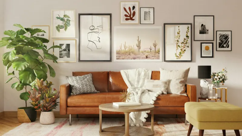
Posters rarely clash because of the art itself. They clash because of the frames. A gallery of mixed styles becomes coherent when the framing and margins practice restraint. You do not need perfectly matching frames, but you do need a family resemblance. Choose one dominant frame color, perhaps a warm wood or a soft black, and let most pieces live there. A single metal frame or a lighter wood can then act as a quiet accent rather than a competing statement.The borders around each poster matter as much as the frame. A wide, consistent margin makes even a busy quote or a dense abstract feel calmer. If you are mixing store bought prints with different built in margins, use mats to even out the breathing room so the wall reads as one considered composition. When margins align, dissimilar images start to feel like pages from the same visual book.
On the wall, avoid arranging by poster type, such as a row of abstracts above a row of quotes. Instead, think about visual weight and conversation. Place a strong abstract slightly off center, then respond to its energy with a quieter nature print nearby, and a small quote where the eye naturally lands after tracing the movement between them. As you add pieces, keep stepping back to see not just the gallery wall but the entire room. The arrangement should make sense from the doorway, not only from twelve inches away.
Trust that you can leave space. A mixed wall with gaps of honest, empty wall between frames often feels more luxurious and intentional than a tightly packed grid. The room’s architecture, the light and even the shadows of the frames become part of the composition. In this way, your posters, however different in style, are simply tools you are using to tune the atmosphere of your home, making it a place where every glance finds something both ordered and alive.