Seeing the Sofa Wall as a Composition, Not a Blank
Styling wall art above a sofa is less about following rigid rules and more about learning to see like a quiet curator. The space over your seating is the largest piece of visual real estate in most living rooms. When it is empty, the room can feel unresolved, as if the conversation never quite starts. When it is overfilled or awkwardly arranged, the eye never finds a place to rest.Begin by considering the sofa and the wall together as one composition. Your sofa is effectively a base line, the grounding element in a visual sentence that the art will complete. Stand back and squint at the room. Notice where your eye naturally lands. A well placed piece or grouping above the sofa should gently pull your attention there and then allow it to move outward, not yank it to an overly bright canvas or let it float in a void of white space.
Proportion is your first ally. As a general guide, the full width of your art arrangement should feel substantial, roughly two thirds to three quarters of the sofa width. A single petite frame marooned in the middle of a long sectional will always look timid. The goal is not to fill every inch but to match the visual weight of the sofa below. If your sofa is generous and deep, consider either one large work or a tightly related pair, each echoing the scale of the furniture. For a more delicate, low profile sofa, a modest gallery of smaller pieces can add nuance without overwhelming it.
Vertical placement is just as important. Many people hang art too high, imagining it must rise up to meet the full height of the wall. Instead, think in terms of a shared zone between seating and artwork. In most cases, the bottom of the frame should hover about six to ten inches above the top of the sofa back. This slim band of wall lets the sofa breathe while keeping the art connected to it. You are creating a soft horizon where the human body, the furniture and the artwork coexist comfortably in the same field of vision when you are seated, not only when you are standing across the room.
Color and mood form the final layer of this first consideration. Ask what role the art should play: chorus or soloist. If your sofa is already saturated, a quieter piece with limited colors and strong composition can anchor the room without shouting. If the upholstery is neutral and the architecture simple, this might be the place where a daring canvas or a vivid photograph provides the room’s single decisive gesture. In both cases, harmony matters more than matching. A soft echo in tone, a repeated line or a shared texture between art and textiles will be felt, even if not consciously noticed.
Balancing Centerpieces, Pairs and Gallery Walls
Once you understand the relationship between sofa, wall and eye level, you can choose the right format for the art itself. Different arrangements carry different emotional temperatures, from calm and meditative to energetic and playful, and the living room you want to inhabit should guide that choice as much as any diagram.A single large piece above the sofa reads as decisive and serene. It is akin to a window onto another place and can calm a visually busy room. When selecting a lone work, pay attention to its internal structure. Strong horizontal lines often echo the length of the sofa and reinforce a feeling of stability. A vertical emphasis can create a quiet sense of lift, useful in low ceilinged rooms, but it must still sit within that two thirds to three quarters width range or be balanced by lamps and side tables that visually widen the whole arrangement.
A pair or trio of works can function like a visual rhythm. To avoid a marching band effect, think of the pieces as related phrases, not identical soldiers. They might share a palette or subject matter but vary in scale or framing. Maintain consistent spacing, often in the two to four inch range, so they read as one unit. Here the negative space between frames is as designed as the art itself. That white or colored wall strip becomes part of the composition, a measured pause between beats.
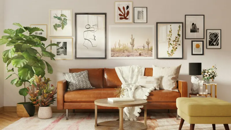
Gallery walls introduce another kind of experience: layered, personal, evolving. Above a sofa, they require more intention than those tucked into a hallway because they dominate the primary living space. Start by quietly mapping an invisible outer rectangle or oval that will contain the group, again respecting the sofa width. Lay your frames on the floor first. Place the visually heaviest piece near the center or slightly off center where you want the eye to land, then build outward with smaller works, allowing diagonals and soft clusters rather than rigid grids if you want a more relaxed mood.
When mixing media, imagine you are balancing flavors on a plate. A single graphic poster, a muted landscape, a small textile and a few line drawings can coexist if something ties them together. That connection might be a repeated frame color, a shared undertone or even a subtle theme like horizons, botanicals or architectural forms. Without that thread, the wall risks feeling like a bulletin board rather than a composed narrative.
Creating Depth with Layers, Texture and Light
A well styled wall above a sofa is not merely flat ornament but part of a larger spatial experience. Depth comes from the dialogue between the artwork, the furnishings in front of it and the light that moves through the room. Instead of seeing the art as the final decorative step, think of it as one layer in a three dimensional composition that includes side tables, lamps, plants and the way people will actually sit and live in the space.One quiet strategy is to echo lines from the art in the objects below it. A photograph with a strong horizon might sit above a low, linear console and a pair of slender lamps, creating a continuous band around the room. An abstract piece with looping gestures could be complemented by a rounded side table or a curving floor lamp. These loose repetitions soften the boundary between wall and furniture, making the entire area feel like a single, intentional installation rather than stacked elements.
Texture is another overlooked tool. If your sofa is a smooth leather or tightly woven fabric, consider art with visible brushwork, layered collage or a tactile textile hanging to keep the space from feeling too slick. Conversely, a deeply textured bouclé sofa might be better paired with cleaner, graphic works to preserve clarity. Even the choice of frame contributes to the sensory balance. Warm woods can ground cooler color palettes; slim black or white frames sharpen an otherwise soft room; metal frames can catch light in the evenings and echo hardware elsewhere.
Lighting completes the composition. The way daylight grazes the wall will change the art hourly, so notice reflections and glare, particularly if you are hanging glass fronted pieces opposite bright windows. At night, a pair of table lamps or sconces flanking the sofa can create gentle pools of light that wash the artwork rather than spotlighting it harshly. The aim is to make the wall feel alive but not theatrical, part of the room’s natural rhythm from morning coffee to late evening conversation.
Ultimately, styling wall art above a sofa is an exercise in noticing: the scale of your furniture, the height of your ceilings, the way you move through the room and what kind of emotional temperature you crave at home. When you treat the wall not as a void to be filled but as a canvas for proportion, balance and personal story, the art above your sofa stops being decoration and becomes part of how the room quietly explains who you are to anyone who sits down within it.