The quiet architecture of a line
Minimalist interiors rely on a careful balance of presence and absence. Walls are often left open, furniture silhouettes are simplified, and color is pared back to a handful of tones. In that world of restraint, line art becomes less of a decorative afterthought and more of a structural element, a kind of visual architecture that can define a room without overwhelming it.At its core, line art is drawing stripped down to what one might call its "essential bones": contour, rhythm and direction. You could think of it as the skeleton of an image, everything unnecessary carved away until only the decisive marks remain. That inherent economy of means echoes the logic of minimalism, where every object is asked to justify its existence. A single black line on a white field behaves a lot like a Shaker chair or a simple oak table: it is an argument for doing more with less.
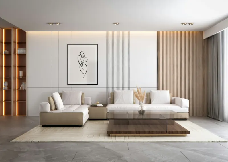
This affinity is not accidental. Minimalist interiors are often built around large planes of negative space, and line art is unusually fluent in that language. Instead of filling the void, it collaborates with it. The unmarked paper around the line is as active as the ink itself, creating a quiet field that lets the interior breathe. Where a colorful painting might compete with furniture and objects, a piece of line art often slips into the room’s rhythm, amplifying the calm rather than interrupting it.
There is also a psychological clarity in a well-drawn line that speaks to why many people seek minimalist spaces in the first place. When you enter a room and your eye lands on a crisp contour, your brain is offered something legible and immediate. The image does not demand decoding through layers of texture and color. It simply states, "Here is the gesture, here is the form." That directness can be surprisingly soothing at the end of a day full of screens and noise, when your attention has been split between dozens of competing inputs.
Yet simplicity does not mean emotional emptiness. The slightest tremor in a line can carry feeling: a soft loop suggesting tenderness, a jagged break hinting at tension, a smooth, unbroken curve offering a sense of ease. In a room where every object is chosen deliberately, those small visual cues become powerful. A loose, wandering line can soften a rigid sofa; a taut, architectural drawing can give structure to an otherwise languid space. Line art works almost like a tuning fork for the mood of a room, quietly adjusting its pitch.
How line art shapes minimalist rooms
Because minimalist interiors are so spare, every visual decision carries extra weight. The size of a frame, the thickness of a stroke, even the way glass catches light can subtly alter how a space feels. Line art operates at that fine-grained level, influencing proportion, movement and atmosphere without announcing itself too loudly.Scale is one of the most powerful tools. A large, mostly empty sheet with a single, off-center line can make a small living room feel expansive by reinforcing the surrounding emptiness instead of filling it. The drawing becomes a kind of window into more space, echoing the blankness of the wall while adding a focal point. Conversely, a row of smaller line drawings over a low console can introduce a gentle rhythm, almost like a heartbeat along the wall, tying together scattered furniture without cluttering it.
The character of the line itself matters as much as the subject. A thick, assertive stroke reads almost like a bold structural beam; in a room with generous natural light and smooth surfaces, it can anchor a floating feeling. By contrast, a hairline drawing of a face or hand adds intimacy, drawing you closer and slowing you down, which can be welcome in a bedroom or a quiet reading corner. Minimalist interiors often risk tipping into the impersonal; the trace of a human hand in a line drawing can restore a sense of presence without adding visual noise.
Color, or the deliberate lack of it, also reinforces the minimalist ethos. Black on white is the classic pairing, mirroring the high-contrast edges of doors, window frames and shadows that already exist in most rooms. But subtle shifts can be powerful: a deep brown line on warm cream paper can soften a stark white wall, while a charcoal gray stroke can harmonize with concrete or stone. Because line art rarely depends on saturated color, it integrates easily into palettes built around beiges, sands and soft grays, letting texture and light remain the main characters.
Framing becomes an extension of the drawing’s logic. A thin frame in wood or metal echoes the clarity of the line, effectively turning the piece into another piece of linear architecture on the wall. In purely minimalist spaces, mats with generous borders intensify the sense of negative space, giving the drawing room to breathe. That border of quiet paper around the image mimics the empty floor around a well-chosen armchair, highlighting both with the same gesture of restraint.
What makes line art such a natural fit for minimalist interiors is not only its visual compatibility, but its philosophical kinship. Both ask, "What can be removed without losing meaning?" In a home, that question is not an abstract exercise. It becomes an everyday practice: choosing a few pieces that feel honest and letting them stand unmasked. A simple drawing on a bare wall can serve as a daily reminder that beauty does not have to shout. Sometimes it is a single, thoughtful line, holding the room together with nothing more than its quiet, deliberate path.