The Invisible Geometry Of A Comfortable Room
Designers rarely begin a living room by asking where the sofa should go. They begin with the question "How do you want to live in here?" Every rule that follows grows out of that answer. A room meant for quiet reading and tea has different geometry than one that hosts movie nights, children, or late dinners stretching toward midnight.Still, there is a kind of shared grammar. Designers look first at doors, windows and sightlines. These are the "non‑negotiables" that quietly dictate everything else. The room has paths people will naturally walk to get from door to window, from sofa to kitchen, from hallway to balcony. Good layouts protect these routes instead of forcing people to zigzag around furniture like an obstacle course.
A commonly used mental rule is that major pathways need roughly three feet of breathable space. It does not need to be exact, but the experience should be that two people can pass each other without twisting sideways. When you shove a sofa so that someone has to slide between its arm and a wall, you make the room feel stingy, even if the square footage is generous. Designers see those pinch points before a single piece is delivered.
Another invisible rule is about hierarchy. A living room cannot have twenty equally important things yelling for attention. Designers quietly decide what the room will honor first. In some homes, the priority is a view or a fireplace. In others, it is a television wall or a bookshelf that holds the story of the family. Whatever that main character is, key seating is oriented to acknowledge it without turning the room into a shrine. The rule is less about worship and more about orientation. Your body knows when the room has a focal point; it can finally relax because it understands where to look.
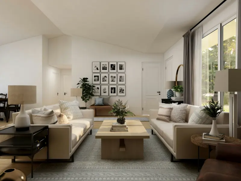
Then there is the geometry of conversation. Designers aim for people to speak to each other without raising their voices or craning their necks. As a guideline, seats in a conversation group tend to be no more than about eight to ten feet apart. Any farther and you are performing across a stage instead of chatting across a coffee table. The layout draws an invisible circle inside which people can be fully present with each other. That circle is what turns a collection of furniture into a place.
The final quiet rule of this first layer is proportion. Sofas that are too deep for the room, tiny rugs under large sectionals, or miniature side tables next to heroic armchairs all create a subtle unease. Designers think of a living room like a paragraph of text. Some pieces are bold, some are punctuation, some are margins. When each element knows its role in the sentence, the room reads fluently instead of feeling like a jumble of fonts.
How Designers Position Seating, Rugs And Tables
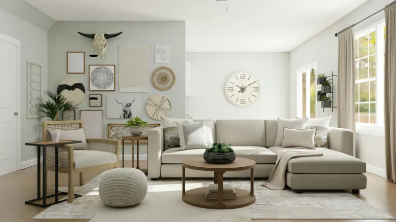
Once the invisible geometry is understood, designers begin placing actual pieces. Sofas are rarely pushed all the way to the walls unless the room is extremely small. The instinct to hug the perimeter comes from wanting to make a room feel bigger, but it often does the opposite. Pulling a sofa even a few inches off the wall creates a sense of depth and intentionality, as if the piece is anchored in the room rather than taped to the edges.The distance between sofa and coffee table is one of those quiet rules that separates comfortable rooms from photographic ones. Designers aim for a reach that feels natural, roughly the span of a casual arm extension. Close enough to set down a glass without leaning sharply forward, but far enough that knees are not pressed into the table when you sit back. The mind registers that ease before the eyes do.
Rug placement is another deceptively powerful rule. A rug that floats like a lonely island in the middle of the floor breaks the conversation group into fragments. Designers usually let at least the front legs of sofas and chairs rest on the rug so that the seating feels like it shares a common ground. In larger rooms, they may place all legs on the rug to create a generous stage for life to unfold. The rug stops being décor and becomes the floor your time stands on.
Chairs are positioned with more care than most people expect. The popular rule designers lean on is to avoid placing every seat in a rigid straight line facing a single wall. They prefer a gentle "C" or "L" shape, a curve that encourages faces to turn toward each other as much as toward a screen. Even a single angled accent chair can break up the feeling of a furniture army shoved against one wall.
Side tables and lamps follow another rhythm. Designers imagine where a person’s hand will fall when they reach for a book, a drink or a switch. A side table much lower than the seat feels like searching in the dark. One much higher turns a simple gesture into an effort. Aligning table tops near the height of the sofa arm, and keeping lamps within easy touch, supports the quiet choreography of daily life.
Throughout this placement phase, designers are constantly editing for what they call visual rest. For every busy corner of books and objects, there is another corner left calmer, perhaps with only a plant and a chair. The layout becomes a composition of active and quiet moments. Your eye travels, pauses, breathes. That rhythm is not an accident but the result of rules followed and occasionally bent with care.
Bending The Rules To Fit How You Actually Live
The most seasoned designers know that rules only matter in service of real lives. A textbook layout that ignores a child’s play zone, an aging parent’s need for a clear walking path, or your ritual of sprawling on the floor with a book is a failed design, no matter how beautifully proportioned it looks in a photograph.So they begin and end by watching how people actually use the space. If the family always drifts toward a sunny corner with a less impressive view, then that becomes the rightful focal point. A reading chair may steal pride of place from a television, and the seating quietly rotates to honor that truth. This is not sentimentality but realism. Layouts that align with ingrained habits are the ones that stay tidy and calm, because the room is finally working with you instead of against you.
Designers are also comfortable making asymmetry feel deliberate. Maybe one side of the room holds a larger sofa while the opposite side relies on a single generous chair and an ottoman. If the weights are balanced through color and texture, the layout will feel intentional rather than lopsided. The rule here is that symmetry is soothing but not mandatory. What matters is that no part of the room feels forgotten or exiled.
Light, too, can overrule other guidelines. Where natural light pools, designers often locate activities that benefit most from it. A desk or reading chair migrates toward a window, even if that means the conversation group shifts slightly off the room’s architectural center. The eye will forgive a layout that chases good light far more easily than one that clings rigidly to centering for its own sake.
Ultimately, the living room layout rules that designers use are less about perfection and more about kindness. They protect ease of movement, the dignity of conversation, the pleasure of a view, the comfort of a reachable table, the security of a well lit corner. When you look at your own room through that lens, you start to see where a chair could pivot, where a rug could grow, where a pathway could widen. In the end the room does not need to obey every rule. It only needs to feel like it is quietly on your side every time you walk in.