The Quiet Power of an Edited Studio
A studio apartment is an essay in editing. One room must do the narrative work of several, yet the goal is to keep it from reading as visual cacophony. When people describe a space as "peaceful," they are usually reacting less to the furniture itself than to what the eye is asked to process. In a studio, managing that flow of information is the real design project.The first move is not adding furniture but subtracting distractions. Imagine standing at the entry and tracing the path your gaze naturally takes. Does it ricochet between open shelves, competing colors, and layered cables, or does it glide along a few intentional forms? Minimal visual noise begins with this mental walk-through. Anything that breaks the rhythm without adding clear function becomes a candidate for relocation or concealment.
Think of the room as a single canvas that must hold multiple scenes without feeling collaged. Bed, sofa, workspace, and dining zone can absolutely coexist, but their relationships matter. Arrange the bed so it is not the first thing you confront from the door; let living or dining functions greet you instead. This simple shift changes the psychological reading of the space from "bedroom with a table" to "home that happens to contain a bed."
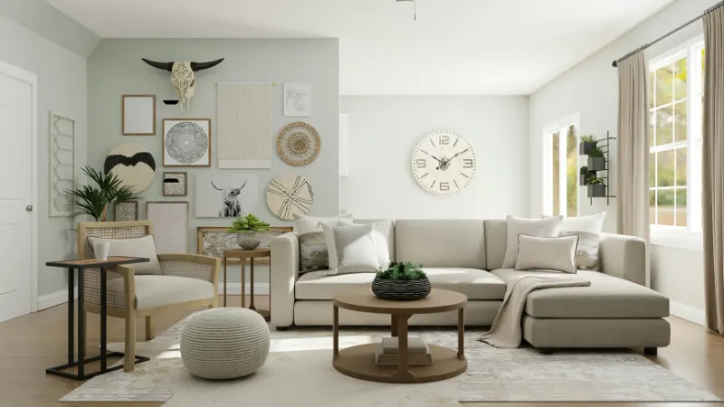
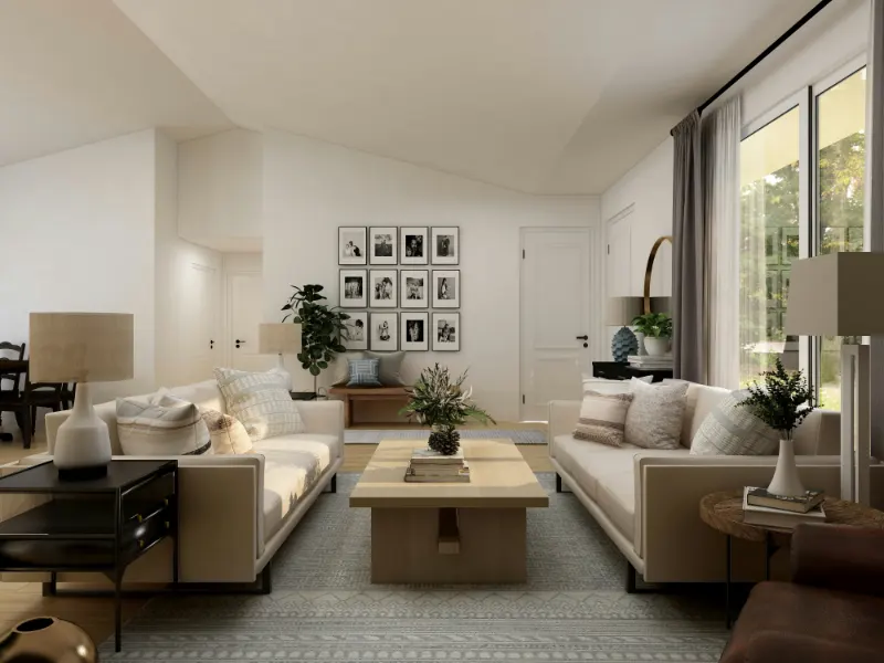
Calm also comes from restraint in material and color. Limiting the palette to a few tones, repeated across textiles, storage, and furniture, lets the eye group objects into visual families. A pale wood table that echoes the floor, a sofa in the same tonal range as the curtains, a rug that quietly bridges bed and seating area; each of these moves reduces contrast without depriving the room of character. Within that quiet background, one or two accents can carry the personality without cluttering the story. A single saturated painting or a sculptural lamp is more powerful when the surrounding field is visually hushed.
Negative space is not wasted space in a studio; it is structural. Leaving deliberate breathing room around a few anchor pieces makes them feel intentional rather than forced. A small sofa pulled slightly off the wall, with a clear path behind it, can function as a subtle room divider while keeping sightlines open. In design terms, you are choreographing both how bodies move and how eyes rest.
Zones Without Clutter: Drawing Lines With Light, Height, and Texture
The central puzzle of a studio is how to imply separate rooms without erecting heavy dividers. The most successful layouts sketch boundaries in soft pencil rather than ink. Instead of tall bookcases that chop the space, consider lower elements that define zones while preserving air and light. A console table at the back of a sofa, a bench at the foot of the bed, or a low open shelf can suggest edges without shouting.Height is a subtle but powerful tool here. Keep the tallest pieces on the periphery so the center of the room remains visually open. When storage must go vertical, let it rise in a single, disciplined plane rather than in scattered towers. A wardrobe aligned with the wall, a stacked bookcase that reaches the ceiling, and curtains mounted high above the window all pull the eye upward in one continuous movement. This vertical rhythm feels calmer than a horizon of mid-height pieces competing for attention.
Light can do the zoning work that walls once did. Place a floor lamp by the sofa, a focused task lamp at the desk, and a soft, lower lamp by the bed. Each pool of illumination carves out a function without adding physical bulk. Overhead light, when too strong or singular, can flatten the room and expose every object equally. Softer, layered lighting invites the eye to move gradually, lingering where life actually happens.
Texture, too, is a quiet boundary marker. A flat-woven rug beneath the living area and a more textured, gentle rug under the bed signal a shift without requiring a change in color. A smooth tabletop near a slightly nubbly upholstered chair suggests dining and lounging, even if they sit within arm’s reach. These micro-contrasts guide the senses more graciously than a patchwork of competing patterns.
Underpinning all of this is storage with discipline. Closed storage reduces visual noise; open storage organizes it. Wherever you introduce open shelving, decide which objects are truly worth display and allow empty space around them. Books arranged by size or tone, a row of identical baskets, or a calm progression of ceramics turns potential clutter into composition. Everyday necessities that do not age gracefully in public view are better handled by drawers, cabinets, or under-bed storage that blends with flooring and walls.
Designing for Daily Rituals, Not Just Floor Plans
A visually quiet studio is not a museum; it is a backdrop for daily habits. The most successful layout starts from how you actually live, then edits around that reality. Begin by mapping your rituals. Where do you naturally drop your bag, make coffee, read, stretch, or work? Give each of those actions a clear, simple landing spot, even if it is small. A single hook by the door can eliminate the visual chaos of a chair that becomes a catchall. A tray on a counter can turn a cluster of bottles into one contained vignette.When you plan furniture, think in terms of alignment rather than mere adjacency. A desk that lines up with the edge of the sofa reads as part of a composed whole; one that floats at an odd angle can introduce low-level visual static you register subconsciously every day. Align rugs with architectural lines, not just furniture legs. Let the bed parallel a main wall rather than tilt toward a corner for novelty. Straightforward alignments feel calmer because the brain spends less effort resolving them.
Technology is another frequent source of visual noise. Corral cords wherever possible, allowing them to trace the shortest, neatest path rather than spanning long diagonals. Choose a limited number of devices that remain visible, and consider integrating them with the palette rather than fighting them. A black metal floor lamp echoing a black-framed television, both grounded by a dark-toned side table, reads as a single intentional cluster rather than unrelated electronics.
Above all, accept that a studio apartment will always reveal most of your life at a glance. The goal is not to hide evidence of living but to orchestrate it. When objects are chosen with care, when lines stay clear and color remains measured, the room begins to hold itself with quiet confidence. You enter, the door closes, and instead of being greeted by a list of tasks to tidy, your eye finds a few calm anchors: the curve of a chair, the fall of a curtain, the rectangle of a table waiting for the next meal or sketch or conversation. That is the promise of minimal visual noise in a small space, and it is well within reach, one deliberate edit at a time.