Seeing Your Wall as a Composition, Not a Blank
Walk into almost any home and you will notice the same quiet problem: the art is too small. A proud 12-by-16 inch print floats above a sprawling sofa, or a petite canvas hovers over a king bed, looking more like a bookmark than a focal point. The room feels oddly unfinished, even if every other piece of furniture is right.
Sizing wall art is less about guesswork and more about simple proportions. Designers do not magically eyeball the perfect dimensions; they rely on a few ratios that keep art in dialogue with the furniture and architecture around it. Once you understand those proportions, choosing the right scale becomes almost automatic.
Begin by thinking of each wall as a frame, and of your furniture as the visual anchor inside that frame. Your art should feel like it belongs to that anchor, not like a distant relative. Most of the time, that means going larger than your instincts suggest. If you hesitate between two sizes and your ceilings are of average height, the slightly larger one is almost always the better choice.
There is also a psychological element at play. Bigger pieces create calm because they reduce visual clutter. One generously scaled work can make a room feel serene, whereas an arrangement of undersized pieces can read as nervous energy, especially when they are scattered too far apart. The right size does not shout; it allows everything else in the room to breathe.
To work confidently, measure. A tape measure will tell you more about what will feel right than any amount of scrolling through inspiration photos. Jot down the width of your sofa, bed or console, as well as the height of your walls and the distance from the top of the furniture to the ceiling. From there, a few simple rules will guide you toward balanced proportions almost every time.
The Sofa, the Bed, and the Magic of Two-Thirds
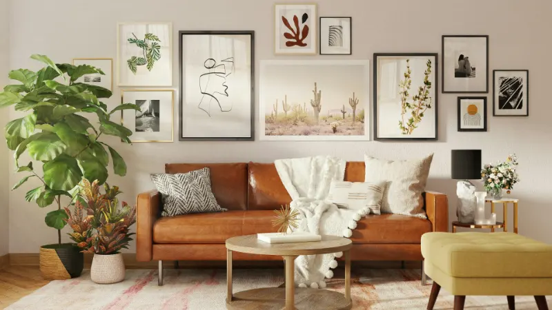
When you are sizing art above a major piece of furniture, the most reliable guideline is the two-thirds rule. Aim for your artwork or grouping to be about two-thirds to three-quarters the width of the furniture below it. A 90-inch sofa looks grounded with art in the 60- to 70-inch range; anything much narrower tends to feel like a postage stamp.
Think in total width. A single large canvas that is 60 inches wide, or a pair of 30-inch pieces hung with a slim gap, both satisfy the ratio. The eye reads them as one visual block, tied to the sofa or bed. If you prefer a grid or gallery, imagine drawing a rectangle around the entire arrangement. That imagined rectangle is the “art size” that must relate to the furniture, not the components inside it.
Height matters too, but you have more flexibility. Generally, the lower edge of your art should hover 6 to 10 inches above the back of a sofa or headboard, close enough to feel connected but with enough breathing room to avoid a cramped look. In a room with standard 8-foot ceilings, keeping the top of the artwork around two-thirds to three-quarters of the wall height often creates a pleasing balance, with a band of calm space near the ceiling.
Consider how the proportions of your furniture influence scale. Low, modern sofas with slim backs can support art that feels extra tall because the open wall above them is generous. A tall, imposing headboard, by contrast, may work best with a horizontally oriented piece that stretches the width of the bed without adding too much height.
If you love the idea of a gallery wall above a sofa or bed, resist the urge to let it sprawl outward without a clear outline. Keep the outer edges of the grouping respectful of that two-thirds to three-quarters rule. Within that boundary, you can play with frames, gaps and compositions while preserving a sense of order and connection to the furniture below.
Blank Walls, Hallways, and When to Break the Rules
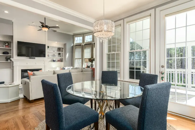
Not every wall has a sofa or a bed to anchor it. In dining rooms, entry halls or stairwells, the wall itself becomes the reference point. Here, think in terms of negative space. A single large piece in the 50- to 60-inch range often looks more considered on a broad blank wall than a modest 18-by-24 inch work that hovers uneasily in the middle.
As a starting guideline, it can be helpful to have art fill between one-half and two-thirds of the wall width on prominent surfaces. In a compact room, leaning toward the lower end of that range keeps things calm; in an airy, open-plan space, larger pieces help the architecture feel grounded. Hanging at eye level is still a useful idea, but remember that “eye level” is contextual. In a dining room, where you are seated most of the time, hanging slightly lower can feel more intimate, like the art is conversing with you at the table rather than floating above the scene.
Narrow spaces ask for a different kind of thinking. In a hallway, vertically oriented pieces or a slender vertical series work well because they echo the proportions of the corridor itself. Here, several medium-scale works in a tidy line can be more graceful than one enormous piece that overpowers the space. The consistent thread is that the art should feel structurally linked to the dimensions it inhabits, whether that dimension is width, height or both.
There are, of course, moments worth breaking the rules. A small, precious artwork hung low beside a reading chair can function like a whispered secret, precisely because it ignores conventional proportions. A tiny abstract piece centered on an expanse of plaster can feel like a deliberate pause, especially in a minimalist room where emptiness is part of the design. These exceptions succeed not by accident but because the surrounding space is styled to acknowledge them: good lighting, a clean wall, and a nearby object that quietly echoes their scale or color.
In the end, sizing wall art is less about perfection than about intention. When your pieces relate clearly to the furniture and architecture around them, your rooms start to feel composed rather than decorated. With a tape measure, a few simple ratios and the courage to choose sizes that feel slightly bolder than your first instinct, you can turn blank walls into backdrops that support the life lived in front of them.