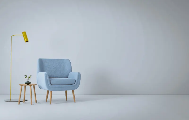
What the 60-30-10 Rule Really Tries to Do
The "60-30-10 rule" sounds like a formula, but it is really a permission slip. It gives you a simple way to structure color so a room feels calm instead of chaotic. Sixty percent of your space becomes the dominant color, usually on walls and large furniture. Thirty percent is your secondary color, often on textiles, smaller pieces and cabinetry. The last ten percent is your accent, the saturated or contrasting note that keeps everything from feeling flat.
Designers have leaned on this ratio because our eyes like hierarchy. When one color clearly leads, the room feels legible in a single glance. The secondary shade creates depth; the accent keeps the eye moving. This hierarchy is why a living room painted in one gentle neutral, layered with a quieter supporting tone and a final jolt of color, tends to feel composed rather than busy.
But formulas in design are never purely mathematical. They are psychological tools. The rule gives anxious decorators a boundary, and boundaries often free creativity. Once you know that most of the room should be one family of color, you can relax and experiment with the rest. The question is whether that mental scaffolding still makes sense when homes have shrunk, floor plans have opened, and tastes have fractured into a thousand micro-trends.
In small apartments, for example, a strict 60-30-10 can feel too divided. If sixty percent of the room is one color and thirty percent is another, a studio can suddenly look like two competing zones crammed into one footprint. At the same time, in open-plan living, where kitchen, dining and lounge areas flow together, repeating the exact ratio everywhere can feel oddly rigid, like a song with only one chord progression.
So the rule still has value, but not always as a literal recipe. It works best when you treat it as a lens. Instead of counting cushions, you ask, "What is visually dominant here? Is anything fighting that dominance? Where is the small, intentional moment of contrast?" Those questions are more important than the arithmetic.
You can see this when something feels subtly wrong in a room. Often, it is not the colors themselves but their proportion. Perhaps the accent color has crept from ten percent to forty, turning what was meant to be a small zing into loud visual noise. Or the secondary shade has all but vanished, leaving you with a bland sea of beige and a few lonely, attention-seeking objects. Thinking in terms of a dominant, a support and an accent helps you diagnose the imbalance quickly, even if your final proportions end up closer to 70-20-10 or 50-40-10.
At its best, then, the rule is less a law than a reminder that every room needs a narrative. One color sets the mood, another deepens the story, and a third writes the exclamation point. Whether those numbers are strict or soft is up to you and your space.
Rethinking Ratios for Modern Homes and Tastes
To understand whether the 60-30-10 rule still works, it helps to notice how homes have changed. Open-plan layouts blur the edges between rooms; rental walls often must remain white; and social media has made maximalism as visible as minimalism. In that environment, color proportion needs to be flexible.
Imagine an open-plan main floor. If you apply the rule mechanically, you might insist all three zones share the same sixty percent color, perhaps a warm white, the same thirty percent supporting shade and the same ten percent accent. The result is calm, but it may also feel generic, like a well-behaved hotel lobby. A more nuanced approach is to stretch the rule across the whole floor, then allow each zone to lean slightly in a different direction. The living area might give more weight to the secondary color in a large rug and sofa, while the dining area pushes the accent color into a statement light fixture. You are still guided by hierarchy, but on a looser, more musical rhythm.
In tiny spaces, the dominant color can become almost all-encompassing. Painting walls, ceiling and even doors in the same hushed tone can make a room feel larger and more serene. Here, the classic 60-30-10 becomes something closer to 80-15-5. The supporting color may show up mainly in textiles, wood tones or a single chair, while the accent shrinks to a small collection of objects: a stack of books, a ceramic bowl, a lamp base. The underlying logic survives; the balance simply shifts to suit the architecture.
Maximalist rooms complicate the picture further. If you love pattern, color and objects, a literal three-color scheme might feel like a straitjacket. Yet even bold, layered spaces secretly rely on proportion. Look closely at a richly decorated room that still feels coherent. One color family usually forms the backdrop: perhaps deep green on walls and upholstery. A second family might emerge in woods, metals or natural fibers. Accents then scatter through art, lamps and textiles, seemingly wild but actually orchestrated in repeating notes. The eye reads this as abundant rather than chaotic because there is still a clear sense of what dominates.
Personal comfort matters as much as theory. Some people relax only surrounded by soft neutrals; others feel most themselves in saturated hues. When your emotional needs do not line up with the textbook version of 60-30-10, it is better to bend the ratio than to betray your temperament. If intense color makes you happy, let it claim the sixty percent and keep your supports and accents quiet. If color overwhelms you, allow your neutrals to fill eighty percent of the space and treat color almost like jewelry: small, intentional and easy to change.
Lighting also affects whether the rule seems to "work." A deep color used as sixty percent in a dim room can read as oppressive, while the same shade in a sunlit space feels enveloping and rich. Before deciding which color takes the largest share, watch how the light moves through the room during the day. The most forgiving choice for sixty percent is often the color that looks kindest in the worst light your room gets.
In the end, the 60-30-10 rule still works if you accept what it really offers: not a fixed proportion, but a way to think. It asks you to choose what leads, what supports and what punctuates. That mental clarity makes it easier to edit, to know when one more cushion is too many, or when a bolder rug would bring welcome life. You are not designing for a photograph; you are composing a space you will live inside. If the ratios help you feel more at ease and more yourself at home, then they are doing exactly the work they were meant to do.