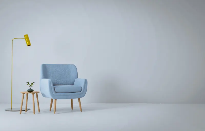
Why Accent Colors Feel Powerful So Fast
Accent colors are small moves with big emotional consequences. A single cobalt pillow on a gray sofa can feel like a confession; a vermilion lamp in a quiet room can seem almost loud. When people say they are afraid of color, what they usually mean is that they are afraid of this intensity being locked into their space.
The key is understanding that accent colors are not decorations added at the end; they are part of the psychological architecture of a room. Your eye is drawn to the highest contrast area first. That means any bright accent against a calm backdrop becomes a kind of visual exclamation point. Too many exclamation points and the room starts shouting.
Start by deciding what you want a room to say before you decide how it should look. A living room whose role is quiet conversation will tolerate a different level of chromatic drama than a kitchen that needs to energize you at 6 a.m. Think about energy levels on a sliding scale: meditative, balanced, or lively. Your accent color is the volume knob, not the whole soundtrack.
It helps to think in terms of "temperature" and "weight." Warm colors like red, orange and yellow tend to advance visually and feel closer; cool colors like blue and green recede and feel farther away. Deep, saturated tones feel heavier, while light, grayed-out tones feel lighter. An overdone accent is usually a warm, heavy color scattered everywhere with no clear hierarchy. A well-judged accent chooses a temperature and weight and lets that one idea repeat calmly.
There is also a time component. The brain tires of high stimulation. A neon cushion may delight you on day one and exhaust you by week three. That does not mean you should avoid it; it means you should contain it. Put the boldest accents on items that are easy and inexpensive to swap: textiles, lampshades, art prints. Keep fixed surfaces like flooring and large sofas quieter, so your appetite for intensity can evolve without a full renovation.
Building a Calm Base and a Clear Color Hierarchy
To use accent colors without overdoing it, first design the room for what it does most of the time, not for the moment the accent color arrives. Imagine the space stripped to its architectural bones and large pieces: walls, floors, main sofa, bed, dining table. Aim for a palette of two to three "quiet" hues here, even if you love color. Neutrals need not be beige; smoke blue, clay, mushroom, stone and soft olive all act as neutrals if they are sufficiently grayed down.
Once the base is calm, create a hierarchy with three rungs: background, supporting tones and accents. Background colors are walls and large surfaces. Supporting tones are woods, metals, rugs and large textiles. Accents are the smallest but punchiest: cushions, ceramics, vases, side chairs, a single painted side table. The mistake most often made is allowing accents to creep up into the middle rung until every object is competing to speak first.
Notice the proportions instead of counting objects. A loose guide is that your background might be around two thirds of what the eye registers, supporting tones about a quarter, and accents the remaining sliver. This is less about tape measures than about how your gaze travels. Stand in a doorway and let your eye scan naturally. If it keeps getting caught and jolted from one bright object to the next like a pinball, your accent slice has grown too big.
Color repetition also matters. A lonely accent can feel like a mistake, but so can a color that appears in every corner. Use what painters call "echoes." If you choose deep teal as an accent, you might have it in a cushion, echoed in a book spine stack, and once more in a small ceramic bowl. Three to four instances in a medium room often feel intentional without flooding the scene. More echoes require you to reduce saturation so the room does not start to buzz.
Pay attention to finishes as much as hue. A glossy accent reads louder than the same color in a matte or linen texture. High shine cherry red on a side table will dominate more than a red woven throw with the same pigment. If you want more color without more noise, lean into texture: boucle, raw linen, ceramic glaze, matte paint. You can climb the ladder of saturation if you climb down the ladder of sheen.
Light, Sightlines and Editing in Real Time
Natural and artificial light can turn a gentle accent aggressive or make a bold one surprisingly soft. Morning light is cool and blue, which pushes warm accents forward and calms cooler ones. Evening light is warm and golden, which can make yellow tones feel almost overwhelming and push blue accents into a moody distance. Before deciding if a color is "too much," live with it across a full day. A cushion that feels perfect at noon may glare at you at 9 p.m. under a cold overhead bulb.
Look at your space from multiple spots: sitting on the sofa, entering through the front door, lying in bed. Each vantage point creates a different composition of colors, like separate frames in a film. Overdoing an accent sometimes happens only in one of those frames. For example, three emerald pieces might be perfectly balanced when you stand in the hallway but crowd your view when you sit at the dining table. Edit for the view you inhabit most, not the one that looks best in a single photograph.
If a color feels too insistent, resist the urge to add another equally strong hue to "balance" it. That usually escalates things into a chromatic argument. Instead, soften the contrast. You can either mute the accent itself or darken and warm the surrounding neutrals so the jump between them shrinks. Think of it as adjusting the gap between piano keys rather than changing the melody.
There is also value in planned emptiness. A strip of unadorned wall, a simple wooden chair left unupholstered, a plain jute rug under a vividly glazed coffee table: these pauses let color breathe. Overdoing accent colors is less about how many colors you use and more about how much uninterrupted rest you allow between them.
Finally, treat your accent scheme as a living experiment rather than a test you can fail. Begin with one accent color in a modest dose and live with it. Notice how often your eye returns to it and whether that return feels like a pleasure or an interruption. Add the second and third echoes only after that observation. Over time, you will calibrate your own threshold for intensity. The goal is not to follow a rule about how much color is "allowed," but to shape a home where each accent feels like a deliberate, gentle nudge of mood rather than a shout you grow tired of hearing.