Why Color Feels Like Weather for Your Home
Color psychology in interior design is less about rules and more about how your body quietly reacts to what it sees. Walk into a room washed in soft blue and your breathing tends to slow. Step into a scarlet dining room and your pulse often quickens, conversation rising with it. Color operates almost like interior weather, altering the emotional climate without saying a word.What we call color psychology is the study of how hues influence perception, behavior, and mood. In design, it is not chemistry-lab precise. Culture, memory, and personal experience keep interfering. One person’s serene gray is another’s memory of an overcast childhood. Still, there are broad tendencies that repeat across studies and across homes, strong enough to guide your choices.
Scientists often describe color in three dimensions. Hue is the basic family, such as blue or red. Saturation is intensity, from soft and dusty to shouting-bright. Value, or lightness, ranges from inky dark to nearly white. Mood does not come from hue alone; it is the combination. A deeply saturated red can feel aggressive, while a pale, pink-tinged red can read as gentle and even nostalgic.
This is where many interiors falter. People choose color as if they were picking a favorite shirt, focusing on hue while ignoring saturation and value. The result is often a room that feels louder, flatter, or more draining than intended. The key is to think of each color as a character in a story you are writing about how you want to feel in the space. The wall color plays the lead role, the larger furnishings are supporting actors, and the accents are brief but memorable cameos.
Our bodies respond to this cast. Warm hues, like red, orange, and yellow, have shorter wavelengths that our brains process quickly, which is one reason they feel stimulating and close. Cooler hues, like blue and green, tend to recede visually and slow us down. Neutrals, especially those close to the color of natural materials, act as a kind of visual exhale, softening the impact of everything else.
Once you accept that each room is its own little climate system, color psychology in interior design becomes a question: what kind of weather do you want to wake up to, work inside of, cook in, or fall asleep under? The answer is rarely one color. It is a palette designed to support a particular state of mind.
Matching Room Functions to Emotional Palettes
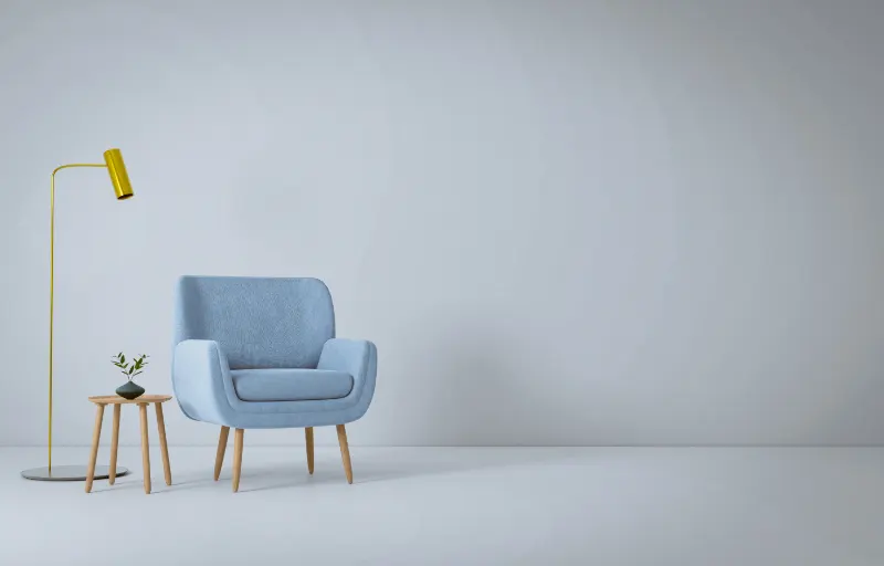
Consider the bedroom, usually the most honest room in a home. Its job is to downshift your nervous system. Cool colors tend to support that. Soft blues are often associated with lower heart rates and a feeling of spaciousness, like looking at distant water or sky. Muted greens echo foliage and can create a sense of restoration, as if you are closing the door on the day and stepping into a small, private garden.But temperature matters. A bedroom that leans too cold, with steely blues or hard grays, can begin to feel more like an office than a refuge. Warming the palette with creams, gentle taupes, or wood tones can restore a sense of human presence. This is an example of how color works relationally. A blue wall that feels icy next to pure white trim can feel almost velvety when surrounded by off-whites and honey-colored floors.
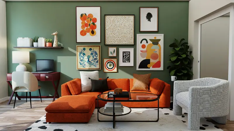
In living rooms and dining spaces, the task is usually more social. Here, warm colors can do subtle but powerful work. Reds and oranges are linked to higher energy and, in some research, even increased appetite. That does not mean every dining room wants to be a red box. A deep terracotta, a clay pink, or a rusty orange in textiles can introduce warmth without aggression. Pairing these with calmer neutrals or grounded greens keeps the room from tipping into visual noise.
Kitchens often sit at the intersection of function and feeling. Bright, clear colors can make them feel clean and awake, which is useful at six in the morning. But highly saturated yellows, for instance, can become fatiguing over time, especially under harsh light. Many successful kitchens borrow their palettes from the ingredients themselves: herb greens, cream, stone, soft charcoal, with a single high note of saturated color in a kettle, a rug, or a row of books.
Workspaces pose their own puzzle. Blues and soft greens support sustained concentration, while very bright reds and oranges tend to pull your attention outward, which is the opposite of what deep work requires. Still, a completely cool, pale room can sap motivation. A narrow band of a warmer accent color, even just in a desk lamp or a chair, can add enough psychological heat to keep energy up without fragmenting focus.
In all of these spaces, neutrals do more than sit in the background. They calibrate intensity. A saturated accent is far less overwhelming against a warm, complex neutral than it is against crisp white. This is why paint chips can be misleading. On a tiny card, any color sits alone. On your wall, it will be judged in the company of your floors, trim, light, and the particular stories you bring to it.
Designing a Palette That Truly Feels Like You
The most convincing use of color psychology in interior design begins not in a showroom but in your own reactions. Pay attention to where your shoulders drop. Maybe it is in a museum gallery with soft gray walls, or a café lined with dark green banquettes, or a friend’s kitchen drenched in pale butter-yellow. Notice how much of that feeling comes from color, and how much from scale, sound, and light.Light is the silent partner in every color decision. A north-facing room tends to cool colors down, pulling blue out of grays and making some whites feel almost sour. South-facing rooms, flooded with warm light, can mellow harsh hues and make warm tones feel even warmer. A color that reads as restful in morning light may feel flat or oppressive at night under a single overhead fixture. This is why designers paint large swaths of sample color on different walls and live with them for a few days, watching them through the day’s changing light.
Personal associations are the final filter. If you grew up in a house where arguments always seemed to erupt in a dark red dining room, that color may never feel appetizing again, no matter what the studies say. On the other hand, a violet that researchers might classify as contemplative could feel thrillingly alive to you because it recalls a childhood bedroom or a favorite dress. Mood is never generated by pigment alone; memory is always mixing into the paint.
A useful approach is to think in layers. Choose a mood for the room that goes beyond single adjectives. Instead of simply calm, you might want calm but not sleepy, or energizing but not hectic. Let that nuance steer you toward combinations. Calm but not sleepy might mean soft blues anchored by dark woods and black accents. Energizing but not hectic might mean muted terracotta walls with linen upholstery and a single, saturated crimson cushion.
Restraint helps. Limiting yourself to a tight palette, varied mainly in texture and tone, tends to produce more coherent emotional results than scattering many unrelated colors around the room. Texture acts almost like a silent color, changing how hues read. A glossy navy cabinet feels slick and formal; the same navy in matte linen feels softer and more forgiving. Rough, natural textures generally soften and de-intensify strong colors.
Over time, you can let your home become a laboratory for your own psychology of color. Swap a rug and notice whether evenings feel different. Change just the lampshades and see if the room’s energy at night shifts from brittle to gentle. Color, in this sense, is not a decision you make once but an ongoing conversation between your home and your nervous system.
In the end, successful color psychology in interior design is not about decoding some universal chart of emotional responses. It is about listening, closely and repeatedly, to how different hues, values, and saturations alter your own inner weather, and then editing your rooms until they support the life you actually live inside them.