The psychology of calm color
Color is never just color. It is light, memory, and atmosphere stitched together. When you walk into a room and feel your shoulders drop a little, it is often because the colors are doing quiet work in the background, softening edges and lowering your pulse.To create a calm home with color, you begin not with paint chips but with your nervous system. Stress is, in part, a response to stimulation. Highly saturated, high-contrast schemes push the eye to work harder. The more the eye works, the more alert you feel. Calm palettes do the opposite: they lower visual contrast, soften saturation, and create a sense of continuity so your gaze can drift instead of dart.
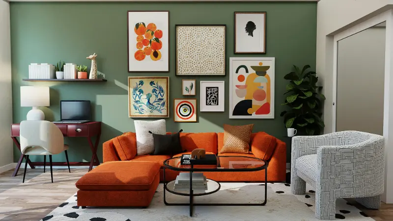
Designers sometimes talk about "visual noise". Every sharp boundary, every loud color, every pattern that stops your eye is another note in the room’s soundtrack. A calm palette reduces this noise by narrowing the range of color temperatures and values. When walls, floors, and large furnishings live in a similar, softly varied family of hues, the room feels like a complete sentence instead of a string of exclamation points.
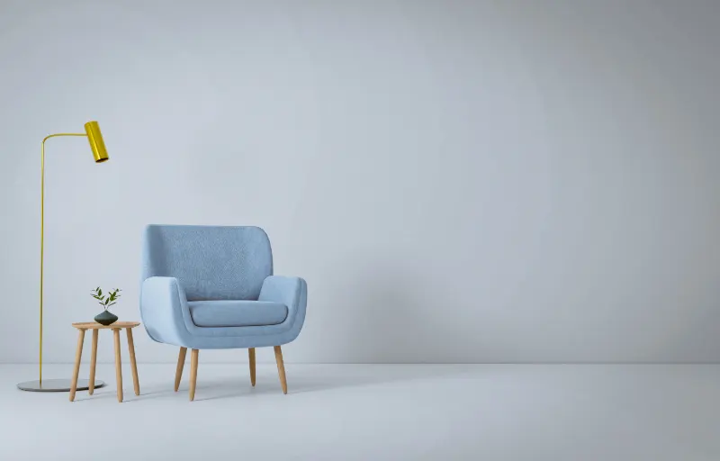
Consider temperature first. Blues and greens are often labeled "relaxing," but context matters more than hue. A cool blue with harsh, icy undertones can feel as tense as a waiting room; a warm gray with a whisper of green can feel like fog on a quiet morning. What soothes is not "blue" or "beige" in the abstract, but balanced undertones and gentle transitions between colors.
Undertone is the almost-hidden color beneath the obvious one. A white with a yellow undertone feels soft and sunny; with a blue undertone, it becomes crisp and distant. A greige with a hint of violet reads cooler than one with a hint of brown. When you align undertones across a space, the room feels harmonized. When they fight, you may not know why you feel unsettled, only that something is off.
Start by looking at what you already own. Wood floors, a favorite table, a much-loved rug: each has its own temperature. Oak often leans warm and golden; walnut is cooler and more chocolate; some engineered floors read almost red. If your fixed elements lean warm, choose wall colors and textiles that echo that warmth with creams, warm grays, muted olives. If your bones are cool, look to soft blue-grays, cloud whites, and hushed sages.
In this framework, a calm home is less about picking a trend color and more about reducing conflict. Every time you remove a jarring contrast and replace it with a gentle shift, the space grows quieter.
Building stress-reducing palettes room by room
To imagine a stress-reducing palette, think of how the sky moves from horizon to zenith. It never jumps; it grades. Your rooms can do the same. Instead of three unrelated colors, picture three related values of one family: a pale, a mid-tone, and a slightly deeper accent. The mind reads this as cohesion, and cohesion feels safe.Begin with the largest surface: the walls. A calm wall color is usually low in saturation and somewhere between very light and mid-depth. Too bright, and it becomes energetic; too dark, and it can become heavy unless you balance it with generous light. Off-whites with soft undertones, muted greens that recall sea glass, and gray-beiges that feel like weathered linen all tend to wear well over time.
Once the walls are set, step down to larger furnishings: sofas, beds, curtains. Keep them within a close distance of the wall color in either lightness or undertone. A sand-colored sofa against a pale mushroom wall creates a quiet gradient. A chalky sage headboard in a bedroom painted in a gray-green that suggests mist will feel like part of the same story.
Then, choose accents that have personality but not volume. If you love color, bring it in through softened versions of your favorites. A lover of red might choose terracotta and rust rather than cherry or scarlet; a fan of turquoise can lean into dusty teal instead of electric aqua. The key is to reduce saturation, as if a bit of fog has rolled in over your palette.
Because calm is also a tactile experience, textures should echo what the colors promise. A pale palette read through shiny, hard surfaces can feel more clinical than soothing. Shift some of that sheen into matte and soft finishes: cotton, wool, clay, limewashed walls, brushed metals. The colors then feel grounded, not cosmetic.
Light is your quietest collaborator. Daylight changes every color in your home, sometimes dramatically. North-facing rooms tend to cool and flatten hues, so warm, creamy tones or muted blush-beiges can keep them from feeling somber. South-facing spaces intensify warmth; there, a delicate gray-green or soft blue can keep the room from tipping into glare. Always test your chosen colors on at least two walls and watch them from morning to night; a truly calming palette should feel trustworthy in every hour.
Finally, expand your view beyond single rooms. Stress often arises in the transitions: the jolt of stepping from a cool gray hallway into a hot white kitchen, or from a neutral living room into a saturated bedroom. Instead, let colors spill gently from one space to the next. A stairwell in a warm white can lead to bedrooms that each carry a slightly different version of that warmth, like siblings in the same family.
When your home’s colors belong to one another, they stop demanding so much of your attention. Walls recede, objects rest, and your own thoughts have more room to move. The calm you are after is not an absence of color but a deliberate, humane choreography of it: "less drama, more depth." Over time, this quietness in the backdrop becomes a daily kindness, the kind you only notice when you step outside and miss it.