The psychology of color when the lights go out
Color in a bedroom is less about impressing visitors and more about what your nervous system experiences at 10:37 p.m., when the door is closed and the day has fully receded. The best colors for a bedroom are not simply a list of fashionable paint swatches; they are a set of emotional temperatures, tuned to how your brain and body interpret light, shadow, and memory.
Human vision evolved under the changing sky, so cool, muted hues often feel like evening, while bright, high-chroma colors simulate midday. In a bedroom, this means that soft blues, grayed greens, and gentle neutrals tend to read as restful because they echo dusk and nature. Strong reds, neon brights, and hard whites tend to feel more like signals and screens, keeping the mind just a little too alert.
Still, the answer is not that every bedroom must be a pale blue box. Color is context. A navy wall can feel like midnight velvet if the light is low and the bedding is creamy, but oppressive if the ceiling is low and the lamps are cold and clinical. A blush tone can be quietly cocooning if it leans toward beige and is broken up by linen textures, or it can feel saccharine if it is glossy and paired with shiny finishes.
To design a calm, cozy, and sleep-friendly room, it helps to think about color in layers rather than as a single decision. The base tone of the walls sets the emotional climate, but the undertones of textiles, wood, and metal either reinforce or contradict that mood. A soft gray with blue undertones paired with cool white bedding can feel serene; the same gray next to orange-toned wood and brass might tip unexpectedly warm and active. The “best” bedroom colors, in other words, are those that keep the whole composition speaking in the same quiet register.
Soothing hues also work physiologically. Studies on color and arousal suggest that saturated reds and yellows can raise heart rate and perceived energy, while desaturated cool tones and earth neutrals correlate with lower arousal and perceived calm. You do not need a lab to prove this to yourself. Imagine waking up in a room painted in traffic-cone orange versus one in foggy blue green. Even as a thought experiment, your shoulders likely respond.
This does not mean your bedroom has to be pale or boring. A deeply pigmented charcoal, ink blue, or olive can be profoundly restful when the finish is matte and the lighting is soft. What matters is not only hue but intensity and contrast. Sleep-friendly spaces minimize abrupt shifts. They trade sharp black-and-white drama for a spectrum of related tones that slide gently into one another, like the phases of twilight.
Calm and cozy palettes that actually work
Begin with the mood you want to feel as you enter the room at night. If you crave the sensation of a lakeside cabin, think in terms of misty blues and gray greens with natural wood and woven textures. A light blue gray on the walls, off-white bedding, and a darker teal throw can echo sky, horizon, and water in a way that feels almost subliminally soothing. The key is to keep the blues slightly grayed, not electric. You are painting “memory of evening”, not an LED billboard.
If your instinct is warmth rather than coolness, consider subdued earthy tones. A mushroom taupe, a soft greige, or a clay pink with a generous dose of brown can feel like being wrapped in a favorite sweater. These hues work particularly well with off-white linen, oatmeal wool throws, and matte black reading lamps. A room like this glows softly even when the lamps are off, as though it remembers sunlight without insisting on it.
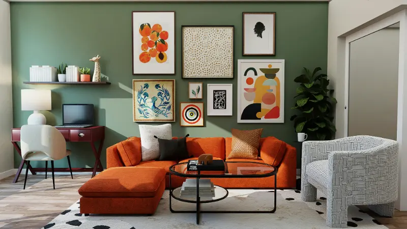
For those who love green, the bedroom is an ideal place to lean into it. Sage, eucalyptus, and muted olive tones borrow their calm from leaves and moss. They are restful to the eye because we trust them; we encounter them constantly in the natural world. On the wall, a sage green with a drop of gray can be paired with pale stone-colored bedding and darker forest cushions, building a vertical landscape that moves from ground to canopy in soft increments.
Neutrals remain the quiet workhorses of sleep-friendly design, but “neutral” does not have to mean bland. A soft putty or warm stone can be a backdrop for textures: a nubby rug, a linen headboard, a wool blanket in a slightly darker shade. The interest comes from shadow and touch rather than high contrast. Even white can work in a bedroom if you choose a warm, milky version rather than a stark, gallery white. The point is to avoid a color that bounces light sharply at night.
The ceiling, often ignored, is a powerful surface in a bedroom because you literally lie underneath it. Painting it a lighter tint of your wall color, or a very soft warm white, can keep the space feeling contained but not low. In smaller rooms, continuing the wall color onto the ceiling, especially in a dark, moody palette like inky blue or deep charcoal, can create a cocoon effect that many people find surprisingly secure and sleep inducing.
Light, texture, and the realities of your room
The same paint swatch can feel serene in one bedroom and restless in another because light changes everything. North-facing rooms, which receive cooler, dimmer daylight, often do better with colors that have a hint of warmth: creamier whites, greige instead of straight gray, greens that skew slightly toward olive rather than icy mint. In a sun-drenched, south-facing room, cooler colors can balance the brightness so that the space does not feel overcaffeinated by 3 p.m.
Artificial light matters just as much. If your bedroom uses cool, blue-leaning LEDs, even the calmest paint will look harsher at night. Swapping bulbs for warm white versions can instantly deepen the sense of coziness. Lamps with fabric shades diffuse light so it falls like a soft gradient across walls, flattering gentle colors and muting contrast. A dimmer switch can turn a seemingly ordinary color into something velvety after dark simply by lowering the intensity.
Texture is color’s quiet accomplice. A navy wall next to a glossy lacquer nightstand will feel far more energetic than the same navy against a raw wood table and linen shade. The eye reads shine as an extra jolt of information. To keep a bedroom sleep-friendly, favor matte or eggshell finishes, both in paint and in surface materials. When light hits them, it dissolves rather than bounces, softening the whole palette.
Finally, remember that your emotional history with a color matters as much as any rule. If you grew up in a yellow bedroom and associate that with comfort and safety, a softened, buttery yellow might be more calming to you than any designer-approved gray. The goal is not to obey a trend but to notice your own subtle reactions. Look at a sample in morning light, evening light, and lamplight. Sense whether your shoulders lift or drop. A bedroom color earns its place when, as you cross the threshold, your breath lengthens almost involuntarily.
The best colors for a bedroom, then, are not a fixed palette but a conversation between hue, light, texture, and memory. When they work together, you do not think about them at all. You simply fall asleep.