How Color Quietly Rewrites Your Workday
Color in a home office is not mere decoration; it is a silent collaborator that sets the tempo of your day. The shade behind your monitor can nudge you to linger, hurry, argue or breathe. That is because color is processed in the same brain regions that handle emotion, memory and arousal. Over an eight hour workday, that background influence adds up.Design psychology research suggests that slightly cool environments can sharpen attention, while warmer palettes feel more social and emotionally open. At the same time, overly intense color can increase heart rate and visual fatigue, the opposite of what a focused work session needs. The art is not just in choosing "the right hue" but in tuning its temperature, brightness and placement to the kind of work you actually do.
Begin by mapping your work rhythms. If your day is heavy on analysis, writing or coding, you need a background that supports sustained concentration, with calm colors that reduce visual noise. If you spend more time brainstorming, presenting or coaching, your space benefits from hues that lift your energy and help you stay verbally fluid. Most people, of course, do both. The best colors for a home office often mix a cool, quiet base with small injections of warmth where your eye naturally rests.
Think, too, about how much of the color you see. A wall directly behind your screen behaves differently from a wall you glimpse in peripheral vision. Your central field of view is where you want the most neutral, non-distracting tones. Bolder colors can live just outside that frame, where they still energize the room without arguing with the text on your screen. In a small apartment office, that might mean one carefully chosen accent wall; in a larger room, it could be a painted bookcase, a rug or the inside of shelves.
None of this erases your own history with color. If you grew up in a house full of olive green, you may find that hue either deeply calming or vaguely oppressive, regardless of what a study suggests. The research is a map; your lived experience is the legend. Use both as you think through what you want your workspace to feel like at nine in the morning and at four in the afternoon.
Colors for Focus and Clarity
For focus, clarity and a sense of mental "air", look to the quieter side of the spectrum: soft blues, blue-grays, desaturated greens and complex off-whites. These tones tend to recede visually, which means your attention can move forward to your work rather than getting caught on the walls.Pale to mid-tone blues are often described as intellectual colors. They are associated with logic and cool-headed problem solving. In practice, that means a soft blue-gray behind your desk can make long stretches of reading or spreadsheet work feel less heavy. Crucially, the saturation should be moderate. An intense cobalt wall may seem dramatic on a mood board but becomes visually demanding on a Tuesday afternoon. A slightly grayed, storm-sky blue, by contrast, delivers the calm without the glare.
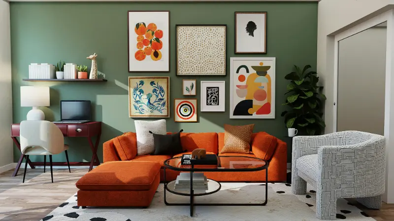
Greens sit between the stimulating warmth of yellow and the cooling calm of blue. In nature, they signal growth and safety more than urgency. In a home office, that can translate to steady concentration with a hint of optimism. Muted sage, eucalyptus or olive can soften harsh daylight and harmonize with wood desks and shelves. Because we are used to seeing green in the periphery outdoors, it works well on side walls or behind open shelving, letting your attention float back and forth without friction.
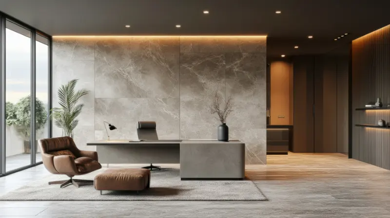
For many people, the best colors for a home office are actually barely there: layered whites, bone, stone and greige. These neutrals are less about color and more about light. They reflect daylight sympathetically, keep the room feeling open and give your brain a clean slate. Yet not all whites are equal. A very cool, blue-leaning white can make skin tones look tired on video calls and can feel clinical by late afternoon. Warmer whites with a hint of yellow or red pigment tend to be kinder to both people and paper.
If you are drawn to deeper hues but fear feeling boxed in, think about grounding rather than enclosing. A darker painted wall behind your monitor can actually increase perceived clarity by boosting contrast, much like a dark frame around artwork. This works especially well in bright rooms, where a deep ink blue or charcoal can absorb glare, allowing your screen to feel more integrated into the space. The key is to balance that depth with lighter adjacent surfaces, so the room still reads as spacious.
Colors that Sustain Energy, Not Exhaustion
Sustaining energy in a home office is less about constant stimulation and more about rhythm. You want a space that gently lifts you when you slump but never feels like a crowded calendar. Warm hues do this well in small doses. Soft terracotta, muted mustard, clay pink or a tempered coral can act as visual caffeine, especially during afternoon slumps.The mistake is often intensity and surface area. A full room in saturated red or citrus orange can amp up arousal so much that minor emails feel like emergencies. Instead, consider placing warmer colors where your gaze lands when you look away from your screen: a small accent wall sideways to your desk, the inside of a shelving niche, a textile on the back of a door. That way the color punctuates your day without hijacking it.
Psychologically, yellows are associated with ideas, sunlight and communication. But vivid lemon or neon tones can quickly feel brittle. A softened, slightly earthy yellow behaves differently. A buttery or straw-colored wall will reflect light in a way that keeps you alert while still allowing your nervous system to downshift. Paired with cooler trim or furniture, it creates a balanced conversation between focus and friendliness.
Red is trickier. Studies often link it to heightened attention on detail-oriented tasks, but also to faster fatigue. In a home office, it can be most effective in very small, deliberate moments: a chair, a desk lamp, the spine of a book, a single painted panel. Think of red as a spice rather than a sauce. It can bring a sense of courage to a room where you negotiate or present, as long as it does not monopolize the palette.
Because energy and calm are subjective, test before you commit. Tape paint swatches to the actual walls and live with them across a few workdays. Watch how the color shifts from morning to evening and notice how your body reacts. Are you leaning in or leaning away. Does your breathing slow or speed up when you enter. This kind of quiet observation is a design tool as reliable as any color wheel.
Ultimately, the best colors for a home office combine focus, clarity and energy in a palette that feels like you on your best working day. A cool, thoughtful backdrop; a few warm, intentional notes; materials that echo nature. When those elements are tuned to your own rhythms, the room itself starts to participate in your work, not as a backdrop, but as a partner in getting you where you want to go.