
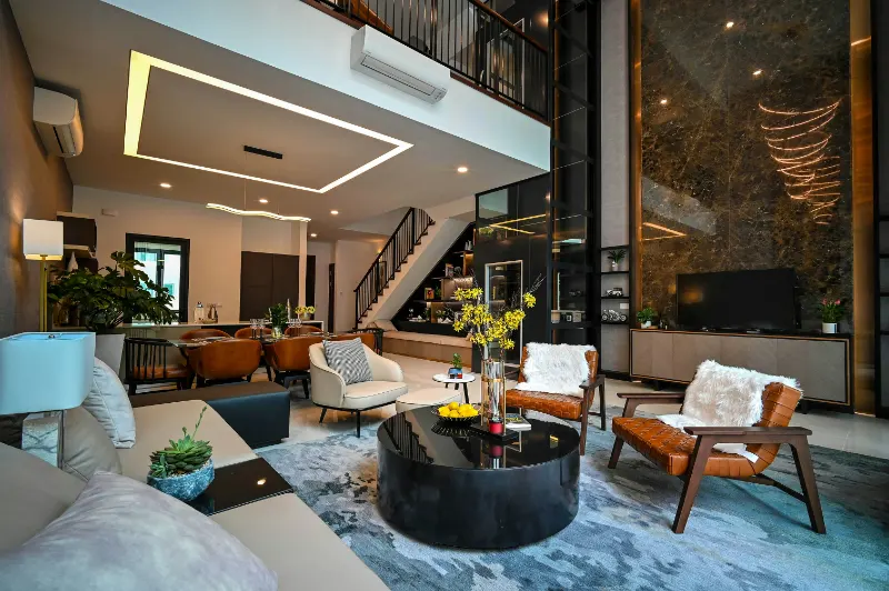
A living room is rarely just one room. It is a crossroads, a half-stage, a quiet refuge, sometimes a mess of shoes and coffee cups. Color is the invisible host of all this, greeting everyone who walks in before a word is spoken. Choosing the right palette is less about chasing trends and more about creating a mood that feels like a deep exhale at the end of the day.
Designers often talk about paint as "the cheapest renovation you can do," but that undersells the psychological weight of hue. Wall color influences how spacious a room feels, how warm or cool the air seems, and even how long you are inclined to linger in a chair. The path to an inviting, warm, and balanced living room starts with understanding what colors actually do in the space you have, not the space you wish you had.
Many of the most successful living rooms do not shout. They whisper. They rely on a foundation of quiet neutrals, carefully tuned undertones, and a few considered accents rather than a riot of color. Yet quiet does not have to mean boring or beige in the pejorative sense. It can mean subtle shifts in warmth, depth, and texture that make a room feel layered and lived in instead of staged.
Think of your wall color as "soft architecture" that shapes how the eye reads the room. Warm neutrals consistently perform well in living rooms because they span styles, light conditions, and seasons with less drama than saturated hues. What matters most is not the color name but the undertone that runs beneath it.
A cream with a drop of yellow undertone will feel like morning light even on grey days, especially in north-facing rooms that tend to skew cool. A greige with a hint of brown calms the edges of a space, making large walls recede and furniture lines soften. Soft taupe can act like a reliable friend to both warm woods and cooler metals, allowing pieces from different eras to coexist without bickering.
Undertones are where disappointment often hides. A grey that looked serene on a paint chip can turn unexpectedly blue or purple when confronted with your flooring and daylight. This is less a failure of the paint and more a reminder that color is a relationship, not a fixed fact. The same "warm white" will feel very different against a red oak floor than against a cool concrete or pale pine. The floor bounces its color up, the ceiling reflects it down, and suddenly your white is not just white anymore.
To create a living room that feels genuinely inviting, start by observing the room as it is. Notice where the light arrives and where it disappears. In darker rooms, creamy whites, pale camels, or light mushroom shades can create a sense of air without leaning cold or chalky. In very bright rooms, a slightly deeper neutral can prevent the space from feeling washed out, giving the walls enough pigment to stand up to direct sun.
This neutral envelope sets the emotional temperature of the space. It is what you wake up to on a Monday in February and what wraps your guests on a late August night. Warm neutrals work particularly well because they flatter human skin tones; people look better and more relaxed against them, which may be the quietest definition of hospitality.
If the wall color is the soft architecture, the accent colors are the conversation. A living room that aims to be inviting and warm benefits from a deliberate balance: enough contrast to keep the eye interested, enough harmony to keep the nervous system calm.
Instead of asking "What color should my living room be?" it is often more useful to ask "What kind of energy do I want when I walk in?" If you crave calm, keep the largest surfaces within a narrow band of value and saturation. A warm neutral on the walls, a slightly darker sofa in a similar family, and wood tones that echo the same warmth will create a gentle, consistent field. You can then layer in quieter color through textiles: a dusty terracotta pillow, a soft olive throw, a muted rust or ochre in a rug pattern that feels like fallen leaves rather than neon confetti.
For those who want more vibrancy without losing balance, color can be concentrated in smaller areas where it can be changed more easily: art, cushions, stools, vases, lampshades. A deep blue painting or a pair of dark green velvet pillows can stand out beautifully against warm walls, providing visual punctuation. Complementary colors can work here, but it is often more successful to let one family lead and use the opposite as a small accent rather than equal partner. A room of mostly warm tones with a touch of cool blue will feel more composed than a fifty-fifty split that reads like an argument.
Contrast is not just about hue; it is also about value, the lightness or darkness of a color. A living room with all mid-tone elements can feel oddly flat, no matter how well the colors technically coordinate. Introducing light and shade creates rhythm. A pale wall, mid-tone sofa, and darker side tables create a comfortable three-step gradient. Add a small, very dark element, such as a black metal lamp or an espresso-stained frame, and the whole composition looks sharper, like a photograph brought into focus.
Finally, consider the emotional continuity between rooms. If your kitchen opens into your living room, the best color for the living room is not only the one that looks good on its own, but the one that makes sense as you move through the home. A warm, quiet living room that gradually deepens in color toward a more intimate dining area can make the journey from public to private feel intentional. A single recurring hue, perhaps a muted clay or a soft sage, appearing in small doses from entryway to sofa pillows to artwork, acts like a refrain in a piece of music.
In the end, the best living room colors are less about a universal answer and more about tuning your space to the life you actually lead in it. When the walls support that life rather than compete with it, the room begins to feel not just decorated, but deeply, quietly yours.
Designers often talk about paint as "the cheapest renovation you can do," but that undersells the psychological weight of hue. Wall color influences how spacious a room feels, how warm or cool the air seems, and even how long you are inclined to linger in a chair. The path to an inviting, warm, and balanced living room starts with understanding what colors actually do in the space you have, not the space you wish you had.
Many of the most successful living rooms do not shout. They whisper. They rely on a foundation of quiet neutrals, carefully tuned undertones, and a few considered accents rather than a riot of color. Yet quiet does not have to mean boring or beige in the pejorative sense. It can mean subtle shifts in warmth, depth, and texture that make a room feel layered and lived in instead of staged.
Warm Neutrals: The Soft Architecture of the Room
Think of your wall color as "soft architecture" that shapes how the eye reads the room. Warm neutrals consistently perform well in living rooms because they span styles, light conditions, and seasons with less drama than saturated hues. What matters most is not the color name but the undertone that runs beneath it.
A cream with a drop of yellow undertone will feel like morning light even on grey days, especially in north-facing rooms that tend to skew cool. A greige with a hint of brown calms the edges of a space, making large walls recede and furniture lines soften. Soft taupe can act like a reliable friend to both warm woods and cooler metals, allowing pieces from different eras to coexist without bickering.
Undertones are where disappointment often hides. A grey that looked serene on a paint chip can turn unexpectedly blue or purple when confronted with your flooring and daylight. This is less a failure of the paint and more a reminder that color is a relationship, not a fixed fact. The same "warm white" will feel very different against a red oak floor than against a cool concrete or pale pine. The floor bounces its color up, the ceiling reflects it down, and suddenly your white is not just white anymore.
To create a living room that feels genuinely inviting, start by observing the room as it is. Notice where the light arrives and where it disappears. In darker rooms, creamy whites, pale camels, or light mushroom shades can create a sense of air without leaning cold or chalky. In very bright rooms, a slightly deeper neutral can prevent the space from feeling washed out, giving the walls enough pigment to stand up to direct sun.
This neutral envelope sets the emotional temperature of the space. It is what you wake up to on a Monday in February and what wraps your guests on a late August night. Warm neutrals work particularly well because they flatter human skin tones; people look better and more relaxed against them, which may be the quietest definition of hospitality.
Balancing Warmth, Contrast, and Personality
If the wall color is the soft architecture, the accent colors are the conversation. A living room that aims to be inviting and warm benefits from a deliberate balance: enough contrast to keep the eye interested, enough harmony to keep the nervous system calm.
Instead of asking "What color should my living room be?" it is often more useful to ask "What kind of energy do I want when I walk in?" If you crave calm, keep the largest surfaces within a narrow band of value and saturation. A warm neutral on the walls, a slightly darker sofa in a similar family, and wood tones that echo the same warmth will create a gentle, consistent field. You can then layer in quieter color through textiles: a dusty terracotta pillow, a soft olive throw, a muted rust or ochre in a rug pattern that feels like fallen leaves rather than neon confetti.
For those who want more vibrancy without losing balance, color can be concentrated in smaller areas where it can be changed more easily: art, cushions, stools, vases, lampshades. A deep blue painting or a pair of dark green velvet pillows can stand out beautifully against warm walls, providing visual punctuation. Complementary colors can work here, but it is often more successful to let one family lead and use the opposite as a small accent rather than equal partner. A room of mostly warm tones with a touch of cool blue will feel more composed than a fifty-fifty split that reads like an argument.
Contrast is not just about hue; it is also about value, the lightness or darkness of a color. A living room with all mid-tone elements can feel oddly flat, no matter how well the colors technically coordinate. Introducing light and shade creates rhythm. A pale wall, mid-tone sofa, and darker side tables create a comfortable three-step gradient. Add a small, very dark element, such as a black metal lamp or an espresso-stained frame, and the whole composition looks sharper, like a photograph brought into focus.
Finally, consider the emotional continuity between rooms. If your kitchen opens into your living room, the best color for the living room is not only the one that looks good on its own, but the one that makes sense as you move through the home. A warm, quiet living room that gradually deepens in color toward a more intimate dining area can make the journey from public to private feel intentional. A single recurring hue, perhaps a muted clay or a soft sage, appearing in small doses from entryway to sofa pillows to artwork, acts like a refrain in a piece of music.
In the end, the best living room colors are less about a universal answer and more about tuning your space to the life you actually lead in it. When the walls support that life rather than compete with it, the room begins to feel not just decorated, but deeply, quietly yours.










