
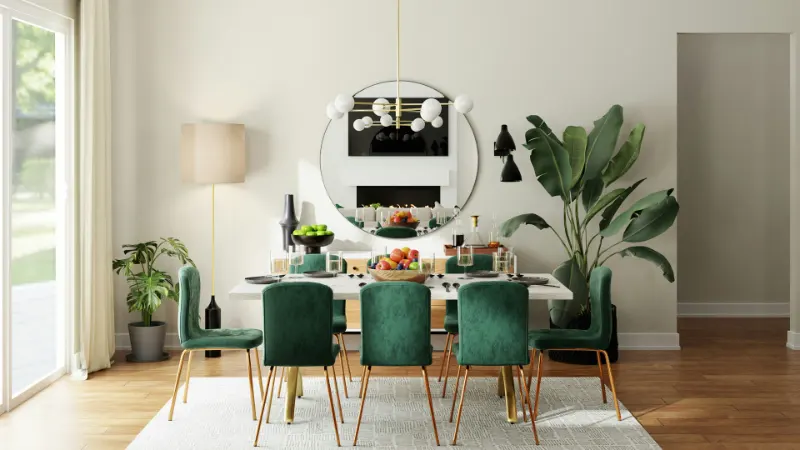
Why Some Color Pairings Always Feel Right
A room rarely succeeds because a color is beautiful in isolation. It succeeds because colors are in a kind of "quiet conversation" with one another. When a pairing feels inevitable and calm, it is usually because three invisible things are aligned: temperature, value and proportion.
Temperature is the sense of warmth or coolness. Even whites lean one way or the other. Warm colors carry a hint of yellow, red or brown; cool colors borrow from blue, green or gray. Pair a cool gray with a warm beige and the room can feel slightly off; shift the gray a touch warmer and the whole space relaxes.
Value is how light or dark a color is. A pale blue next to a nearly identical pale green feels indecisive; deepen one of them and you suddenly have foreground and background. Designers rely on contrast in value to give a space depth, so the eye knows where to rest.
Proportion is how much of each color you use. A pairing can be exquisite on a paint chip and chaotic at room scale. When one color clearly leads and the other plays support, your brain reads the scene as organized. The most reliable pairings follow an informal rule: one dominant neutral, one supporting hue and a small echo of contrast woven through fabrics, books, art or trim.
With those ideas in place, the designer’s secret is less about memorizing swatches and more about learning which colors behave like reliably good neighbors. Certain pairs work in almost any home because they echo the natural world or the architecture we intuitively trust.
Neutral + Whisper Color: Calm Spaces That Still Feel Alive
The safest color pairing in design is a grounded neutral carrying the weight of the room and a "whisper" color that drifts through textiles, art and small surfaces. The neutral stabilizes the eye; the light accent keeps things from feeling dead.
Think of soft white with muted blue-gray. White walls, if chosen carefully, become an unobtrusive backdrop. A white with a touch of warmth feels like linen in daylight rather than printer paper. Against that, blue-gray appears in bedding, a rug border, perhaps the inside of a bookshelf. The pairing recalls cloud and sky, so the room reads as familiar and easy to inhabit.
Beige with gentle green is another almost foolproof combination. The beige echoes stone, sand and clay. The green, kept slightly grayed, suggests leaves or moss rather than highlighter ink. In a living room, that might mean oat-colored walls, a natural jute rug and a sofa in a soft olive. The green is not there to shout; it glows at the edges of your awareness. Plants, even a single tree in a corner, quietly reinforce the pairing so that everything feels intentional.
Gray with blush works on the same principle. A mid-tone gray anchors the architecture; blush moves in through textiles. The success of this pairing depends on restraint. The blush should feel like the color of a faded rose or the underside of a seashell, not cosmetics. On a bed, gray linen paired with a single blush throw or a pair of shams is enough. The warmth of the blush keeps the gray from slipping into corporate coolness; the gray keeps the blush from turning saccharine.
These quiet pairings thrive on texture. When you limit your palette, you must give the hand something to discover. Rough woven upholstery against a smooth ceramic lamp, matte walls beside a gloss-painted door, a wool rug under a glass table: the contrast of touch keeps a restrained palette from feeling one-note.
High-Contrast Pairs: Energy Without Visual Chaos
When you want more drama, you do not need more colors; you need sharper contrast between two of them. Reliable high-contrast pairings tend to borrow from classic uniforms and landscapes, where the eye is used to seeing strong opposites.
Navy with crisp white is the obvious example. It feels nautical, tailored and surprisingly flexible. Treat navy as your dark neutral on cabinetry, a sofa or a rug. Let white handle trim, lampshades, bedding and art mats. The power of this pair lies in its cleanliness: both colors read as intentional even in modest interiors. If you are worried about severity, introduce a third, low-key tone such as natural wood or a camel throw. The wood softens the pairing without diluting it.
Charcoal with camel or tobacco brown achieves a different kind of sophistication. Charcoal is cooler and moodier than navy; camel introduces a quiet warmth. In a dining room, charcoal walls can frame a wooden table and leather chairs in warm browns. The combination feels like a well-made coat: structured yet comfortable. The key is balance. Too much dark and the room becomes cave-like; too much camel and it loses its edge. Using charcoal on vertical surfaces and camel on items you touch—chairs, a bench, a throw—keeps the pairing human.
Black with warm white is the most graphic of all. It works because it mirrors ink on paper and window frames against daylight. But in a home, pure black and pure white can feel brittle. Designers tend to soften both edges: off-black instead of jet, creamy white instead of optic. Black appears in slender moments—picture frames, thin lamp bases, a metal chair leg, door hardware. White stretches across walls, ceilings and larger upholstery. The black outlines the space the way eyeliner defines an eye; it is not the main event, just the emphasis.
In any bold pairing, scale is crucial. The larger the surface, the quieter its color should be. Reserve the highest saturation for smaller objects: a rust cushion against navy, a single emerald vase in a charcoal room, indigo napkins on a white tablecloth. This hierarchy prevents the room from shouting all at once.
If you remember nothing else, hold onto this: first choose the feeling you want—calm, tailored, dramatic. Then select one grounding neutral that matches that mood, and pair it with a single, carefully tuned companion color. Adjust temperature, value and proportion until the room feels like a deep breath. The right pairing is the one your shoulders lower into when you walk through the door.










