
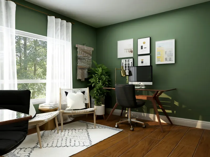
The Psychology of Going Dark
Painting a wall a deep color is less a decorative decision than a psychological one. You are choosing to live inside a mood. That is why the same navy that feels quietly luxurious in one room can read like a cave in another. Dark walls concentrate attention. They pull the edges of a room toward you, shrinking the perceived distance between surfaces, which can feel either intimate or oppressive depending on how you handle everything else in the space.
The first question is not which shade of charcoal you like, but what kind of intimacy you want. A small bedroom in a deep olive can feel like a cocoon, a place where the edges blur and you exhale. A long living room in the same color, without enough light or contrast, might feel like the air has gone missing. So begin by noticing how light moves through your room before you test a single paint sample. Sit in the space at noon and at dusk. Where does the natural light fall, and where does it retreat first? The darker the color, the more honestly it will reveal your answer.
Dark paint absorbs light instead of scattering it. This can be a gift. Colors that scatter light, like bright whites, bounce visual energy around a room; they make everything hyper-visible, including clutter and architectural flaws. Deep colors do the opposite: they turn down visual volume. Outlines soften, corners recede, and what you choose to highlight becomes a kind of deliberate act. The room becomes less about everything at once and more about a handful of chosen elements, almost like a small gallery.
Because of this, dark walls reward curation. A space drenched in deep color but crowded with furniture will feel heavy. A space with fewer, more intentional pieces will feel composed, even serene. The color becomes a backdrop rather than a statement screaming for attention. To use dark paint well is essentially to commit to editing: fewer objects, clearer silhouettes, more disciplined choices about what truly matters in the room.
There is also an emotional paradox to embrace. As counterintuitive as it sounds, darker rooms can feel calmer precisely because the world outside falls away. At night, a pale room glows; its surfaces stay bright even when the sky dims, which can keep your nervous system slightly alert. A dark room, lit softly, lets your eye rest. Once you accept that darkness can be restful and not just dramatic, your design decisions become less about fighting shadows and more about collaborating with them.
Balancing Light, Contrast, and Texture
If you think of dark walls as the low notes of a song, the rest of the room needs to provide the melody. Light, contrast, and texture are the tools that keep those low notes from turning into a monotone hum. Start with lighting. Overhead fixtures alone, especially bright, cool ones, flatten a dark room. You want multiple, softer sources at different heights: a floor lamp washing a wall, a table lamp glowing on a sideboard, a small fixture illuminating a piece of art. The goal is not to banish shadows but to let them gradate, so the walls feel like a velvety backdrop rather than a void.
Color temperature matters just as much as quantity. Warm white bulbs soften deep colors and let them bloom with subtle undertones. A chocolate brown wall under warm light reveals rust, plum, or coffee shifts that give the surface life. Under cold, blue-leaning light, the same wall can look flat or muddy. Think of your light as the sun in a painting; it reveals which notes inside the paint come forward and which recede. Test bulbs just as you test paint samples. A color that looks perfect at the store can feel leaden at home if the light is wrong.
Contrast is the second essential layer. Without it, everything melts into a single, indistinct mass. Trim painted in a clean, lighter tone gives the eye a frame to hold onto. Pale upholstery or a light rug keeps the room from feeling like it is collapsing inward. You do not need stark black and white; in fact, soft contrasts usually feel more sophisticated. A deep ink wall with cream linen chairs, a sand-colored jute rug, and wood furniture in mid tones creates not drama for its own sake but a gentle rhythm of dark and light. That rhythm is what reads as elegance rather than theatricality.
Texture is where dark walls become truly tactile. The more light a surface absorbs, the more it benefits from physical variation. Matte paint will hide minor imperfections and give a velvety depth; eggshell or satin can bounce just enough light to suggest a faint gloss. Beyond paint, think about what touches the wall visually and physically. A simple linen curtain against a charcoal wall reads differently from a velvet one; the former makes the room feel breezy despite the depth of color, the latter pushes it toward old-world opulence. Neither is wrong; the question is what you want your darkness to say.
You can also use natural materials as quiet counterpoints. Woven baskets, a raw wood console, stone side tables, or ceramic lamps all benefit from sitting against a dark ground. Their edges appear cleaner, their textures more legible. On a white wall, these items can blend into a general sense of lightness. On a deep wall, they appear as small, sculptural moments. This shift in perception is what allows a dark room to feel expensive without being filled with expensive things; the background does half the work of elevating each object.
Choosing the Right Shade for Your Space
The question most people ask is which dark color is safest. The better question is which color will cooperate with the qualities your room already has. A north-facing room, which receives cooler light, will push any color toward its bluer, grayer undertones. In such a space, an inky navy might feel stormy, while a warm, browned green can balance the chill. A south-facing room flooded with warm light can tolerate, and often reward, cooler, moodier shades; that same navy will glow rather than brood, and a deep plum might reveal a surprising softness.
Undertone is the quiet engine of any dark color. A black with a green base can feel natural and grounding, like the shadows under a tree. A black with a red base leans toward drama and can flirt with feeling theatrical or even aggressive. Similarly, a dark gray that skews blue will read crisp and urbane, while one with brown in it will feel earthier and more relaxed. Holding several paint cards side by side is the fastest way to train your eye. Against each other, their hidden biases leap out. Choose the one whose bias suits the personality you want in the room, not simply the one that looks safest alone.
Scale plays its own role. In very small rooms, especially ones you use at night, a single enveloping color on walls, trim, and even the door can blur boundaries and make the space feel calmer. The line where wall meets ceiling becomes less obvious, so the room reads as a single volume rather than a box. In larger rooms, keeping the ceiling lighter usually preserves a sense of air and height. You can still bring the color up partway, using a painted picture rail or a high wainscot to create a tailored break that feels intentional rather than cautious.
Above all, dark walls ask you to slow down. Paint a large swath on the wall, live with it for several days, and watch it from morning into evening. Notice not only how it looks but how it makes you behave. Do you reach for a book more often in that corner now that it feels tucked away? Does conversation linger longer at the table because the room feels less exposed? Elegance, in the end, is less about a specific color than about the way a room encourages you to inhabit it. When done thoughtfully, dark walls do not just transform how a space appears; they gently reframe how you move, see, and rest inside your own home.










