The Quiet Power of a Natural Palette
Walk into a room where earth, stone and linen are quietly in charge and you feel it before you see it. The air seems slower. Edges soften. Color steps back so that texture and light can do the talking. This is not minimalism for its own sake; it is a gentle reordering of attention from objects to atmosphere.A natural palette grounded in these three materials begins with a simple premise. Instead of hunting for the perfect paint swatch, you start by asking what you want your space to feel like. Earth provides warmth and psychological grounding. Stone introduces weight, clarity and a sense of permanence. Linen offers softness, breath and movement. Together they become a kind of visual chord, letting you tune a room the way a musician tunes an instrument.
The shift from color to texture is more than a stylistic choice. Surfaces with real grain, depth and irregularity give your eye something to rest on. They diffuse light, soften sound and encourage you to slow down. A flat painted wall reads as a smooth note; a lime-washed or clay-coated wall reads as a whole paragraph. A linen curtain does not just cover glass; it turns daylight into something you can almost feel across your skin.
Designing with earth, stone and linen is not about performing authenticity by displaying raw materials. It is about letting the materials work as they were meant to. Clay likes to be matte and porous. Stone prefers to show its veining and mineral shifts. Linen is at its best when it creases, drapes and moves. When you stop forcing them into sleek, high-shine roles, they begin to harmonize almost on their own.
A practical way to think about this harmony is to assign each material a sensory job in the room. Earth tones handle warmth and psychological comfort. Stone manages structure and visual clarity. Linen addresses softness and the way light filters through the space. If each is present and doing its job, the room usually feels complete even before you add art or objects. That sense of completeness is what keeps a natural palette from drifting into monotony.
The advantage of grounding your home in these elements is durability, both literal and aesthetic. Natural textures age; they do not simply wear out. A stone sill develops a soft polish where people rest their hands. A linen slipcover fades slightly where the sun falls every morning. These marks are not losses but a slow record of how you actually live. A palette built on lived-in texture needs less refreshing because time becomes part of the design rather than something you are fighting against.
In a world of endlessly available digital color, the decision to let your home lean on earth, stone and linen is surprisingly radical. It accepts limits. It says no to a certain kind of novelty, which makes room for nuance instead. Once you commit, you begin to notice the hundred subtle variations inside what used to look like the same beige, the same gray, the same white. Your eye gets quieter and sharper at once.
Layering Earth, Stone and Linen in Real Rooms
Translating this palette into an actual room starts with one honest surface. That might be the largest wall, the floor underfoot or even a single piece of furniture. If you choose the wall, a soft clay-based or lime wash in a warm earth tone immediately shifts the mood. The color is less important than the texture: a chalky, velvety finish catches light irregularly, so the wall feels alive over the course of the day.Once the wall is doing the quiet emotional work, stone can step in as the structural counterpoint. In a kitchen that might mean a honed stone countertop rather than a high-gloss composite. The matte finish avoids hard reflections and lets the mineral pattern read like a landscape rather than a graphic print. In a living room, even a modest stone coffee table or a slab used as a side table can anchor the seating area with real, almost gravitational weight.
Linen does its best work in motion and at the edges of things. Curtains are the most obvious place to start. Off-white or unbleached linen sheers soften the view and turn strong sunlight into something closer to a watercolor wash. The way the fabric lifts with a breeze creates an almost meditative rhythm in the room. At night, when the curtains glow against interior light, the space feels contained yet breathable.
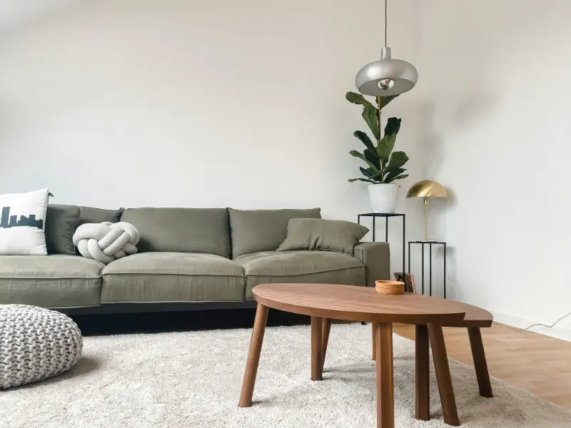
On seating, linen slipcovers invite a different relationship to furniture. Their slightly rumpled, forgiving texture suggests that the sofa is meant to be used, not guarded. The visible weave adds grain to an otherwise blank plane. In a bedroom, a linen duvet over crisp cotton sheets layers textures so that the bed reads as both structured and relaxed, like a shirt you have worn and pressed and worn again.
Balancing these elements is less about strict rules and more about noticing contrast. If your floors are already a strong, warm wood, they are playing the role of earth. You might then introduce cooler stone, perhaps in a tabletop or a small side stool, to keep the room from feeling too heavy. Linen at the windows or on the bed introduces pale, open surfaces that act almost like visual pauses.
Scale matters as much as material. Large planes of earth tone create a calm backdrop. Medium-size stone elements, like a mantel or bench, give the eye a place to land. Smaller linen touches, such as cushions or lampshades, bring the palette closer to the body. You can reverse this hierarchy, of course, but having at least one generous gesture in each material keeps the room from resolving into a single, flat mood.
The final step is editing. Because earth, stone and linen are all quiet, it is tempting to keep adding. Instead, pause and listen to the room. Notice where your eye jumps or stalls. Remove one object, then another, until what remains feels inevitable. A successful natural palette is less about everything you included and more about the few textures you allowed to carry the full conversation. When the balance is right, you will not think about the scheme at all; you will simply find yourself breathing a little easier at home.