Why Earth Tones Feel Instantly Calming
Most people register color far earlier than they register furniture. You walk into a room and feel something before you can name the sofa, the rug, or the art. That first impression is where earth tones quietly excel."Earth tones" are less a strict palette than a family resemblance: clay, sand, stone, moss, bark, wheat, mushroom, smoke. They are colors you can imagine touching. Their power has less to do with trend and more to do with what your nervous system already knows. Our eyes evolved outdoors, calibrating against soil, sky, and foliage. When you bring those hues inside, rooms begin to echo the landscapes where your body expects to relax.
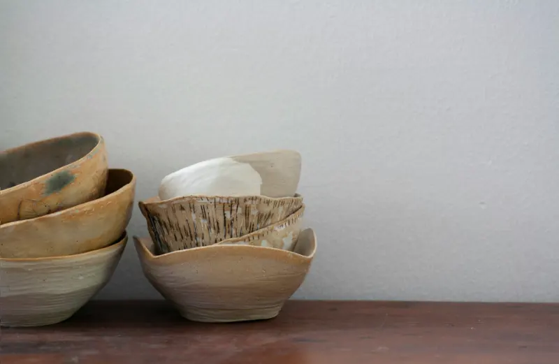
Think of a saturated terracotta bowl, a soft olive throw, a linen curtain the color of unbleached flour. None of these demand your attention; they allow it. High-chroma color says, "Look at me." Earth tones say, "Look around." In a living space that has to serve as office, theater, and dining room, that distinction matters.
This does not mean every surface must be beige. A calm interior depends less on how light a color is and more on how grounded it feels. Deep soil browns, charcoal with a warm undertone, rusty red, even a shadowy green-black can all read as earth tones if they lean slightly warm and appear somewhere in nature. What unifies them is a low to medium saturation and a sense of being mixed with something: a little gray, a little brown, a little air.
Designers sometimes talk about "visual temperature" and "visual weight." Cool, sharp whites and icy grays can make a space feel airy but also emotionally thin; they reflect light but do not hold it. Earth tones, especially those with a bit of brown in the base, have a heavier visual mass. They make walls, textiles, and even small objects feel steady, as if they could anchor the day’s jittery energy on contact.
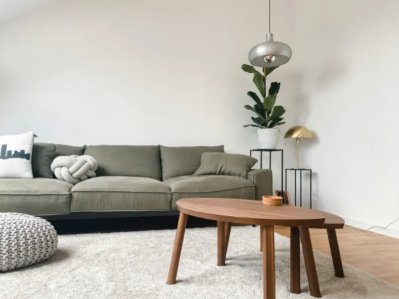
To test this, imagine two identical rooms. In one, the walls are a cool blue-gray, the sofa a crisp white, the rug a clean black-and-white pattern. In the other, the walls are a soft mushroom, the sofa the color of oat milk, the rug an undyed wool with a subtle, irregular weave. The first room sharpens your focus; the second slows your breathing. Neither is inherently better, but only one is designed to make your shoulders drop the moment you cross the threshold.
There is also the matter of time. Highly specific colors age fast because they attach themselves to a particular moment. Earth tones age slowly because they attach themselves to geology, agriculture, and weather. Clay does not go out of style. Wood does not become passé. When a palette has one foot in the garden and one foot in the hillside, trends become background noise.
The calm that emerges from earth tones is less about perfection and more about continuity. When the walls, floors, textiles, and small objects all live within the same extended family of hues, the eye can move without stumbling. That uninterrupted visual rhythm is what reads as ease.
How Texture Turns Neutral Rooms Into Sanctuaries
If color is how a room speaks from a distance, texture is how it whispers up close. You can paint four walls the most nuanced sand tone and still end up with a flat, forgettable space if every surface is smooth, hard, and immaculate. A calm interior is not just about what you see; it is about what your body anticipates touching.Texture begins with the obvious: the nubby linen of a pillow, the looped wool of a rug, the grain of oak under your hand. But it also includes the matte or gloss level of paint, the slight irregularity of handmade objects, the way light scatters across plaster instead of sliding off a perfectly polished wall. In a room dominated by earth tones, these nuances prevent monotony. Instead of many colors shouting, you have fewer hues saying more interesting things.
There is a quiet alchemy when you pair a restrained palette with layered texture. A single color can appear to change temperature as it moves across surfaces. A warm white on a plaster wall will feel gentler than the same white on lacquered cabinetry. A sand-colored linen curtain looks almost luminous at noon and then dissolves into shadow at night. Because the hue remains consistent, your nervous system registers continuity, but because the textures shift, your curiosity stays engaged.
Think about where your body actually meets the room. The back of your knees against a dining chair, your feet on a runner, your cheek against a sofa arm. These contact points are where texture does its most persuasive work. A finely grained wood seat will feel more grounded than a plastic shell; a thick cotton slipcover will invite you to sink rather than perch. When those tactile experiences line up with what your eyes expect from the color palette, the result is harmony that you feel before you understand.
Texture also softens the many hard edges of contemporary life. Screens are luminous and glossy; metal fixtures are precise; appliances are unapologetically mechanical. Introducing rougher, more irregular textures is a way of rebalancing the room. A woven seagrass basket next to a steel floor lamp, a ceramic lamp base with a faint fingerprint beside a sleek monitor, a wool rug underneath a glass coffee table: each pairing says, "Technology lives here, but so does the hand that made things." That subtle message affects how you occupy the space.
Paradoxically, the more layered the textures, the simpler the forms can be. A plain boxy sofa in a stone-colored bouclé, a straightforward wood table with visible grain, a minimal bed wrapped in crinkled cotton can feel fully furnished without elaborate shapes or ornate details. The texture supplies the depth; the silhouettes stay calm.
Composing Your Own Calm Interior
Designing a calmer home does not require starting over; it requires editing toward coherence. Begin with what already feels like "earth" in your space: a wood floor, a clay pot, a jute mat, a leather chair. Let these elements nominate your base colors. If your floor is a honey oak, for example, choose wall and textile tones that echo its warmth rather than fighting it with cool grays. When the largest surfaces agree with each other, everything else can be quieter.Once you have that base, use texture as your primary tool for interest instead of layering many competing colors. A room built from three or four related hues can be richly alive if they show up as velvet, linen, wool, raw wood, and ceramic. Aim for a balance of smooth and rough, tight and loose, solid and open. The eye relaxes when there is variety, but a gentle kind of variety.
Light is the silent partner in this process. Earth tones reveal their complexity as the day shifts; texture gives the light something to do. Notice where the sun actually falls in your rooms and let that guide your decisions. A textured rug where morning light lands will feel almost like landscape. A matte wall in the softest part of the afternoon can become a backdrop instead of a spotlight. Meanwhile, in dimmer corners, texture provides interest where color alone would flatten into shadow.
The most successful calm interiors are not immaculate showrooms; they are landscapes that can absorb daily life without breaking their own spell. A child’s drawing taped to a warm white wall, a half-read book on a walnut nightstand, a throw left in a small, satisfying pile on a sofa: in a carefully composed earth-toned, textural space, these ordinary intrusions feel less like clutter and more like evidence that the room is fulfilling its purpose. It is being lived in, not simply looked at.
The formula, such as it is, is disarmingly simple. Choose colors that could plausibly exist outside, then let texture carry the story inside. When in doubt, ask whether a new object brings you closer to that sense of groundedness or pulls you toward visual noise. Over time, your home will begin to act the way a good landscape does: a place where the mind can wander, the body can rest, and the day’s harsher edges finally have somewhere soft to land.