
Why Earth Tones Feel Instantly Calm
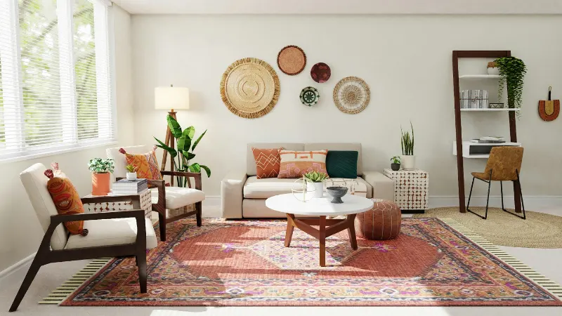
Earthy interior style is less a “look” than a soft recalibration of how a room feels. Instead of chasing an image from a glossy feed, it starts with asking what your nervous system might need at the end of the day. Earth tones tend to answer that question gently. They are the colors of soil, rock, bark and clay, the things our eyes evolved to trust.Psychologists sometimes talk about “visual noise” as the background chatter of shapes, colors and light levels that our brains constantly process. Highly saturated hues and busy contrasts raise that volume. They are not bad, but they are stimulating. Earth tones, by contrast, drop the saturation and mute the contrast, creating what could be called visual silence. Think of a forest floor at dusk: a dozen shades of brown, gray-green and stone that blend rather than shout.
In design terms, an earthy palette lives in the middle of the color wheel rather than at the edges. Browns lean warm without turning orange. Greens pick up a whisper of gray. Off-whites hold a hint of clay, mushroom or sand. The result is a spectrum that feels like it has already existed for a long time, which is why rooms in these colors can feel immediately “settled” even when they are sparsely furnished.
There is also a quiet democratic quality to earth tones. They rarely look expensive or cheap; instead, they look inevitable. A linen sofa the color of oat milk will age differently from a slick white sectional, but it will age in a way that makes sense to the eye, gathering patina rather than visible anxiety. That is part of their appeal in a culture that cycles through trends so quickly. An earthy interior does not scream for attention. It just continues, which might be the most radical statement you can make with your living room.
Composing a Grounded Palette at Home
Designing an earthy interior is less about buying “natural” objects and more about learning to grade your neutrals the way a painter would. One way to begin is to choose your ground color, the one that will quietly dominate the largest surfaces, then let everything else orbit around it.If your home gets cool northern light, a warm neutral can prevent rooms from feeling chalky. Think of colors that suggest oatmeal, unbleached canvas or café au lait. You do not have to commit to a full brown wall. Even an off-white with a trace of yellow or red in its base will read as subtly sunlit and pair well with wood and stone. In southern or western light, which can yellow a room by late afternoon, slightly cooler earth tones like mushroom, putty or pale taupe will keep things balanced and prevent a “tan box” effect.
Next comes temperature pairing. Earthy palettes work best when they balance warm and cool so that no mood dominates. A caramel leather chair needs something cool nearby to keep it from feeling heavy, perhaps a gray-green throw or a stone-colored rug. Conversely, a room heavy on sage or olive will benefit from a touch of warmth, maybe in walnut picture frames or a terracotta lamp base. The trick is to make sure that both warm and cool notes share a similar softness in saturation, so nothing breaks the spell.
Texture is the secret color in earthy interiors. A single shade of beige can look flat on a plastic surface and quietly luxurious in linen. When people describe a space as “peaceful,” they are often responding less to hue than to how materials handle light. Matte finishes scatter it softly. Nubby textiles catch shadows in their weave. Honed stone eats glare that a polished slab would bounce across the room. When you choose materials, consider how they will feel not only under your hand but also to your peripheral vision at night when lamps are low.
There is also the question of depth. An earthy room that is all mid-tone can feel curiously washed, like a photograph with no darks or lights. To keep the palette grounded, anchor it with at least one deeper element, something in the zone of espresso, soil or charred wood. This might be a floor stain, a low cabinet, or even a cluster of dark ceramic vessels. Equally important is a pale counterpoint: a plastery wall, a soft white lampshade, a raw cotton throw. Together, these extremes give the eye a gentle path to travel, which reads as compositional calm rather than monotony.
Layering Nature Without the Clichés
Once your palette is roughly in place, you can begin to layer in the more literal gestures of nature without turning the room into a themed set. Plants are the obvious move, but their effect shifts dramatically depending on context. A single broad-leafed plant in a simple clay pot can feel serene against a mushroom wall, while a cluster of bright plastic planters in a high-saturation green room will read as busy. The goal is not to prove that you own foliage; it is to let an organic shape interrupt the room’s straight lines just enough.Art and objects do a similar job. In an earthy interior, you might look for pieces that echo the language of landscape rather than depict it literally. A charcoal drawing with soft gradients, a textile with a pattern that feels like raked sand, a bowl that still remembers the touch of the wheel. These things extend the palette into form. Their colors do not have to be strictly neutral, but they should share a certain dustiness, as if the saturation has been dialed down to meet the room halfway.
Light itself can be treated as a material. Warm bulbs with a low color temperature will lean into the golden notes of wood and clay, while cooler bulbs can emphasize gray-greens and stone. Neither is universally correct; the choice depends on the emotional climate you want. What matters is consistency. Mixing very warm and very cool bulbs in the same small space can fracture even the most carefully composed earthy palette, creating pockets of color that feel like separate rooms.
There is a final, quieter layer that determines whether an earthy interior feels grounded or simply brown: edit. Because these colors are forgiving, it is easy to accumulate. But grounded spaces have a certain decisive emptiness, a willingness to let negative space do part of the decorating. When you bring an object into a room, notice whether it deepens the sense of calm or simply occupies it. In this way, earthy interior style becomes a kind of daily practice. The palette is natural, yes, but so is the act of choosing what deserves to live on your shelf.










