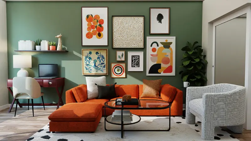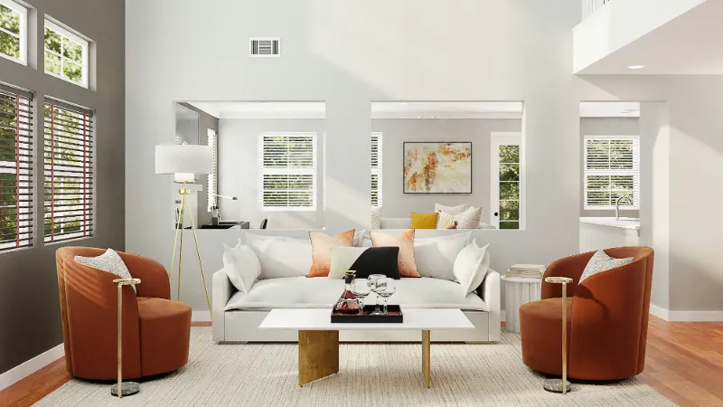
A calm room rarely happens by accident. It is almost always the result of a set of quiet decisions about color: how light moves across a wall, how fabrics talk to each other, how a floor keeps everything grounded. Building a calm color palette is less about strict rules and more about learning to turn the volume down without making a space feel flat.
The good news is that you do not need a designer’s eye to do this; you need a slower gaze. The calm you are after is already in the sky at 6 a.m., in river stones, in a favorite worn sweater. The work is translating those feelings into paint, textiles and finishes, so your rooms begin to hold you instead of asking for your attention all day long.
Most people begin with paint swatches. It is more useful to begin with undertones and light. Undertones are the subtle temperatures hiding inside a color, the hints of green in a gray, the whisper of yellow in a white. They determine whether a room feels like a foggy morning or a bright afternoon, even when the colors look nearly identical on paper.
Stand in the room you are working on and notice the light at three points in the day: morning, midday and evening. A north-facing room will naturally cool colors down; blues and grays can drift into something that feels icy or withdrawn. A south-facing room exaggerates warmth; beiges and creams can turn overly yellow or sleepy. Calm is not a paint name, it is the balance between the room’s natural light and the undertones you add.
Lay out a small family of neutrals on a table near a window. Instead of asking which one you like, ask which one feels like the room itself if it exhaled. The goal is to find a base color that does not shout for attention but quietly supports everything else. Often that is a soft gray with a touch of beige, a warm white with a drop of gray, or a pale sand that nods toward pink or mushroom. None of these sound thrilling on their own, but together they build a gentle rhythm your eye can rest on.
The next step is to choose one or two accent hues you genuinely love living with, not just looking at. Imagine buying a large sofa in that color or living with it on curtains the size of a wall. Colors that stay calm over time are usually slightly grayed down, as if softened by distance. A blue that reminds you of weathered linen will be easier to live with than one that recalls a sports team. The more visual noise you have in your life, the more your home benefits from colors that feel like a low murmur instead of a loud conversation.
Once you have a base and one or two gentle accents, the work shifts from choosing colors to composing them. Think in terms of a micro palette for each room: a tight group of three to five colors that appear in different proportions. This is how you avoid the patchwork effect that makes a home feel restless. Calm does not mean every room is the same, but there should be a sense that all the spaces are part of a single sentence.
Begin with the largest surfaces: walls, floors and large upholstery pieces. These should sit in the softest part of your palette, because they carry the most visual weight. A calm room usually gives the majority of its square footage to quiet colors, using deeper or more saturated tones in smaller, more intentional doses. A single chair in a muted moss green can feel like an invitation; six chairs in bright emerald may feel like a demand.
Next, look at texture as a kind of color. The same beige appears very different in wool, linen, glazed tile and lacquered wood. In a calm palette, textures do a lot of the expressive work that bright color might do in a livelier interior. Rough ceramics, open-weave linen and matte paint absorb light gently, softening the room’s energy. High-gloss finishes bounce light back and can raise the temperature in a space without changing the hue at all. When in doubt, keep the shiniest surfaces small and scattered, like punctuation marks in a reflective sentence.
Editing is where a palette becomes calm. Lay textiles, artwork and accessories together on a bed or big table. Anything that pulls your eye too quickly is worth questioning. Does it earn its place because it is meaningful, or is it simply loud? A calm palette can handle a few deliberate disruptions, but they should feel chosen, not accidental. Often, removing two or three jarring pieces does more for serenity than repainting a wall.
Paint samples on the actual walls before you commit. Color cards are too small to trust. Live with the patches for a few days; see how they look next to your existing furniture and under your evening lamps. A calm palette unfolds over time. Paying attention during this testing phase is its own kind of mindfulness practice, a way of noticing what you need from your home beyond the purely visual.
A calm color palette is not a moral victory; it is a tool that should support how you live. If your mornings are frantic, the entry might benefit from muted tones that slow your breathing the moment you walk in. If you work from home, the room where you spend your days might lean into cooler neutrals with a single grounding dark tone to keep your thoughts ordered. Bedrooms can stretch toward duskier, cocooning colors that make the transition from phone screen to sleep a little easier.
Notice how you want to feel in each space and nudge the palette accordingly. Calm is not always pale; it can be a deep, inky blue that makes a small den feel like a secret, or a tobacco brown that turns a dining room into a candlelit refuge. The key is consistency within the room and kindness between rooms. When you move through the house, your eye should not have to work hard to adjust. Over time, your calm palette becomes less about decor and more about a background that lets your life come into focus. The art on the walls, the stack of books by the bed, the stray shoes in the hall all sit against a color story that does not compete with them. Instead of walking into a room and seeing paint, you walk in and simply feel that you can stay.
The good news is that you do not need a designer’s eye to do this; you need a slower gaze. The calm you are after is already in the sky at 6 a.m., in river stones, in a favorite worn sweater. The work is translating those feelings into paint, textiles and finishes, so your rooms begin to hold you instead of asking for your attention all day long.
Begin with undertones, not paint chips
Most people begin with paint swatches. It is more useful to begin with undertones and light. Undertones are the subtle temperatures hiding inside a color, the hints of green in a gray, the whisper of yellow in a white. They determine whether a room feels like a foggy morning or a bright afternoon, even when the colors look nearly identical on paper.
Stand in the room you are working on and notice the light at three points in the day: morning, midday and evening. A north-facing room will naturally cool colors down; blues and grays can drift into something that feels icy or withdrawn. A south-facing room exaggerates warmth; beiges and creams can turn overly yellow or sleepy. Calm is not a paint name, it is the balance between the room’s natural light and the undertones you add.
Lay out a small family of neutrals on a table near a window. Instead of asking which one you like, ask which one feels like the room itself if it exhaled. The goal is to find a base color that does not shout for attention but quietly supports everything else. Often that is a soft gray with a touch of beige, a warm white with a drop of gray, or a pale sand that nods toward pink or mushroom. None of these sound thrilling on their own, but together they build a gentle rhythm your eye can rest on.
The next step is to choose one or two accent hues you genuinely love living with, not just looking at. Imagine buying a large sofa in that color or living with it on curtains the size of a wall. Colors that stay calm over time are usually slightly grayed down, as if softened by distance. A blue that reminds you of weathered linen will be easier to live with than one that recalls a sports team. The more visual noise you have in your life, the more your home benefits from colors that feel like a low murmur instead of a loud conversation.
Build a micro palette for each room
Once you have a base and one or two gentle accents, the work shifts from choosing colors to composing them. Think in terms of a micro palette for each room: a tight group of three to five colors that appear in different proportions. This is how you avoid the patchwork effect that makes a home feel restless. Calm does not mean every room is the same, but there should be a sense that all the spaces are part of a single sentence.
Begin with the largest surfaces: walls, floors and large upholstery pieces. These should sit in the softest part of your palette, because they carry the most visual weight. A calm room usually gives the majority of its square footage to quiet colors, using deeper or more saturated tones in smaller, more intentional doses. A single chair in a muted moss green can feel like an invitation; six chairs in bright emerald may feel like a demand.
Next, look at texture as a kind of color. The same beige appears very different in wool, linen, glazed tile and lacquered wood. In a calm palette, textures do a lot of the expressive work that bright color might do in a livelier interior. Rough ceramics, open-weave linen and matte paint absorb light gently, softening the room’s energy. High-gloss finishes bounce light back and can raise the temperature in a space without changing the hue at all. When in doubt, keep the shiniest surfaces small and scattered, like punctuation marks in a reflective sentence.
Editing is where a palette becomes calm. Lay textiles, artwork and accessories together on a bed or big table. Anything that pulls your eye too quickly is worth questioning. Does it earn its place because it is meaningful, or is it simply loud? A calm palette can handle a few deliberate disruptions, but they should feel chosen, not accidental. Often, removing two or three jarring pieces does more for serenity than repainting a wall.
Paint samples on the actual walls before you commit. Color cards are too small to trust. Live with the patches for a few days; see how they look next to your existing furniture and under your evening lamps. A calm palette unfolds over time. Paying attention during this testing phase is its own kind of mindfulness practice, a way of noticing what you need from your home beyond the purely visual.
Let the palette serve the way you live
A calm color palette is not a moral victory; it is a tool that should support how you live. If your mornings are frantic, the entry might benefit from muted tones that slow your breathing the moment you walk in. If you work from home, the room where you spend your days might lean into cooler neutrals with a single grounding dark tone to keep your thoughts ordered. Bedrooms can stretch toward duskier, cocooning colors that make the transition from phone screen to sleep a little easier.
Notice how you want to feel in each space and nudge the palette accordingly. Calm is not always pale; it can be a deep, inky blue that makes a small den feel like a secret, or a tobacco brown that turns a dining room into a candlelit refuge. The key is consistency within the room and kindness between rooms. When you move through the house, your eye should not have to work hard to adjust. Over time, your calm palette becomes less about decor and more about a background that lets your life come into focus. The art on the walls, the stack of books by the bed, the stray shoes in the hall all sit against a color story that does not compete with them. Instead of walking into a room and seeing paint, you walk in and simply feel that you can stay.