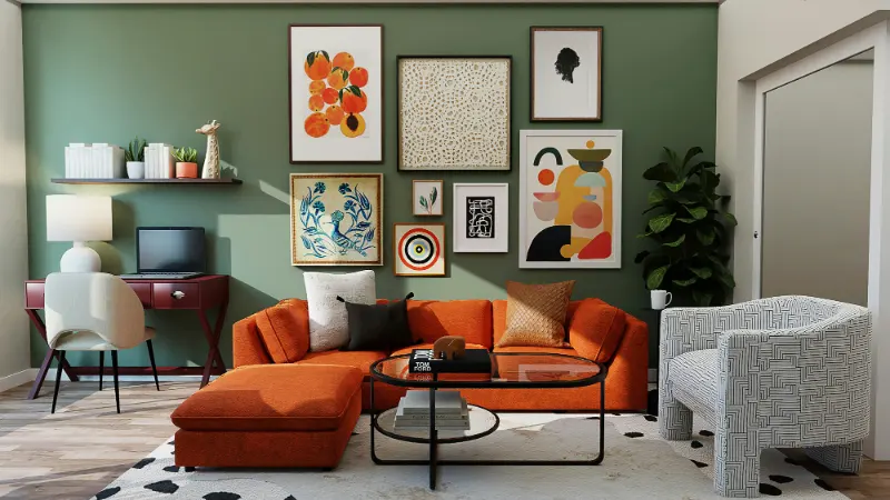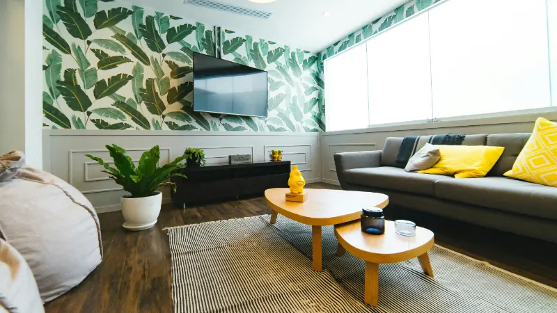
Start With Mood, Light and What You Already Own
The most reliable way to choose a color palette for your home begins not with paint chips, but with questions. Before you consider specific shades, look around and ask how you want each room to feel. "Calm," "energized," "cozy," and "open" become more useful than the names on paint cans. A living room that needs to soothe you after work asks for different colors than a kitchen meant to wake you up at 6 a.m.Mood is deeply entangled with light. Stand in each room at different times of day and simply look. Northern light tends to be cool and even, flattering soft neutrals, grays and blue-greens. Southern light is warm and strong, intensifying yellows, reds and warm whites. Eastern light is gentle and clear in the morning, western light glows golden and dramatic in the late afternoon. The same beige can feel elegant in one exposure and muddy in another because light alters both color and shadow.
Take note of fixed elements you are not changing: floors, countertops, large rugs, a beloved sofa. These surfaces quietly dictate many of your options because they already occupy visual space. Hold any potential colors against them, not just against a blank sheet. A soft white that flatters your oak floors may fight with cool gray tiles. Let what you own act as your first constraint instead of imagining color in a vacuum.
From there, gather visual evidence. Tear pages from magazines or save images that make you exhale. Do not analyze them yet; collect instinctively. After you have a small stack, look for repetition. Are you drawn to pale, misty rooms, or to dense, jewel-toned spaces? Do you keep choosing spaces with high contrast or gentle transitions? This repetition is your underlying preference, even if you did not have words for it before. Your eventual palette will work best when it aligns with this instinct rather than with a trend you think you should like.
Finally, notice how color behaves over scale. A velvet cushion in deep green might feel luxurious in a photograph, but the same color on all four walls could become oppressive. Conversely, a sunny yellow that animates an accent wall might feel relentless on cabinetry and ceiling. Keep an eye on your emotional reaction as you imagine colors expanding over surfaces; if you feel tense, the shade may be too strong for the role you are giving it.
Build a Cohesive Palette: Base, Support, and Accent
Once you understand mood and light, you can begin to construct an actual palette. A useful way to think about this is in three roles: base, support and accent. Instead of memorizing color theory terms, you are casting colors like characters in a story, each responsible for a different kind of visual work.The base color is the quiet background character, often a white, off-white, soft gray or muted beige, though it can also be a very pale color. It lives on large surfaces such as walls and ceilings, sometimes trim. This is the color you will see in your peripheral vision most of the time, so it should be something you can live with daily. A cooler base will feel crisp and urban, emphasizing clarity and edges; a warmer base leans welcoming and relaxed, softening corners and shadows.
Support colors are those that sit close to the base in intensity but shift the mood slightly. They might appear on interior doors, trim, built-ins or one or two adjacent rooms. For example, if your base is a warm white, a support color could be a pale clay in the dining area or a muted blue-gray in a bedroom. The goal is to vary the experience without breaking the sense of continuity. Colors with similar undertones, whether warm or cool, tend to cooperate more gracefully from one space to the next.
Accent colors provide emphasis and rhythm. These are stronger, more saturated or darker hues used in smaller doses: a deep marine on a bookcase, a terracotta side chair, a band of color in a hallway. Because accents draw the eye, use them where you want attention, not where you hope to hide something. The power of an accent rests on restraint; too many intense colors competing at once create noise, not energy.
To coordinate these roles, it helps to consider relationships rather than isolated favorites. Colors that share an undertone often feel related even when they differ in hue: a warm gray, a tobacco brown and a muted rose can live together comfortably because of their shared warmth. By contrast, mixing a cool bluish gray with an orange-tinted beige often looks accidental. When you test colors, look for that subtle harmony in the background of the shade. This is where deep reasoning pays off, because what you are really managing is not individual colors but the temperature and contrast between them.
As you assemble your palette, test your candidates in real light. Paint large swatches on multiple walls, or use foam boards you can move around. Observe them in the morning, afternoon and after dark under your actual bulbs. You are not only checking whether you still like the colors, but whether they maintain the mood you intended as the day shifts. A color that looks perfect at noon but turns sour at dusk will become a daily irritation.
Flow Between Rooms and Adjust With Texture
Choosing a color palette for your home is not only about getting each individual room right; it is about how the rooms speak to each other. Stand in a doorway and notice how many spaces you can see at once. Those simultaneous sightlines should feel like variations on a theme, not abrupt costume changes. Repeating your base color across most walls, then adjusting support and accent colors by room, creates that feeling of coherence while still allowing each space to have its own personality.Rather than assigning entirely separate palettes to each room, think of your home as a gentle gradient. A soft green in the entry might become a slightly deeper green in the living room and resolve into a neutral bedroom, with textiles and art carrying the green thread. This repetition reassures the eye. When color choices feel intentional, the space feels calmer, even if the hues themselves are lively.
Texture is an overlooked part of color. The same paint color in matte and gloss finishes can read as different shades; a velvet in deep blue absorbs light and looks inky, while a linen in the same blue diffuses it and appears softer. Wood tones, metals and stone all tint the colors around them. If your palette seems flat, you may not need more colors, only more varied textures within your existing ones. A wool rug, a rough ceramic lamp and a smooth lacquer tray can make a restrained palette feel rich.
Finally, allow for evolution. A color palette is not a fixed contract but a living framework. Once your walls and large furniture are in place, you can adjust accents seasonally or as your life changes. The underlying structure you have created based on mood, light and relationships will keep the space grounded even as pillows, art or a single striking chair shift. That is the quiet power of a thoughtful palette: it turns your home into a backdrop that can adapt while still always feeling, unmistakably, like yours.