Color as Quiet Architecture
Color is the first thing your nervous system reads when you enter a room, long before you notice the furniture or the art. To create a zen atmosphere at home, especially through Japandi and wabi-sabi palettes, you are not just choosing shades you like. You are designing how your body will feel in that space.Japandi, the meeting point of Japanese minimalism and Scandinavian warmth, leans on soft neutrals, muted woods and chalky pastels. Wabi-sabi, with its gentle reverence for imperfection and impermanence, gravitates toward earthier tones, weathered surfaces and colors that look as if they have been lived with for decades. Together, they create a vocabulary of quiet hues that favors “whisper over shout.”
Think first in terms of temperature, saturation and contrast rather than specific paint names. A zen atmosphere needs slightly warm undertones, low to medium saturation and soft, low contrast between elements. If the eye has to work hard to process a space full of competing colors or harsh jump cuts between dark and light, the body generally cannot relax.
One way to test this is to squint at a room and read it as an abstract painting. If you see a few large, calm blocks of related color rather than a patchwork of unrelated ones, you are moving toward a Japandi and wabi-sabi palette. Beige against warmer white, stone gray against weathered oak and clay tones beside linen all create continuity instead of visual noise.
Zen color is also about air and weight. Light, milky tones are visual breath; deeper earth colors are visual gravity. Your home needs both, in considered proportions. Let walls and ceilings handle the breath, then allow floors, larger furniture and a few accent pieces to supply the gravity. The goal is a stable horizon line for the eye, so the mind can settle.
Japandi Calm: Quiet Neutrals and Soft Contrast
Japandi color lives where northern light meets Japanese restraint. Imagine the palette of a misty morning: warm white sky, pale wood, the soft gray of stones, a hint of muted green from distant trees. None of these colors clamor for attention; instead, they layer into a gentle gradient.Begin with the largest surfaces. Choose a wall color that is more “porcelain” than stark gallery white, with a whisper of warmth. A slightly creamy white or a pale greige will keep the room from feeling clinical, especially in the evening. The key is to avoid both icy blue whites and heavily yellow creams. Either extreme pulls focus away from calm and toward sensation.
Floors and major furniture anchor the palette. Light oak, ash or birch in matte finishes support the Japandi mood because they blur into the background while still feeling alive. If your floors are dark or orange-toned, you can mediate that intensity with a wide, low contrast rug in wool or jute that echoes your wall color but one or two shades deeper. This creates a visual cushion, softening any abrupt changes.
From there, introduce a narrow band of muted color. Japandi favors dusty blues, soft sage, mushroom taupe and pale putty pinks. The trick is low saturation and repetition. Use the same muted green in a linen throw, a ceramic vase and the leaves of a single potted plant. When a color repeats in small doses, the mind stops cataloging it as an event and starts reading it as part of the room’s overall atmosphere.
Avoid the typical accent wall that shouts for attention. In a zen atmosphere, the accent is subtler, often created through texture rather than bold contrast. A slightly deeper shade on a single wall, a darker linen curtain or a charred-wood side table will give the eye a resting spot without disturbing the overall hush.
Lighting quietly completes the Japandi palette. Warm, diffuse light in the 2700 to 3000 Kelvin range preserves the softness of your neutrals. Harsh, cool bulbs fight against them, turning your creams chalky and your soft woods pallid. A zen room is less about single bright fixtures and more about pools of gentle light, which makes color feel like it is emanating from within the space rather than being blasted onto it.
Wabi-Sabi Depth: Earth, Imperfection and Patina
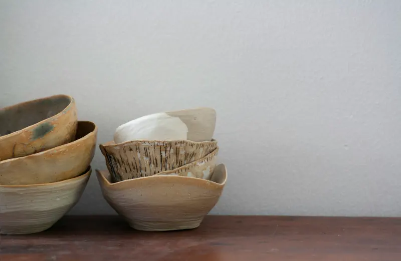
Where Japandi smooths edges, wabi-sabi introduces a deeper, more contemplative quiet. Its colors feel as if they have weathered seasons: the brown of worn leather, the smoke of extinguished incense, the green of moss in shadow. If Japandi is morning, wabi-sabi is late afternoon.To weave wabi-sabi into a Japandi base, deepen the earth notes without tipping into heaviness. A single clay-colored cushion on a pale sofa, a rust toned linen table runner on a warm white table or a charcoal ceramic bowl against blond wood can all introduce that sense of time and presence. The point is not to make the room darker, but to give your soft neutrals a grounded counterpart.
Imperfection is part of the palette. Surfaces that show variation in tone help the eye relax because they echo the randomness of nature. Limewash, plaster, raw linen and unglazed ceramics all carry slight shifts in color that soften a room’s geometry. A wall with subtle brush marks in a warm gray will feel calmer than a flawlessly sprayed flat finish in the same shade, because it gives the eye something slow and gentle to trace.
Wabi-sabi palettes also rely on restraint. It is easy to mistake earth tones for permission to add every brown, terracotta and olive available. Instead, treat them like a limited ink set. Choose two or three deeper hues that resonate with your existing Japandi neutrals and repeat them sparingly. A dark, inky brown that appears in a frame, a floor cushion and a woven basket creates coherence and prevents the room from feeling visually scattered.
Crucially, emptiness is part of the color story. Negative space, the bare stretch of wall or the unadorned corner, acts as a field of quiet that makes each hue more meaningful. A single branch in a muted ceramic vase on a pale wood console carries more emotional weight than a shelf crowded with colorful objects. Zen atmosphere comes not from adding the right colors, but from allowing them room to breathe.
Designing with Japandi and wabi-sabi colors is ultimately an exercise in listening. Notice how your body reacts when you walk into a room painted in a soft, warm gray versus one in crisp white. Pay attention to how a single moss green cushion against a beige sofa changes the way the light feels at dusk. Over time, you will begin to recognize the quiet threshold where your home stops performing and starts simply holding you. That is the moment color has done its most subtle, most zen work.