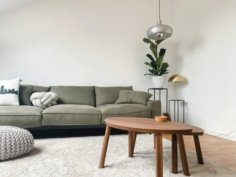
The Quiet Drama of Texture
Contrast is usually framed as a question of color: light against dark, cool beside warm, a decisive “pop” in a sea of neutrals. But if you’ve ever walked into a largely monochrome room that still felt surprisingly alive, you’ve met a different kind of tension: contrast through texture.Texture is the way a surface behaves in light and under your hand. It is the difference between a linen sofa that “breathes,” a lacquered cabinet that flashes back daylight, and a wool rug that seems to swallow sound. When color takes a step back, these qualities move quietly to the front. Instead of asking, “What color should this be?” you begin asking, “How should this feel?”
A room built around texture rather than color often reads as calmer, but never blank. The drama is low-contrast, like a whispered conversation rather than a shouted one. Fine grain wood beside honed stone, boucle against smooth leather, mat cotton against the faint sheen of silk; these are pairings that give a neutral room structure and depth.
The first step is to notice how your existing surfaces already interact. That slick marble countertop might be echoing the glass of your coffee table, while your smooth painted walls repeat the flatness of a plain cotton sofa. “Flat meets flat” creates a kind of visual silence. To create contrast without color, you disrupt that repetition by introducing a counterpoint: something matte against something reflective, nubby beside polished, structured next to slouchy. The aim is not to make each object shout for itself, but to build a small orchestra of sensations that play well together.
This is where deep reasoning about your space matters. Texture doesn’t exist in isolation; it lives in light, in sound, and in the rituals of daily use. Ask yourself which surfaces carry the most visual weight. In most homes, that means the floor, the sofa, the largest wall expanses, and the main window treatments. If these big planes all share a similar texture, you can safely predict a flat-feeling room, no matter how sophisticated your color palette. If each offers a distinct tactile character, you are already halfway to a textured contrast that doesn’t rely on color at all.
Building Layers: From Floor to Eye Level
Think from the ground up. The floor is often the largest uninterrupted surface you see, and it sets the base note. A highly grained oak floor already carries a visual rhythm, so you might balance it with a rug that is softer both in look and in feel: a dense, low pile wool that reads almost like felt. On a smoother, more anonymous floor, like a uniform tile or concrete, you have room for a rug with more overt texture: chunky jute, hand-knotted wool, or a thick loop pile that creates shadows.Above the floor, seating becomes your next major canvas. A sofa in a quietly textured linen or cotton twill offers a subtle weave that catches light in small variations. Pair it with an armchair in a different tactile family altogether, like a tight, almost glossy leather or a deeply nubby boucle. The trick is to let each piece occupy its own sensory lane. If the sofa reads as dry and matte, the chair might be smooth and cool to the touch. They can be very similar in color, yet the experience of looking at and sitting on them will feel distinctly contrasting.
Coffee and side tables are where you can sharpen or soften the existing story. A glass-topped table over a refined wool rug will heighten sharpness and reflection; the glass becomes an intentional “hard” accent amid softness. In a room that already feels busy in grain and weave, however, a simple, honed stone or solid wood top can act as a resting point, a place where the eye can pause. Contrast through texture is not a race to add more; it is the art of choosing when to change pace.
At eye level and above, textiles and wall finishes do much of the work. Even if your walls stay painted in a plain eggshell finish, the fabrics you hang and place in front of them can provide a layered relief. Heavy linen curtains, slightly rumpled and thick, feel different beside the cool, tight weave of a Roman shade. On a sofa, a single velvet pillow amid a field of crisp cottons instantly reads as a textural accent, even if everything is roughly the same shade.
Remember that touch is only half of texture; the other half is how a surface carries light. A raw plaster wall, for example, converts daylight into a soft, almost powdery glow, whereas a satin paint or lacquer bounces it back in clear highlights. When you pair a plaster-like finish with a high-sheen lamp base or glossy ceramic vase, the contrast between absorbing and reflecting light is what gives the vignette depth. You can hold the color nearly constant and still create a compelling, visible difference.
Editing, Quiet Rhythm and Everyday Use
Once you start noticing texture, it can be tempting to bring in every interesting surface you encounter. But contrast is meaningful only in relation to what surrounds it. A room that mixes coarse wood, woven seagrass, boucle, velvet, polished brass, chrome, thick ceramics and glossy lacquer, all at once, risks turning into a kind of sensory static. The pieces stop contrasting and start competing.Instead, think in terms of families. You might choose a small set of dominant textures and let the rest play supporting roles. For instance, a “soft and dry” family: wool, linen, matte wood. To that, you add one “cool and smooth” counterpoint, like glass or polished stone, and one “quietly reflective” accent, such as brushed metal. Most surfaces then either reinforce one of these families or stay intentionally neutral. That limited vocabulary gives each contrast more clarity.
Editing is also how you keep the idea of texture connected to how you actually live. A hand-troweled plaster fireplace looks wonderful, but if your household leans on it, scuffs it, and leans picture frames against it, a more forgiving limewash or matte paint finish might deliver a similar softness with far less anxiety. The most successful textural schemes are not museum pieces; they tolerate fingerprints, pets, shoes on the sofa. Pay attention to the moments where you hesitate to touch something. Texture should invite contact, not discourage it.
As you refine, use repetition to establish rhythm. If you introduce a strong texture in one place, echo it somewhere else in a smaller way. A rough, carved wood bench at the entry might find its quiet counterpart in the frame of a mirror or the leg of a side table in the living room. This soft mirroring keeps the room from feeling like a series of unrelated experiments. Contrast then feels like a pattern, not a surprise.
Ultimately, creating contrast through texture is about learning to read your space without leaning on color as a crutch. It asks you to slow down and notice how light falls, how surfaces respond, how your own body feels moving through the room. If color is the first impression, texture is the lasting one. A monochrome interior can be as layered as a landscape if you allow rough to meet smooth, matte to speak to sheen, solid to answer soft. In the end, the most beautiful rooms often say the least in color, and the most in how they feel.