Why texture is the secret engine of minimalism
Minimalist rooms often get unfairly summarized as "white, empty, cold." In practice, the most inviting minimal spaces share a quiet richness that has less to do with color and more to do with what you feel under your fingertips. Texture is the hidden engine of a room that looks simple but feels complete.
When you strip back ornament, pattern and clutter, every remaining element has to work harder. The wall is no longer just a wall; its finish matters. The sofa is not simply a silhouette; the way its fabric breaks the light matters. Without that thoughtfulness, minimalism can tip into the aesthetic equivalent of an unfurnished rental: clean, but slightly hollow.
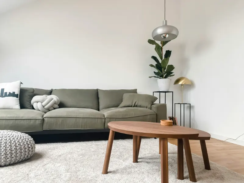
Texture solves that hollowness without breaking the promise of simplicity. It introduces "quiet contrast" rather than loud decoration. A flat painted wall next to a limewashed one, or a smooth metal lamp beside a wool sofa, invites the eye to move slowly through the room. Nothing shouts, but nothing is inert, either.
To layer textures in a minimalist room, it helps to think in three dimensions: what you see, what you touch and how your body moves through the materials over the course of a day. The question is not "What can I add?" but "Which few surfaces can carry the most sensory weight?" That shift keeps you grounded in minimalism while making the space more human.
One useful lens is to balance three broad texture families: hard, soft and in between. Hard textures, like wood, stone and metal, define structure and edges. Soft textures, like textiles, soften those edges and make the room inhabitable. Transitional materials, such as woven grasses, paper and matte plaster, live between the two, keeping the space from feeling either too rigid or too plush.
Within each family, subtle differences matter more than quantity. A honed stone counter next to a slightly rougher ceramic vase already creates a dialogue. The point is not to chase variety for its own sake, but to let each piece bring a distinct tactile note, the way a small ensemble of instruments can still feel like a complete piece of music.
This is where restraint becomes a kind of generosity. By giving each texture more breathing room, you allow it to be legible. The grain of oak looks richer against a plain painted wall than surrounded by competing patterns. In a minimalist room, emptiness is not a lack; it is what frames the few textures you do choose, the way white space frames a drawing.
Choosing and balancing textures without losing calm
If you think of the room as a landscape, certain surfaces read as "ground," others as "horizon" and a few as "accent." Texture needs to be calibrated at each of those levels so the space stays coherent.
Start with the ground plane. Floors carry enormous visual and tactile weight, because every piece of furniture and every step happens in relation to them. If you have smooth concrete, you already have a strong minimalist statement: cool, even, reflective. That can be balanced by a single rug with a low, dense pile or a tight flatweave that adds warmth without erupting into fluff. If your floor is already textured, like knotty wood or stone, it may be wiser to keep rugs simpler and let the floor do more of the talking.
Next, consider the vertical planes. Walls and large storage pieces create what the eye reads as horizon. A flat, matte wall will feel calm and recede; a subtly brushed or limewashed finish will catch light, giving depth even in one color. Built in cabinetry can be an opportunity to introduce a second texture, such as a ribbed wood front beside a smooth wall, but keeping the palette close prevents that contrast from feeling busy.
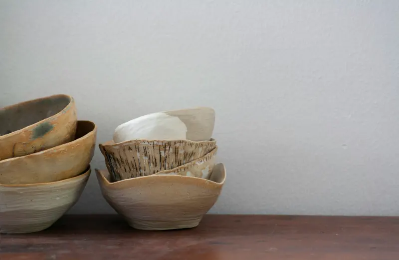
Finally, think about accent textures at the scale of the hand: the throw on the sofa, the ceramic of a lamp base, the edge of a wood tray. In a minimalist room, these carry more emotional charge because there are simply fewer of them. A single nubby wool throw can offset an otherwise sleek sofa. One rough clay pot can keep a white shelf from looking sterile. The key is to let these accents align in spirit, even if they differ in feel. They might all share a certain honesty of material, a sense that nothing is pretending to be anything else.
Color quietly underwrites how many textures you can layer before the room begins to fragment. Holding most materials within a narrow band of tones allows you to be more adventurous with touch. Several off whites, beiges and pale grays, all in different finishes, can coexist calmly. Introduce one deeper anchor, perhaps a charcoal linen or a darker wood, to ground the palette, and the room gains depth without visual noise.
It can help to make a kind of tactile mood board as you plan. Lay out fabric swatches, wood samples, a tile offcut, a piece of paper representing your walls. You will quickly see if something feels too shiny, too synthetic or too loud. Minimalism thrives when there is alignment not only in color but in how the materials age. A room where the leather is meant to patina, the wood to deepen and the stone to show faint rings will read as more coherent than one where half the textures want to stay pristine and the others are designed to look distressed from day one.
Practical layering: where to push and where to stay quiet
Once you understand the roles each surface plays, the question becomes where to be bold with texture and where to recede. The answer usually lies in tracing your daily rituals. Where do your feet land first thing in the morning? What do your fingers wrap around as you read or drink coffee? Those are the places most worth investing in richer materials.
For example, in a minimalist bedroom, you might let the walls and wardrobe stay almost invisible in a soft, flat paint, while the bed becomes a concentrated island of texture: a linen duvet with a slight crinkle, a tightly woven blanket at the foot, a headboard in a quiet bouclé or simple canvas. The room still reads as calm, but the place where you spend the longest time in direct contact with the environment feels distinctly human and layered.
In a living room, you might reverse the emphasis. Keep the sofa tailored and relatively smooth, letting the fabric fall in clean planes, then bring texture into the pieces around it: a heavy knit throw folded with intention, a woven stool that can double as a side table, curtains in a textural but unpatterned fabric that subtly filter light. You want each added texture to earn its place, doing at least two jobs at once: functional and sensory, structural and softening.
Editing is as important as adding. If everything is textured, nothing is. A useful rule is to let one or two surfaces in any vignette stay almost completely plain. On a console table, that might mean a very simple top supporting a more tactile object, rather than a busy wood grain beneath an equally assertive sculpture. In a corner with a chair and lamp, it might mean a smooth metal lamp base paired with a more robustly woven chair seat, leaving the wall behind them unadorned so the interplay can breathe.
Over time, notice how your eye and your body respond. Do certain corners feel a bit flat or chilly? A change in the hand of the material, rather than its color, may be enough: swapping a smooth cushion for a subtly slubbed one, or a glossy tray for a matte version. Conversely, if a space starts to feel crowded, remove the least essential textured element and see whether the remaining ones suddenly feel more legible. Layering textures in a minimalist room is less about achieving a final, perfect composition and more about maintaining a dialogue between calm and character as your life in the space unfolds.