Reading the Emotional Temperature of Color
Color is not just decoration; it is the emotional climate of a room. When a space feels cold, echoey or somehow unfinished, it is often because the palette is out of sync with how you want to live there. To make a room feel cozier with color, you are really adjusting its temperature, depth and softness, all without moving a single wall.
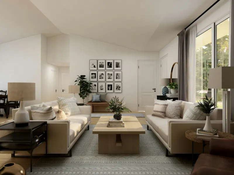
The first step is to think less about the names on paint chips and more about the undertones hiding beneath them. A gray with a cool blue undertone will feel crisp and distant, while a gray with a whisper of brown or violet can suddenly feel like a wool sweater. The same is true of white. A bright gallery white reflects light so efficiently that it keeps your eye in motion, which can be energizing but not especially intimate. A white with a touch of cream or mushroom softens edges, letting the room feel as if it is exhaling rather than bracing.
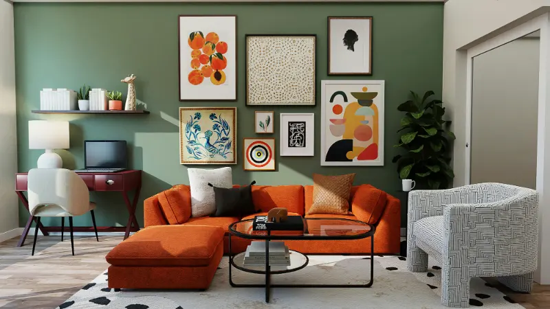
Coziness comes from a sense of embrace. Warm colors, those with red, yellow or brown undertones, appear to visually advance, making walls and furnishings feel a bit closer than they are. Cool colors, leaning blue or green, tend to recede. But the story is more nuanced than simply warm versus cool. A desaturated moss green with a drop of brown can be quieter and cozier than a loud tomato red, because it wraps the room in a low, steady mood instead of a shout.
Think of color in terms of voice. High contrast combinations, like bright white against sharp black, are the loudest. They can be beautiful, but they keep the eye jumping, which is the opposite of rest. Lower contrast pairings, like oatmeal with taupe or soft terracotta with dusty rose, speak more softly and are easier to live with when you want a room to feel like a retreat. To make a space cozier, you are trying to lower the volume of the visual conversation while still keeping it interesting.
Light, too, is a collaborator. Natural daylight shifts throughout the day, warming at sunrise and sunset, cooling at midday. A north facing room already leans cool, so layering in warmer toned paint and textiles keeps it from feeling chalky. A sunny south facing space can carry deeper, moodier shades without feeling oppressive because the light continually lifts them. The same color can feel completely different depending on the direction of the windows and the time of day, so samples on the wall are not just helpful, they are essential detective work.
As you consider the emotional temperature of color, pay attention to how your body reacts when you see certain shades in real spaces, not just in magazines. That sense of your shoulders dropping, of your breathing slowing slightly, is often a clue that the palette is doing the quiet work of coziness.
Building a Cozy Palette from the Ground Up
Designing a cozier room begins not with the walls but with the largest surfaces closest to your body. Floors, rugs and large upholstered pieces set the base note of the palette. When these are in mid to dark tones with warm undertones, the room feels grounded, like earth underfoot. A pale sofa on a pale rug in a pale room can be elegant, but it leaves you hovering. To shift toward coziness, introduce colors that feel weighty enough to hold you down gently.
One approach is to imagine the room in layers. Start with a grounding color underfoot, perhaps a caramel jute rug or a deep patterned wool in olive and rust. This first layer visually shortens the distance between you and the floor. Next, consider the wall color as a backdrop that supports, rather than competes with, the furnishings. Instead of a stark white, a warm greige or muted clay can wrap around the room, softening the corners and making the perimeter feel closer and more continuous.
Once the base is in place, build a family of related hues that share a similar undertone. If your rug leans ochre, let that golden warmth echo in the wood stain of a coffee table, the threads of a throw, the background of a piece of art. Repetition of undertone is what makes a room feel cohesive and calm. It is less about matching and more about rhyming. A blush cushion, a cinnamon velvet chair and a tan leather ottoman can all belong to the same cozy sentence if they share that red brown warmth deep down.
Contrast still has a role, but in a cozier room you want gentler shifts rather than abrupt jumps. Instead of pairing navy with white, consider navy with a soft putty or linen tone. Instead of placing a single black object in an otherwise airy space, repeat that darkness in small doses, like the frame of a lamp, the spine of a book or the trim on a pillow. This kind of dispersed contrast anchors the eye without making any one element shout for attention.
Textures amplify what color starts. A saturated hue in a glossy finish feels sleek and cool, while the same color in a nubby wool, matte plaster or brushed cotton feels touchable and warm. If you fall in love with a deeper wall color but worry it might be too intense, consider balancing it with fabrics that have visible weave and tactility. The interplay between color and texture is where the room begins to feel genuinely habitable, not just styled.
Using Light and Small Gestures to Deepen Warmth
After the main palette is in place, the coziest effects often emerge from small, thoughtful gestures. Color in a room is constantly edited by light, both natural and artificial. Warm light bulbs, labeled with a lower color temperature, will enhance the golden, pink and brown notes in your palette, making the space glow at night the way a candle does. Cooler bulbs tend to flatten these nuances and can undo some of the softness you are working to create.
Think of lamps and shades as color instruments. A cream fabric shade will diffuse light into a gentle halo, while a colored or parchment shade tints the room in subtle ways. A rust linen shade over a bedside lamp can cast the faintest blush onto nearby walls, leaning into coziness without a single stroke of paint. The point is not to create drama, but to let color and light work together like layers of atmosphere.
Artwork and objects are where you can introduce slightly bolder or more personal colors without overwhelming the room. In a largely muted living space, a painting with deep emerald and soft saffron can act as a hearth for the eye, a concentrated pocket of warmth that gives everything else context. The surrounding colors should chat with the artwork rather than argue with it. If the art includes a particular shade you love, echo it softly in a throw, a book cover or a ceramic bowl nearby so it feels integrated and not like a lone statement.
When you are unsure if a color choice is making the room cozier, test it in the evening. Sit in the space with the lights you actually use, not the full ceiling glare, and notice what happens. Do the corners of the room soften, or do they disappear too much. Do the colors encourage you to linger, or do they make you suddenly aware of every object that feels out of place. Coziness is not only warmth; it is also clarity. A well considered palette can make even a small, imperfect room feel like somewhere you choose to be, rather than a temporary stop between other obligations.
Ultimately, making a room feel cozier with color is a slow conversation between how you want to feel and what the space can naturally offer. Walls, textiles, light and objects all contribute their notes. When you tune them toward gentle contrasts, shared undertones and tactile finishes, the room begins to hold you a little closer. That is the quiet power of color used with intention, not as a final garnish, but as the atmosphere of home itself.