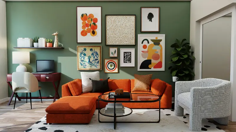
Learning to See Your Palette, Not Just Your Paint
Matching wall art to your color palette is less about finding a perfect paint chip twin and more about learning to read the room the way a designer does. It starts with the simple question that rarely gets asked: what colors are actually in the space, beyond the walls. The sofa, the rug, the wood tone of the floor, the metal of the lamps, even the view out the window all quietly add to your palette.
Designers often talk about "dominant," "secondary," and "accent" colors. The dominant color is usually your wall or your largest furniture piece. Secondary colors appear in medium sized elements like rugs, curtains, and bedding. Accents show up in smaller bursts, such as cushions, vases, or the spine of a single book left on the coffee table. When you look at your room this way, you stop hunting for generic art that just looks "nice" and start looking for pieces that can talk to these layers.
Instead of pulling out a fan deck to match your paint, try a slower exercise. Sit in the space at different times of day and notice what actually stands out when the light shifts. Morning light may cool a warm beige into something closer to gray. In the evening, the same walls might glow and pull your warm woods into focus. These shifts matter because the colors you see in your art will be shaded by the exact light bathing your room. A cool toned abstract that looks balanced in a bright gallery can feel icy against north facing gray walls at home.
A useful method is to capture your space with your phone, then desaturate the image to black and white. Without color, you can read value, which is the lightness or darkness of everything in the room. Value is what prevents your art from either shouting or whispering. If your walls, sofa, and rug all live in the mid tone range, a piece of art with both strong darks and bright lights will bring welcome contrast. If your room is already high contrast, very dramatic art can make the space feel restless. In that case, pieces with softer transitions in value can calm the eye.
Seeing the palette this way means you are no longer just matching tones, you are shaping the mood. A muted, earth toned room with a single, heavily saturated artwork will always read as a stage set for that piece; the art becomes the protagonist. A room whose art gently lifts the colors already present feels more like a conversation than a monologue. Neither is wrong. The choice is about the kind of energy you want to live with every day rather than what looks impressive in a single photograph.
Balancing Echo, Contrast, and Mood
Once you understand the colors and values at play, you can start balancing echo and contrast. Echo is when art repeats a color already in the room. It can be subtle, like a small stroke of ochre in a landscape that quietly mirrors your brass floor lamp, or overt, like a bold blue abstract hung over a navy velvet sofa. Echoing establishes a visual rhythm that feels intentional and grounded.
Contrast is when art introduces something new. A slate blue room with a rust toned painting gains an unexpected warmth. A cream and linen space with a deep, inky photograph takes on depth and seriousness. The art does not need to match anything to feel at home; it needs to complete the sentence the room has started. Designers often use art to supply the color that would be too risky or overwhelming as paint. This is how you can love chartreuse or acid pink without committing to seeing it on an entire wall.
To keep this balance workable, it helps to give every artwork a job. Ask what the piece contributes beyond decoration. Perhaps a black and white drawing calms a room that has a lot of competing colors. Perhaps a highly saturated print is the one thing that cuts through an ocean of beige and tan. Perhaps a landscape quietly bridges the greens of a houseplant and the blues of a rug. When art has a role, it feels woven into the space rather than hung on top of it.
Color temperature is another subtle but powerful lever. Warm colors such as reds, oranges, and warm yellows advance visually; they make walls feel closer. Cool colors like blues, greens, and cool grays recede; they can visually push a wall back. In a small room painted in a cool tone, art with just enough warmth can make the space feel inviting instead of chilly. In a room already dominated by warm beige and honey wood, a piece with cooler blues or greens introduces breath and space.
You can also think of saturation as volume. Highly saturated color is loud; desaturated, smoky color is quiet. A mostly neutral palette can handle one loud artwork, but several can start to feel like competing speakers. In color rich rooms, softer, more toned down art keeps the energy from tipping over into visual noise. When you stand in the doorway and your eyes ping frantically from one piece to another, the volume is too high. When they travel easily from wall to textile to window and back again, you have likely found the right relationship between your art and your palette.
Using Art to Correct, Soften, and Personalize
Not every room begins as a blank canvas. Sometimes you inherit paint colors, floors, or furniture that are not what you would have chosen. Matching wall art to your existing color palette then becomes an act of gentle correction rather than simple coordination. If your walls are cooler than you like but repainting is not an option, choosing artwork with warm, layered tones can visually re balance the room, especially when repeated in smaller accessories like cushions or throws.
If the room feels flat, look for art that plays with a range of values from dark to light. The shadows in a charcoal drawing or the deep blues in a seascape can add the dimension your walls are missing. Conversely, if your space already has a lot of heavy, dark furniture, lighter and more ethereal works can keep it from feeling oppressive. Watercolors, line drawings, and photographs with generous negative space allow your eye to rest.
Scale and placement contribute as much to color harmony as the hues themselves. A small, intensely colored piece surrounded by a wide mat and a pale frame can live happily in a room whose palette is otherwise quiet, because the framing introduces a pause between the art and the wall. A large, edge to edge canvas commands more of the color conversation and should therefore be in better dialogue with your dominant tones.
In the end, matching art to your color palette is less about obeying rules and more about clarity of intention. Rooms that feel serene tend to use art as an extension of their main colors, varying value and texture more than hue. Rooms that feel energetic tend to introduce one or two deliberate departures in color, letting the art and a few accents carry those bolder notes. There is room for both approaches, even within the same home.
The most compelling spaces rarely look perfectly coordinated. Instead, they feel like a series of considered choices, where wall color, furnishings, and art collaborate to express something about the people who live there. When you select art that listens to your palette but is not afraid to answer back, your walls stop being simply decorated and start to feel, quietly and persuasively, like your own.