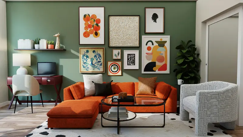
The Problem with Being Too “Matchy”
You know the room the moment you walk into it. The sofa pillows echo the rug, which echoes the curtains, which echo the art. Every blue is the same blue, every beige the same beige. It should feel harmonious, yet somehow it feels flat, cautious, almost like a furniture showroom rather than a lived‑in home.That overly coordinated look happens when we treat color as a set of paint chips instead of a spectrum. Matching wall art to a color scheme is not about hunting for the exact navy of your sofa or the precise terracotta of your throw. It is about understanding relationships: how colors deepen or soften each other, how undertones play together, and how texture can quiet what might otherwise be visual noise.
Designers often talk about “tying the room together,” but what they really mean is creating a rhythm. Your eye should move around the room, noticing small echoes of color and contrast, not a single big chorus of perfectly repeated hues. The art on your walls is one of the most powerful ways to achieve that rhythm, because it can hold complexity: multiple colors, line, movement, even mood. The question is how to let that complexity live comfortably alongside your existing palette without tipping into chaos or cliché.
A helpful shift is to stop asking “Does this match?” and start asking “Does this belong here?” Belonging, unlike matching, leaves room for surprise. When art belongs to a room, it resonates with its colors without copying them. It feels as if it could only live on that particular wall, in that particular light, in conversation with that particular sofa. To get there, you learn to work with undertones, ranges of value, and a bit of contrast, instead of chasing identical swatches.
There is also a practical benefit to avoiding the overly matchy approach. Your furnishings will change over time, but art is often what you keep. If every piece on your wall has been chosen to echo a specific pillow or rug, you trap the art in that moment. When you select work that relates to your color scheme more loosely, through shared warmth or contrast or mood, you give yourself the freedom to evolve the rest of the room while the art remains a steady, anchoring presence.
Color Families, Undertones, and the “Off” Match
Color is rarely as simple as “blue” or “green.” Most hues lean warm or cool, and many straddle categories in quiet ways: a gray with a violet whisper, a white with a drop of cream, a beige with a greenish cast. When your wall art feels mysteriously wrong in a room, it is often because the undertones are arguing, even if the top notes appear similar.Start by naming the undertone of your main pieces. If your living room is largely neutral, look closely at what sort of neutral you are living with. A sofa described as “oatmeal” might actually lean pink; a rug that reads “greige” in the showroom may show up green in late afternoon light. Notice whether your dominant colors skew warm, with yellow, red, or brown undertones, or cool, with blue, green, or violet undertones. Wall art that belongs will usually share that temperature or play against it with intention, not accident.
This is where the idea of the “off” match becomes useful. Instead of searching for a painting that repeats your wall color exactly, look for pieces that sit a step or two away. If your walls are a cool pale blue, a piece with stormy slate, inky navy, and a touch of warm beige will harmonize more interestingly than something that copies the pale blue outright. The slight misalignment creates depth, the way a jazz chord becomes richer when one note is unexpected but related.
Another simple way to test belonging is to imagine pulling a single color out of a work of art and dropping it into your room in the form of a pillow, a vase, or a throw. Would that color feel comfortable among your existing pieces, or would it shout? If it feels at home, the art likely will too, even if the work also contains bolder or stranger hues. You are looking for overlap, not total alignment.
Value, meaning how light or dark a color is, is just as important as hue. A room built from mid‑tone colors can benefit from art that includes both lighter and darker versions of those tones. If your scheme leans light and airy, a piece with deeper notes of the same family can keep the room from floating away, grounding it gently. In a darker, moodier space, art with a touch of light can act like a window, preventing the palette from collapsing into gloom. Again, the goal is relationship rather than repetition, a shared conversation between wall and frame rather than a mirror image.
Letting Art Lead: Contrast, Texture, and Mood
Once you understand your color families and undertones, you can give yourself permission to let the art lead. Often the most memorable rooms are built around a single strong piece that sets the tone, rather than art squeezed in as an afterthought. When a painting or photograph carries a complex palette, it can act as a quiet “color oracle,” suggesting accents you would never have chosen from a fan deck alone.To keep this from feeling chaotic, use contrast and texture as your guides. A very colorful piece can sit comfortably in a mostly neutral room if the textures around it are soft and calm. Think of a large, expressive abstract full of rust, teal, and ivory against a wall in linen white, flanked by a simple oak bench and a wool rug. The art becomes a focal point but not a disruption, because the surrounding surfaces are tactile and understated, absorbing some of the energy rather than competing with it.
The opposite can also work: in a space with many colored textiles and patterns, choosing art that is more restrained, perhaps in black and white or a limited palette, can provide relief. You are not turning down the volume on color altogether; you are creating moments of pause. Those pauses are what keep a home from feeling like a collage of purchases and instead like a composed, considered environment.
Mood is the final, often overlooked layer. A room in soft, misty greens and grays can absolutely host a bold, saturated piece, but if the art’s energy is frenetic while the space is meant for unwinding, the mismatch will be felt more than seen. Ask whether the emotional temperature of a piece aligns with what the room is for. Calm does not have to mean dull; a landscape in stormy blues can feel contemplative rather than agitated if the brushwork is gentle and the composition open.
In the end, the most successful color pairings between art and interior are felt before they are analyzed. When something looks slightly off but you cannot explain why, check the undertones and values. When a piece feels too loud, see if adding texture or a neutral frame softens it. And when you fall in love with a work that does not obviously match your scheme, look for small bridges of color and mood that let it belong. A home with well chosen art is less about perfect coordination and more about an ongoing dialogue between the things you live with and the walls that hold them.