The Quiet Drama of Japandi Rooms
In a world of constant alerts and visual noise, Japandi decor offers a kind of visual exhale. It is the meeting point of Japanese minimalism and Scandinavian coziness, two cultures that share a reverence for light, natural materials, and the everyday ritual of living well. What makes Japandi more than a trend is not the furniture silhouette or the right shade of beige, but a particular way of seeing your home as a landscape of calm.
At its heart, Japandi asks you to edit your space the way a thoughtful curator edits a gallery wall. Every object is doing something: holding a memory, softening a corner, catching the morning light. The look feels simple, but the simplicity is deceptive. Behind it is a quiet choreography of contrast and restraint, where rough meets smooth, cool meets warm, and “almost empty” can feel surprisingly full.
To work, Japandi needs more than a shopping list of pale wood chairs. It needs a few clear decisions about art, color, and materials, and a willingness to let negative space do as much talking as your favorite ceramic vase. When you understand those decisions, you can adapt the style to a city studio or a rambling house without losing its essence.
Art and Color: Composing a Calm Palette
Japandi art is not shy, but it is purposeful. Instead of filling every surface, it often relies on a few large gestures: a single abstract canvas, a low branch in a handmade vessel, a long, unbroken line of shelving with only a handful of objects. The art is not there to impress guests; it is there to settle the room’s energy.
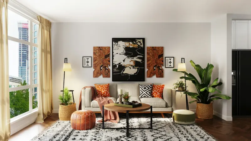
Think of art as visual breathing space. A large, quiet piece above a sofa can remove the need for multiple smaller frames. Look for compositions with broad fields of color, visible brushwork, and a sense of imperfection. Ink drawings with irregular lines, textiles with hand-dyed gradients, or a black and white photograph printed with generous borders can all carry the right mood. The key is clarity: can you take in the artwork with one slow glance, without feeling pulled in ten directions.
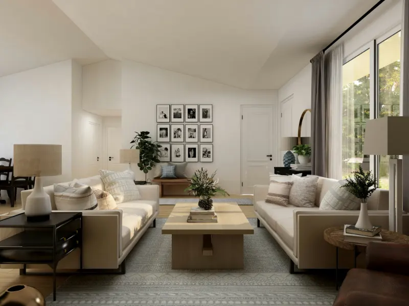
Color works similarly. Japandi palettes tend to start with a backbone of warm neutrals: chalky whites, soft greige, and muted sand tones. This warmth keeps the room from tipping into clinical minimalism. Over that base, layer slightly deeper tones, like mushroom, clay, or oat, to give depth. The contrast is low, but not flat; imagine the subtle shift in shade between a linen curtain, a limewashed wall, and a wool rug all in the same color family.
Then add a few deliberate accents. Instead of bright pops, think “anchoring notes.” A deep indigo cushion on a beige sofa, or a charcoal ceramic lamp on pale oak, can give the room gravity. Darker elements echo the Japanese appreciation for shadow and mystery, while the paler field beneath them keeps the Scandinavian lightness intact.
Green, in Japandi, often arrives through plants rather than paint. A single potted olive tree, a low bowl of moss, or a simple glass vase of branches does more than decoration; it introduces a living vertical line that softens architecture. The restraint is crucial. Too many plants, or too many hues of green, and the room starts to feel busier than intended.
If you already live with bold colors, transitioning to a Japandi feel does not require erasing your palette. It asks instead for softening. A saturated blue wall can be calmed with layers of off-white textiles and natural wood, while bright artwork can be paired with quieter frames and more breathing room around each piece. The guiding question becomes “What can I subtract so the few things I love can come forward.”
Materials and Touch: Designing for the Hand as Much as the Eye
Walk into a well considered Japandi room and your hand instinctively reaches out. You want to run your palm over the tabletop, slide your fingers along the edge of a ceramic, press your toes into the rug. The space may be visually pared down, but it is materially rich, almost tactilely abundant.
This richness comes from contrast within a natural vocabulary. Woods are central, but not glossy and uniform. Oak, ash, or birch with a matte finish, visible grain, and squared off edges brings the Scandinavian clarity. Darker woods, like walnut or stained pine, hint at Japanese interiors, especially when used sparingly in a bench, a lamp base, or a low table. When these woods coexist, they should feel related rather than random, which is why keeping undertones either all warm or all cool matters more than perfect matching.
Textiles soften all that wood. Linen, cotton, wool, and the occasional touch of leather create a layered, quiet luxury. A heavy linen duvet, a wool throw with a simple weave, or cushions in a slubby fabric introduce micro shadows and depth without pattern overload. Pattern does have a place, but often in modest scale or tone on tone, like a subtle grid on a cushion or a hand loomed rug with a barely visible stripe.
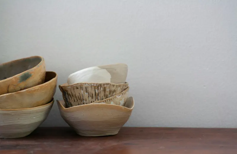
Harder materials, such as ceramics and stone, contribute a sense of grounding. A simple, thick walled mug, a slightly irregular bowl, or a stone tray can shift a vignette from generic minimalism into something more human. Imperfection is welcomed here. A glaze drip, a tiny asymmetry, a knot in a wooden stool all echo the Japanese idea that beauty and time are intertwined, while the overall restraint in number of objects satisfies the Scandinavian instinct for order.
In practice, designing your own Japandi leaning room is less about buying matching sets and more about tuning a few key moments. Choose one or two surfaces as focal points: the coffee table, the console by the entry, perhaps the dining table. Keep what sits on them edited and intentional. A single sculptural vase with branches on an otherwise empty table will feel more luxurious than a scattering of small items.
Lighting is another material, even if we do not touch it. Overhead fixtures can be softened with paper lanterns, fabric shades, or simple pendants with warm temperature bulbs. The light should skim across surfaces, emphasizing texture. A floor lamp that sends light up a wall can turn limewash, plaster, or even matte paint into a quiet evening artwork.
The cumulative effect of these choices is a home that feels almost slow to the senses, in the best way. Edges blur slightly under soft light, hands recognize the difference between linen and wool, and the eye can rest on a single ink drawing without interruption. Japandi decor, at its most successful, is less a look than a rhythm: fewer, better things; warmer, softer light; quieter, deeper color; and materials that seem to remember where they came from. In living with that rhythm, your space becomes not just more beautiful, but more breathable.