
The Quiet Psychology of Grounding Colors
Designers talk about a room as if it has a pulse: a low, steady thrum when it is calm, a quickened beat when it is visually noisy. Color is often the metronome. In mindful interiors, the question is not "What color do I like?" but "How does this color make my body feel once I sit down and exhale?" Grounding tones are the ones that slow that internal rhythm, making your home feel like it holds you rather than performs for you.Grounding begins in the nervous system. We register color not only through the eyes, but also through associations laid down over years. The reason a deep clay wall or a soft moss sofa feels restorative is part biology, part memory. Low-saturation hues, especially those that echo earth and skin, demand less effort from the eye. They do not shout; they murmur. This quietness allows the brain’s alert systems to stand down, which we experience as calm and stability. High-chroma colors, by contrast, can be thrilling but also fatiguing if they dominate every surface.
The most reliably grounding palettes share three traits. First, they are slightly muted, as if a veil of gray, brown or cream has softened the color. Second, they borrow heavily from the natural world: soil, bark, stone, dusk sky, dried grasses, soft petals rather than electric blossoms. Third, they repeat tones across the room so the eye can rest on gentle rhythms rather than constant surprises. Think of walking through a forest where green is everywhere, but never in exactly the same way; that is what a mindful palette tries to recreate indoors.
There is also temperature to consider. Warm tones nudge us inward, cool tones invite mental clarity. A grounding room often balances both: warm in the elements that touch your body, like textiles and flooring, cooler in the distant planes like ceilings or distant walls. This subtle gradient mirrors nature, where earth underfoot is warm, and the sky above is cooler and lighter. When your home echoes that logic, it reassures the mind at a level you do not have to consciously name.
If you are unsure whether a color is truly grounding, do a simple test. Look at a swatch and pay attention not only to your first impression but to what happens after ten seconds. Does your breathing soften, or do you feel a slight agitation, a need to look away? Grounding hues let you linger without restlessness. They are the colors in which you could comfortably read an entire book without noticing the walls at all, except as a gentle backdrop to your own thoughts.
The Tones That Hold You: From Earth to Sky
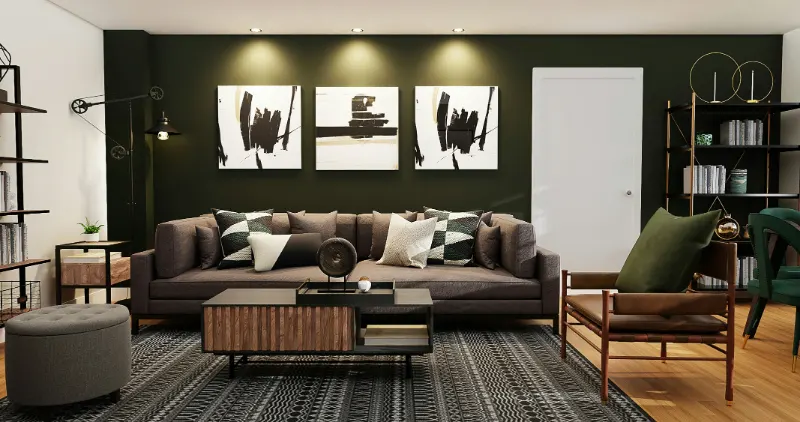
Among the broad families of color, earth tones are the obvious candidates for grounding, but they are more nuanced than the phrase suggests. Think less about generic "brown" and more about specific materials: the cool beige of raw linen, the pinkish tan of hand-thrown clay, the deep umber of rich soil after rain. These colors feel stable partly because they reference weight and gravity. When they appear underfoot in rugs or on lower portions of walls and cabinetry, they create an almost architectural sense of being anchored.Greens, particularly the desaturated ones, are the quiet diplomats between earth and sky. Olive, sage, eucalyptus, lichen: these are greens that already seem to contain a bit of gray or brown. They feel both alive and rested. Used on large surfaces like walls or curtains, they can make a room feel like a clearing in a forest, protected yet open. Brighter, leafier greens can still be grounding if they are confined to details, such as a chair or a vase, so they read as punctuation rather than the whole paragraph.
Blues are trickier. Highly saturated, cool blues can be bracing, even chilly, which may work in a study but not necessarily in a bedroom. For grounding, look to stormy or dusty blues, those that seem to hold a touch of smoke or slate. These tones pair quietly with wood, stone, and off-white upholstery, conjuring a sense of distant horizons without pulling your attention away from the room itself. Navy can feel deeply secure, almost enveloping, if softened with plenty of warm textures so it reads as a night sky rather than an ink stain.
Neutrals are often hailed as the safest path to a serene room, but "neutral" is not one thing. A chalky white with cool undertones can feel crisp to the point of sterility in a space where you hope to unwind. By contrast, an off-white with a hint of cream or mushroom creates a softer halo of light, flattering to skin and forgiving to clutter. Greiges, the tones that live between gray and beige, are popular precisely because they straddle warm and cool. They recede gracefully, leaving you free to add subtler moments of color in textiles and art without losing the room’s sense of stability.
Even traditionally stimulating colors like red or yellow can participate in a grounding palette if they are carefully muted. Brick red, terracotta, or the color of dried paprika feel closer to earth than a glossy fire-engine hue. Mustard, ochre, and flaxen straw tones borrow directly from fields and late-summer light; they warm a space without making it buzz. The key is to imagine the color covered in a thin layer of dust or lit by a cloudy sky. If it still feels welcoming in that softer state, it likely has grounding potential.
Translating Mindful Palettes into Real Rooms
Choosing colors in theory is one thing; living with them is another. A mindful approach starts with how you want each room to function in your daily life. In a bedroom, grounding usually means sleep and soft mornings, so emphasize the slower side of the spectrum: warm neutrals on the walls, maybe a greige or sandy beige, with deeper, cocooning tones like mushroom, olive or cocoa in the headboard and bedding. Allow the palest tones to touch the ceiling and upper walls, so the room feels like it opens gently above you while the lower half remains rooted.In a living room, grounding does not have to mean hushed. It can support conversation and family life while still taming visual chaos. One strategy is to choose a single dominant grounding color family and let it repeat in slightly different values. For example, you might anchor the space with a mid-tone linen sofa in a warm stone hue, echo that color more deeply in a wool rug, then soften it again in curtains. Accent colors, whether in cushions, books, or ceramics, can then be drawn from adjacent natural tones: a sprig of sage, a knotted throw in dusty blue, a clay lamp base. The repetition of related hues allows your eye to move around the room without jolts.
Light is your collaborator here. The same paint will feel entirely different in a north-facing room versus one that floods with afternoon sun. Before committing, test your grounding tones on large swatches and watch them over a day. Do they become too gray and flat at dusk, or do they grow richer and more enveloping? The most mindful choice is not the one that photographs best midday, but the one that holds you gently through the hours you actually inhabit that room.
Texture is another quiet tool for grounding. A color that might feel bland on a slick surface can become complex and soothing in a woven fabric or a limewashed wall. Pairing rough with smooth, matte with a hint of sheen, keeps a restrained palette from tipping into monotony. Your hand, as much as your eye, should feel at ease. When you run your fingers along a wood table in a deep honey tone or sink into a chair the color of wet sand, you are experiencing grounding not as a design principle but as a bodily fact.
Ultimately, mindful color palettes are less about following trend forecasts and more about noticing subtle shifts in your own energy as you move through space. A truly grounding tone is the one that makes you linger, that supports your daily rituals, that lets the small dramas of life unfold without competing for attention. When you assemble these colors with care, your home stops trying to impress and instead begins to do something both simpler and rarer: it makes you feel, unmistakably, at home.










