Why Calm Color Feels Like a Deep Breath
Minimalist color is often misunderstood as an exercise in deprivation, a house on a strict diet of "only white" and "nothing fun." In practice, a calm palette is less about austerity and more about editing. When you reduce the number of competing hues, every remaining color has room to breathe. Walls stop shouting. Objects stop fighting for attention. Your eye can move slowly, which is precisely what “calm” feels like in a space.
Color has weight. A room full of saturated, high-contrast tones can feel visually heavy, as if everything is leaning toward you. Muted, low-contrast combinations, on the other hand, sit back. They give you what architects sometimes call "visual silence"—a neutral, stable background that lets light, shadow, and texture do the expressive work. Minimalist color palettes take advantage of this by choosing just a few hues, then stretching them through tints, shades, and materials rather than expanding the rainbow.
"Ten calm combinations" is less a strict list than a framework. Imagine them as families of mood rather than rigid recipes: soft whites with mushroom grays, pale stone with warm sand, clay pink with bone, misty blue with oat, olive with linen, charcoal with chalk, and a few more in that lineage. The names sound like paint swatches because that is how you will meet them in the real world, but the principles that make them soothing are remarkably consistent. They all lower contrast, mute saturation, and weave in warmth so minimalism feels human rather than sterile.
Underlying these palettes is the idea that your home is not a gallery for color, but a container for your life. A softer, more limited scheme lets objects with emotional weight—a wooden chair your grandfather sanded, the ceramic mug you reach for every morning—become the subtle focal points. In this way, color restraint becomes a kind of curation. You are not just choosing paint; you are choosing which experiences are visually amplified and which are allowed to recede into quiet support.
How Calm Combinations Actually Work
If you line up those ten gentle palettes, a pattern emerges. Most begin with a base of warm or neutral white. Not a cold, gallery white that casts a blue edge, but a version with a hint of cream or taupe. This is the canvas. On top of it, one or two secondary hues arrive: perhaps a soft greige leaning toward mushroom, a whisper of clay, or a foggy blue. These are not fully saturated colors; they have gray or brown worked into them, which takes the vibrational edge off. The eye reads them as calm because the difference between them and the base color is subtle rather than jarring.
Within each palette, there is almost always a quiet hierarchy. One dominant light tone covers the largest surfaces: walls, often large rugs, sometimes cabinetry. A supporting mid-tone appears on furniture frames, bedding, or curtains. A darker accent shows up sparingly in lines and edges: the graphite metal of a lamp, the deep olive of a throw, the nearly-black of picture frames. Even in a minimalist scheme, that darkest tone is important. It provides what designers call "visual punctuation," something for the eye to land on so the room does not dissolve into a blur of sameness.
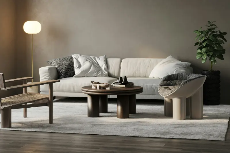
Consider a combination built around stone, sand, and charcoal. Walls in a soft stone white form the quiet shell. A sand-colored sofa and rug lower the contrast between floor and seating, so the room feels like one continuous, gentle plane rather than a patchwork of rectangles. A charcoal side table, a black metal floor lamp, and a single ink drawing on the wall become the room’s commas and periods. They ground the space without turning it dramatic. Or imagine a room based on misty blue, oat, and warm white. The blue appears not as a statement wall but as linen curtains and a quilted bedspread; the oat appears in the headboard and a wool rug. The walls are a warm white with just enough yellow to keep the blue from feeling icy. You are left with a space that recalls sea air, not a themed coastal rental.
Texture does as much work as hue. When you limit color, you must let materials step forward. A palette of bone and clay becomes engaging when clay shows up in matte pottery, bone in plaster walls, and the same color value in different surfaces: nubby wool, smooth cotton, gently distressed wood. Light moves differently across each, creating subtle variations even where the color is almost identical. This is why a minimalist palette often feels richer in person than in photographs. Your hand, as much as your eye, is involved in the experience.
Designers also talk about temperature balance inside a palette. Too many cool grays and blues, and a room starts to feel remote, even under a pile of blankets. Too many warm beiges and browns, and it can feel stagnant or muddy. The calmest combinations usually carry one clear corrective. If the main colors lean cool, introduce a small amount of warmth in wood tones, a caramel leather strap on a chair, a beige undertone in the rug. If the scheme is mostly warm—sand, camel, cream—let something like a muted sage or a slate accent cut the sweetness. The equilibrium is almost invisible when you get it right; you register only that the room feels "soft but alive."
One quiet advantage of these minimalist palettes is longevity. Because they sit closer to what we find in nature—stone, bark, shells, fog—they slip out of trend cycles more slowly. A living room in bone, mushroom, and deep olive will feel relevant far longer than one anchored in a specific year’s "it" color. This does not mean the room never changes. A calm scheme is a stable backdrop against which you can rotate seasonal flowers, art, or textiles without starting over. You are not just choosing colors for a moment; you are creating a long, low hum of calm that can adapt as your life, and not just your mood board, evolves.