The Quiet Drama of a Single Color
Monochrome interiors sound simple in theory: pick a color, repeat, done. In reality, they are closer to composing a piece of music with only one instrument. The beauty lies in how you handle silence, rhythm and subtle shifts, not in loud moments of contrast.Designers often use monochrome spaces to create an immediate sense of calm. With visual noise dialed down, the room stops shouting and begins to hum. This restraint can make a small apartment feel more intentional or allow a busy life to meet a quiet backdrop. But when handled poorly, one-color rooms can fall flat, looking either dull and lifeless or like a furniture showroom where everything arrived as a set.
The difference between serene and sterile is nuance. Monochrome is not literally one single note but a family of related notes: undertones, tints, shades and the neighboring hues that orbit your chosen color. A beige room becomes more interesting when you notice that some pieces lean creamy, some rosy, some almost gray, like sand at different moments of the day. A blue bedroom starts to feel layered when denim, slate, ink and powder blue coexist, each catching light in its own way.
The first decision is less about the specific color and more about how you want the room to feel. A monochrome interior in sage and olive can mimic a walk through a garden after rain. A charcoal and soft-black palette can suggest a late-night bar, intimate and cocooning. Ask yourself what the room should do for you daily: slow you down, wake you up, hold your focus. The color becomes the tool, not the starting dogma.
Once you know the mood, look at undertones. Whites with a warm yellow or pink base will feel comforting; cooler whites with blue or green undertones feel crisp, sometimes even aloof. The same is true for grays, blues and neutrals. Two paint chips both labeled "light gray" can behave like different characters once on the wall. In a monochrome interior, those undertones are not background details; they are the entire plot.
Designers often build a palette around a single reference object that already contains a spectrum of related tones. It might be a favorite wool coat, a stoneware bowl, a piece of marble or even a black-and-white photograph. The idea is to let something physical guide the variations of your color story so your room feels grown rather than manufactured.
Texture, Shape and Light as Your Hidden Colors
If color choice writes the script, texture and shape deliver the performance. In a monochrome interior, you quietly replace contrast of hue with contrast of touch. This is where one-color rooms become genuinely interesting.Imagine a living room done almost entirely in warm white. On paper, it sounds dangerously close to a waiting room. Now imagine that white repeated in a boucle sofa, a smooth plaster wall, washed linen curtains, a matte ceramic lamp and a high-gloss lacquered side table. Each surface reacts to light differently. The boucle catches shadows, the plaster softens them, the lacquer bounces them back into the room. You begin to see that what looked like a rigid limitation is in fact a wide playground.
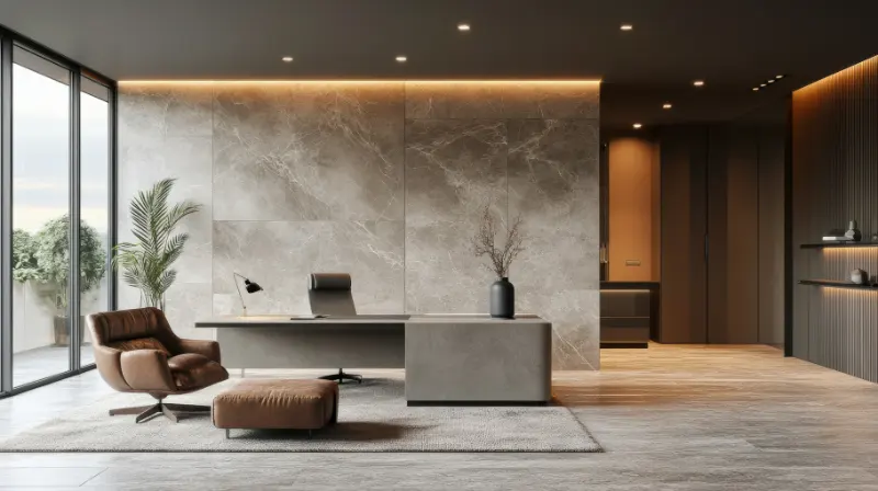
Texture in monochrome spaces does not need to be exotic; it just needs to be deliberate. Pair nubby with smooth, matte with sheen, hard with soft. A single-color kitchen gains depth when flat-front cabinets sit beside subtly veined stone, a honed metal faucet, ribbed glass and woven stools, all in variations of the same color temperature. The eye moves, but it never feels jarred.
Shape plays a similar role. Without multiple colors dividing your attention, the silhouette of each object becomes almost architectural. A curved sofa reads as more generous against linear window frames. A simple pedestal table in the same color as the floor suddenly looks sculptural because the monochrome treatment dissolves visual boundaries. When objects and planes share the same color, they merge and separate depending on the light, a kind of visual meditation that rewards longer looking.
Light itself becomes your secondary palette. One-color rooms shift character dramatically from morning to evening because they give light more power. A north-facing room painted in a cool gray might feel intellectual and calm during the day but turn somber at night unless you layer warm lamp light, dimmers and possibly a slightly warmer fabric story. In a south-facing room, a pure white scheme might verge on clinical at noon yet glow at dusk. This is why designers often cheat slightly within a monochrome approach, warming or cooling materials to correct what the natural light is doing.
Artificial light can subtly break the color monotony without sacrificing harmony. A warm linen shade over a lamp will cast a gentle cream tone across white walls, softening them. A frosted glass globe will give a diffused, almost cloudlike quality to the same surfaces. In darker monochrome spaces, like charcoal bedrooms or deep green studies, pools of light on artwork or a stone tabletop become their own kind of contrast, guiding the eye slowly through the room.
Keeping a One-Color Room Alive Over Time
A successful monochrome interior is not a frozen moment; it is a system that can absorb change. The risk with leaning into a single color is that a new object in a slightly off tone can suddenly feel like an error. The way around this is to commit not to a specific paint number but to a bandwidth.Think of your color as living along a spectrum with clear outer edges. In a tan-and-caramel room, you might allow yourself from pale oatmeal at the lightest end to almost coffee at the darkest. Anything wildly outside that range, like a cold blue-gray, risks feeling like visual noise. But a leather chair that leans a bit more orange or a stone bowl that veers slightly cooler can keep the space from feeling airless. The discipline is what makes the small deviations pleasurable instead of chaotic.
Patterns can live in monochrome interiors too, though they behave differently. A striped rug in two close shades of the same color will read more as texture from a distance, then reveal itself slowly as you approach. A floral wallpaper printed in matte ink barely darker than its background can transform a small powder room into a quiet surprise. Because the hues stay tight, the room remains calm, yet the pattern adds an undercurrent of energy.
Over time, one-color rooms benefit from seasonal micro-adjustments rather than constant reinvention. You might swap a wool throw for a lighter cotton in summer, trade heavier curtains for something gauzier or rotate a darker artwork into storage during brighter months. These changes are modest, but in a monochrome context they feel significant. The room breathes with your life instead of standing apart from it.
Finally, remember that you live in the room, not the concept. The stack of books on the side table, the green of a plant, the label on a favorite candle will add their own minor colors whether you plan for them or not. Rather than policing these intrusions, treat them as the equivalent of a musician occasionally bending a note. They make the composition feel human. A monochrome interior, at its best, is less about purity and more about quiet coherence, a backdrop that lets small moments of daily life register as the brightest colors in the room.