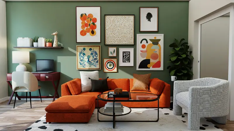
Why Muted Colors Feel Like a Deep Breath
Muted colors are the visual equivalent of an exhale. They are not a separate family of hues so much as ordinary colors with the volume turned down. Technically, a muted color is any hue that has been softened by adding gray, its complement, or a touch of black or white. The saturation drops, the edges blur, and our nervous system gets a very different message than it does from bright, high-intensity color.The human eye does not merely perceive color; it reacts to it. Highly saturated colors deliver strong, fast signals that increase arousal. Think of a stop sign red or a warning yellow. Muted tones, by contrast, carry less visual urgency. When saturation falls, edges and contrasts soften, and the eye moves more slowly across a room. That slower scan is part of what feels like calm. Your gaze glides instead of jolting from one focal point to another.
Our brains also carry a lifetime of associations. Muted colors tend to mirror the tones we encounter in the natural world when light is diffused. Overcast skies flatten bright blues into slate and steel. Forest greens are rarely as vivid as paint chips; they are veiled by shadow, mist, and distance. Sand, stone, lichen, bark: all are desaturated. These references to nature matter, because we are physiologically drawn to environments that feel like shelter, not spectacle. A room that echoes an overcast beach or a late-afternoon hillside will register as more restorative than one that mimics a billboard.
There is also the matter of contrast, which is as important as color itself. Strong contrast creates sharp boundaries: dark against light, complementary colors in their pure state, glossy next to matte. Our attention keeps snapping to the edges, which can be energizing, even thrilling, but not particularly restful. Muted palettes tend to compress contrast. The gap between the lightest and darkest tones narrows, and neighboring hues share a common softness. This is what gives a space that sense of being enveloped rather than pushed. Instead of individual objects shouting for attention, the room has a low, continuous murmur.
Yet calm does not mean bland. The most successful muted spaces are precise. Each color is chosen, not because it is neutral, but because it has a particular temperature, depth, and emotional timbre. A cool blue-gray can feel like distance and air, while a warm greige leans toward linen, clay, and candlelight. When you begin to read these subtleties, muted color becomes less a compromise and more a language for describing the mood you want to live inside.
Composing a Muted Palette That Still Has a Pulse
Designing with muted colors is less about avoiding bright shades and more about orchestrating relationships between tones, textures, and light. The first step is to decide what kind of calm you are after. There is quiet that feels like fog, and there is quiet that feels like sun-warmed stone. Both are muted, but they are not the same. If you picture your ideal room as a coastal morning, for example, you might lean into soft blue-grays, chalky whites, and stone-beige. If you imagine a still library, your palette might shift toward olive, tobacco, and ink softened with brown or gray.Once you have a mental atmosphere, look at saturation instead of just color name. Take the hue you are drawn to and imagine diluting its intensity until it no longer feels fluorescent on the wall. That might mean selecting a blue that looks almost gray until you place it next to true gray and suddenly the blue emerges. The most useful test is not the chip itself, but how it behaves under your light. A muted green in a showroom may turn muddy at home if there is little natural daylight, while the same green in a bright, south-facing room may look more vivid than you intended.
A muted palette benefits from subtle shifts rather than dramatic jumps. You might anchor a living room with a soft, putty-colored wall, then step a shade deeper for the sofa fabric and a shade lighter for the rug. Each element belongs to the same family, but the layering of tones creates depth. The eye moves through the space without ever feeling jarred, yet there is enough variation to keep the room from flattening into a single note. Think of it as a chord rather than a lone piano key.
Texture is where muted color comes fully alive. Because the hues themselves are quiet, surface becomes the stage. A grainy oak tabletop, a nubby wool throw, a matte ceramic lamp, a washed-linen curtain: all of these catch and disperse light differently. In a bright, saturated room, those nuances can be drowned out. In a soft, desaturated scheme, they become the primary interest. This is why minimalist interiors often feel rich rather than sparse when they lean on well-chosen muted materials. There is less to look at, but more to notice.
It can help to let one slightly stronger color act as a gentle heartbeat in the room. In a field of grays and creams, a dusty terracotta cushion or a muted indigo artwork provides a focal point that is still soft enough not to break the spell. The key is to keep even that accent color tempered. If the surrounding palette is low in saturation, a single pure, bright object will feel like a foreign body. Instead, choose an accent that has already been dulled a little, so it rises above the rest without shouting.
Making Muted Colors Work from Room to Room
Muted color schemes are most persuasive when they extend beyond a single room. Continuity from space to space allows the whole home to feel like one coherent thought rather than a series of unrelated ideas. That does not require every wall to be painted the same hue. Instead, you can carry a family of colors through the home, adjusting their depth and proportion as you move. A pale mushroom in the hallway might become a deeper taupe in the living room and reappear as upholstery or bedding in the bedroom.Function matters as much as aesthetics. In rooms meant for unwinding, such as bedrooms and reading corners, cooler muted tones often create a sense of distance and mental spaciousness. Soft blue-grays, pale sages, and silvery mauves recede visually, making the walls feel farther away. In social spaces like dining areas or kitchens, warmer muted tones can wrap people in a subtle sense of hospitality. Clay, sand, and warm gray carry a hint of firelight and food, especially when paired with natural wood and soft white.
Light will continually rewrite your colors through the day. Morning light can pull the green out of a gray; evening light can imbue beige with pink. Rather than fight those shifts, choose hues that you like in more than one mood. A good experiment is to place large swatches of your candidates on different walls and live with them for several days. Watch them under overcast skies, artificial light, and bright sun. Muted schemes are meant to be quiet companions; they should not surprise you every time the weather changes.
If you are worried about your home feeling too subdued, remember that calm does not rule out contrast. It simply asks for gentler versions of it. You can still contrast matte and gloss, rough and smooth, cool and warm. A chalky off-white wall against a slightly darker, satin-finished trim can feel as deliberate as a black-and-white pairing, only more forgiving. A pale oak floor with a deeper, smoked-oak table sets up a conversation within the same species of wood rather than a clash between extremes.
Over time, living with muted colors can change the way you notice the world. You may find yourself more attuned to the hundreds of variations of gray in a rainy street, or the difference between the beige of stone and the beige of sand. This is the quiet gift of a softer palette. It does not demand your attention, but it trains it, gently, toward nuance. In a culture that often equates brightness with vitality, muted colors offer another definition of aliveness: not a shout, but a steady, sustained hum you can actually rest inside.