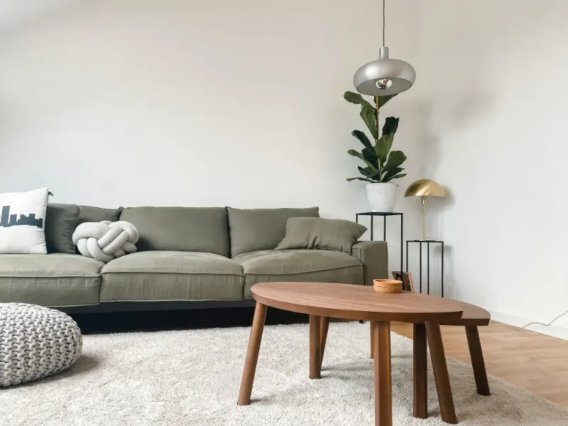
The Quiet Power of Patterns You Barely Notice
Pattern has a reputation problem. Many people hear the word and picture jittery wallpapers, dizzying tiles or upholstery that never quite sits still. Yet some of the most calming rooms rely not on flat, empty surfaces, but on patterns so gentle you almost miss them at first glance. These are the quiet naturals: wood grain, stone veining and the subtle weave of linen.
What they share is a kind of visual humility. Instead of demanding attention, they lend a room a soft background hum. The lines in a plank of oak, the mineral swirls in a slab of marble, the crosshatch of a linen curtain all offer information to the eye, but at a low volume. They are, in design terms, “low contrast and high character.”
To understand why these patterns don’t feel busy, it helps to think less like a shopper and more like a psychologist. The human eye is wired to scan for edges, contrasts and repetitions. High-contrast patterns with sharp boundaries and tight repeats flood that system with signals. Natural patterns are different. Their structure is organic, irregular and often directionally soft. Grain wanders. Stone veins taper in and out. Linen’s weave creates a grid that is present but slightly fuzzy, especially at a distance. Your eye can rest because nothing insists on perfect repetition.
There is also the matter of scale. “Busy” usually describes patterns that are small, insistent and repeated. A stone’s veining, on the other hand, is typically larger in scale, flowing across a countertop or fireplace in big, slow movements. Wood planks run the length of a floor or table; linen fibers read as a texture rather than a motif. You register movement, but as a single gesture rather than a chorus of little shapes competing for attention.
In a calm room, pattern is not the enemy. The real culprit is contrast without relief: loud graphics pressed against other strong gestures, with nowhere for the eye to land. Quiet naturals solve for this by delivering interest and depth while keeping contrast moderated and edges soft. They allow you to live with pattern the way you might live with a view of trees outside the window: always present, rarely tiring.
Once you start to recognize this quality, you can deploy it strategically. Instead of asking, “Is this patterned or plain?” you can ask the better question: “At what volume does this pattern speak, and how do I want the room to feel?”
Grain, Stone, Linen: Three Ways to Add Calm Complexity
Wood grain is often the first quiet pattern people bring home, sometimes without realizing it. A pale oak floor, a walnut dining table, even a simple plywood cabinet all carry lines that arc, knot and fade. The key to keeping wood serene rather than chaotic is alignment and tone. Long boards running in one direction read like a gentle current. Multiple short pieces laid in conflicting directions can start to buzz.
Color matters just as much. Close-to-each-other wood tones blend into a calm field; high contrast between very dark and very light boards makes the pattern pop. If you want a softer effect, think of grain as a single neutral color that happens to have a bit of movement. Lighter stains with matte finishes tend to recede, while glossy surfaces sharpen every line of the grain and throw reflections into the mix.
Stone offers a different kind of natural pattern, more overt but still capable of great subtlety. Marble, quartzite and even concrete can add what might be called “structured randomness” to a space. Large, sweeping veins feel like brushstrokes; tiny, speckled aggregates resemble a night sky. To avoid busyness with stone, two aspects are crucial: veining intensity and surrounding context.
If the stone itself is dramatic, let it be the star on a stage of quiet surfaces. A heavily veined countertop against plain cabinet fronts and simple hardware feels luxurious but composed. Echo that same bold stone again on the backsplash, on shelves and on the island sides, and the room can start to vibrate. By contrast, a honed, lightly speckled stone can appear almost solid from a distance, revealing its character only at arm’s length. This delayed discovery keeps a space from feeling overloaded while still rewarding closer attention.
Linen weave is perhaps the softest of the three, and the easiest to live with near the body. Unlike printed fabrics, linen’s pattern is structural: the warp and weft themselves create a quiet grid. Under daylight, that grid catches and scatters light, which is why a sheer linen curtain can glow without looking glossy. On a sofa or bed, linen’s irregular fibers and slight slubs add a sense of ease and imperfection that reads as human rather than mechanical.
Here, the main decisions are weight and color. Pale, midweight linen in off-whites, stone grays or sandy beiges will show just enough weave to feel alive but not so much that the surface looks restless. Darker linens emphasize texture and can become a statement, especially under directional light. If you layer several linens in one room, let them share a similar tonal family so the different weaves harmonize instead of competing.
Designing Rooms That Breathe Instead of Buzz
Working with natural patterns is less about strict rules and more about rhythm. Think of your room as a piece of music: you need both melody and rest. Grain, stone and linen weave can be the melody lines, while flatter surfaces are the quiet pauses in between. The balance you strike will determine whether the room feels meditative or overcaffeinated.
One practical way to test this is to squint at the space, in person or in a photo. When you blur the details, you should still see large, calm zones of similar tone, with a few areas of movement. If every surface breaks into small, active shapes even when blurred, you likely have too many attention-seeking patterns in play. Reduce contrast, simplify one element and let one natural pattern take the lead.
Light is another quiet collaborator. Directional light across a wood floor exaggerates grain but also reveals its warmth. Soft, diffuse light through linen curtains turns the weave into a gentle haze. Overhead spotlights on a veined stone backsplash highlight every swirl. Adjusting where and how you light these surfaces can dial their presence up or down without changing a single material.
The most successful use of natural patterns tends to follow a simple ethos: “real over loud.” Materials that reveal how they are made or formed in nature bring an undercurrent of calm, even when they are visually complex. A home rich in subtle grain, soft veining and honest weave does not read as decorated in the formal sense. It feels, instead, like a place that has settled into itself, where the eye can wander, find details and then rest again.
In the end, designing a space that is both interesting and soothing is less about subtracting pattern and more about choosing the right kind. Natural patterns that do not feel busy give you a way to live among layers of visual information without feeling crowded by them. They invite you to notice, then to breathe, and that rhythm can quietly shape how it feels to be at home.