
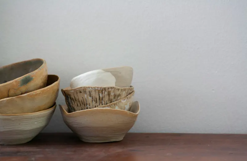
The quiet power of neutral walls
Walk into a room wrapped in calm, and you usually feel it before you can explain it. The furniture may be simple, the light may be kind, but often the most decisive element is hanging at eye level. Neutral wall art, stripped of loud color and high drama, works like a gentle soundtrack for the room: always present, rarely demanding attention, quietly shaping how you feel.“Neutral” in design is frequently misunderstood as a non-color, the absence of personality. In practice, it is the opposite. Whites, creams, sands, mushrooms, stones, grays and soft charcoals all carry temperature, mood and memory. They recall plaster and linen, clay and weathered wood, mist and cloud. When you place these tones on your walls, you are not choosing nothing; you are choosing atmosphere.
The key is to think in terms of temperature and depth rather than a strict palette. A cool dove gray abstract over a cool white wall will feel different from a warm oatmeal landscape on an off-white backdrop. One leans toward gallery stillness, the other toward reading-nook softness. If your walls already skewer warm, subtle taupes and sand-colored pieces will nestle in naturally. If they are crisp white, smoky grays and soft blacks bring contrast without sacrificing calm.
Texture, too, plays an outsize role. In the absence of saturated color, our eyes become acutely aware of surface. A chalky matte painting, a slightly raised canvas, a deckled paper edge under glass, a linen mat board: all of these generate quiet visual interest. The room feels layered rather than flat, tranquil but not blank. That is the distinction between “calm” and “empty.”
To keep neutrals from sliding into monotony, introduce a spectrum within the same language. Imagine a wall where a pale clay-toned photograph hangs beside a charcoal line drawing and a soft beige wash on raw linen. None of these compete, but they relay from light to dark, smooth to rough, delicate to bold. The eye travels. Your nervous system does not spike.
Ultimately, neutral wall art is less about a strict list of approved colors than about deciding what you do not want the art to do. If your goal is serenity, you are choosing pieces that support the room rather than dominate it, that speak at the volume of a low conversation instead of a shouted announcement.
Composing a calm visual rhythm
Once you accept that neutrals can be expressive, the question becomes how to arrange them. Calm does not mean static. A neutral gallery wall, if composed with intention, can feel as alive as a collection of bold paintings, just with its edges softened.Start by considering the architecture. Long, uninterrupted walls invite a horizontal rhythm: two or three large works spaced evenly, like pauses in a line of poetry. Narrow walls or spaces between windows lend themselves to vertical pairings, a tall print over a shorter one, echoing the lines of the room. Neutral art thrives when it feels integrated with these proportions rather than floating without context.
Scale is your next quiet instrument. A single oversized neutral piece above a sofa can act as a visual exhale, turning the wall into a field of calm. Multiple smaller works, on the other hand, create a slower read: your eye moves from one frame to the next, like turning pages. The room can handle both approaches, but each sets a different tempo. If your furniture already has intricate lines or busy upholstery, larger, simpler art will bring welcome stillness. If your furnishings are streamlined and minimal, a cluster of small neutral pieces can prevent the space from feeling overly austere.
Within that framework, think of repetition and variation. Repeating one element, such as black frames or cream mats, knits the arrangement together. Varying another, such as subject matter or degree of abstraction, keeps it alive. You might pair a soft, foggy landscape with a precise architectural photograph and a loose gestural sketch. All are neutral in color, but their different forms and textures keep the wall from dissolving into sameness.
Negative space is as important as the art itself. In a calm room, your eyes need places to rest. Leaving generous breathing room around each piece makes the wall feel thoughtful instead of cluttered, even when you have several works. The gaps between frames become part of the composition, the visual equivalent of white space on a page.
Finally, notice how light interacts with your choices. Neutrals are particularly sensitive to daylight. A warm beige print may glow golden in a west-facing room, while a cool gray abstract can become almost silvery in north light. In the evening, a shaded lamp casting a pool of soft illumination over textured canvas can turn a simple neutral piece into a quiet focal point. When you choose and place art with these shifts in mind, the room changes gracefully with the hours rather than snapping from one mood to another.
Letting neutral art reflect you
The danger with any restrained palette is that it can slip into imitation: another beige grid copied from an image that flashed past your screen. To avoid that, it helps to remember that neutral wall art is not a style in itself but a vehicle for your own stories, edited down to a softer register.Ask what you want the room to hold for you. Rest, focus, conversation, a sense of spaciousness. Then choose neutral works that hint at those states. A blurry photograph of distant water might stand in for the daily walk you rarely take. A minimal ink drawing could echo the feeling of a favorite poem. A field of textured plaster might remind you of a place you once lived, even if no one else can name it.
You can also soften pieces you already love into a calm scheme by paying attention to context. A slightly colorful artwork surrounded by neutral companions will read quieter than it does alone. A warm-toned photograph in a simple white frame with a wide mat can sit comfortably in a mostly neutral room, the mat acting as a buffer between the image and the wall. The goal is not to strip your home of color, but to allow neutral art to be the ground against which your more personal flashes of saturation appear intentional rather than accidental.
As you live with the pieces, you will notice that their subtlety leaves room for your life to be the main event. Books arrive, textiles change, plants grow and retreat, and the neutral art remains steady, reinterpreted by each new layer. In that sense, calm wall art offers a kind of design humility. It does not try to finish the room once and for all. Instead, it opens a quiet, flexible backdrop you can keep returning to, adjusting and refining until the space feels like a gentle extension of your own breath.
Standing back from a well balanced wall of soft tones, you sense not emptiness but a deliberate pause. The colors of your day, in all their noise and urgency, have somewhere to land and soften. That is the real work of neutral wall art in a home: not to impress, but to make it easier to be there.










