The quiet side of color trends
Color trends used to arrive like seasonal fashion: loud, insistent, and gone before the paint dried. Today’s most popular interior palettes are softer around the edges. Even in bolder hues, there is an unmistakable turn toward what designers call "livable color"—shades you can sit with for years, not seasons.
The desire is not merely to impress a guest at the entry, but to calm the nervous system after a long day of scrolling and commuting. When color is handled gently, it stops being a performance and becomes a backdrop for ordinary life: reading on the sofa, chopping vegetables, listening to the washing machine in the next room. The task is not to chase every trend, but to understand why these colors feel good now and how to bend them toward your own temperament.
A calm home does not mean a colorless one. It simply means that saturation, temperature and contrast are deliberately tuned. Think of your rooms as a sequence of breaths: some deeper, some quieter, all linked. As you consider what is fashionable, it helps to ask a more private question: what colors make you exhale?
Soft neutrals, warm woods and the new "quiet base"
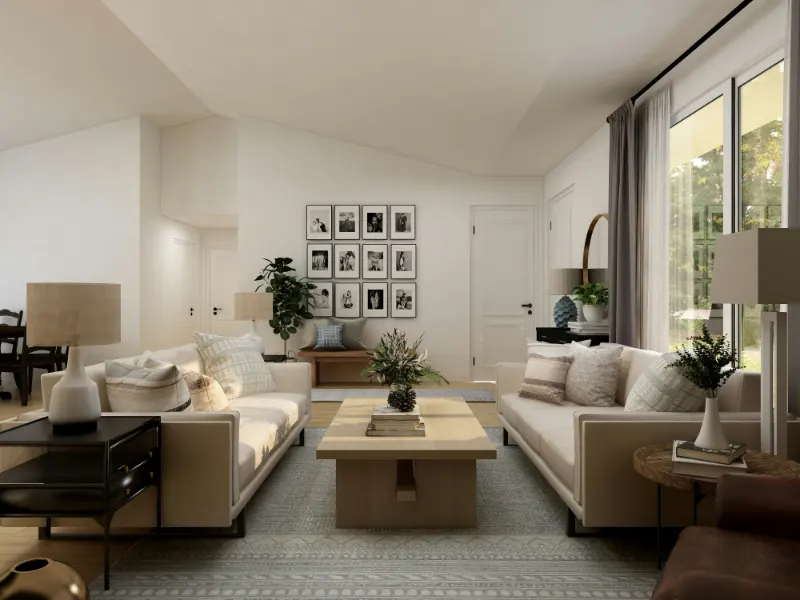
The strongest trend is actually the softest: warm, nearly weightless neutrals replacing the sharp whites and cool grays that once ruled renovation shows. Instead of chilly blue-gray walls, people are gravitating toward "mushroom," "linen" and "bone"—those not-quite-white tones with a drop of brown, pink or yellow that make skin, artwork and furniture appear more forgiving.
Why the shift? Cool grays looked sleek in photos but often felt thin in real life, especially under evening light. Soft neutrals absorb and scatter light in a kinder way. They blur the edges of a room slightly, making corners feel less strict. Psychologically, they act more like the background of a landscape than a smartphone screen: something you can look past without strain.
To use these neutrals calmly, think of them as a canvas, not the painting. Start by noticing the light in your space. North-facing rooms can handle creams with a hint of yellow or peach, which correct the natural coolness. Sun-drenched spaces do better with neutrals that lean a touch gray or beige, so the room does not overheat visually. The goal is to have the walls feel like a gentle fog rather than a spotlight.
Warm woods are the other half of this quiet base. Honey oak, walnut and even red-toned timber are returning, but they look calmer when the surrounding palette is softened. If your floors are already a strong color, do not fight them. Instead, echo their warmth with a wall shade that has the same undertone at a much paler intensity. This repetition lets the eye rest, as if the room is speaking in one language rather than several dialects at once.
You can still introduce contrast, but keep it low to medium rather than extreme. A soft beige wall with slightly darker putty trim feels snug without becoming muddy. The absence of hard edges is where the calm lives. Even black can appear gentle if it is used in slender doses—window frames, a lamp base, a picture rail—like punctuation in a paragraph, not a headline shouted across the room.
Earth tones, muted blues and the art of restrained drama
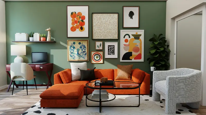
Beyond the flexible neutrals, two families of color are especially popular: earth tones and softened blues and greens. They appeal for opposite reasons that happen to be compatible. Earth tones—terracotta, clay, ochre, rust—pull us downward, closer to the ground. Muted blues and greens pull our focus outward, toward sky and water. Used calmly, they create rooms that feel both rooted and expansive.
The risk with earth tones is heaviness. On a paint chip, a cinnamon red may look delicious; on four walls, it can feel like living inside a cupboard. To keep these colors tranquil, reduce their saturation and surface area. Consider using a mid-tone terracotta only on lower cabinets, a single accent wall, or even just the backs of open shelves. Let it be a warm ember in a mostly neutral fireplace. Surrounding it with pale, warm walls and natural textures—linen, rattan, unglazed pottery—tempers the drama without erasing its character.
Muted blues and greens, meanwhile, are the current darlings of bedrooms and kitchens. The calm comes from choosing versions with a bit of gray or brown mixed in: "blue-gray," "sage," "eucalyptus" rather than nautical navy or highlighter teal. These misted-down hues behave almost like a neutral, especially if you repeat them in textiles and art rather than relying on the wall color alone to carry the mood.
One useful way to decide where to put color is to imagine movement through your home as a gradient. Entry and circulation spaces can be the lightest and most neutral, like a deep inhale. As you move into more private or lingering rooms—the dining area, the den, the bedroom—the colors can deepen slightly, like the breath leaving your body more slowly. This progression makes bolder shades feel intentional, not abrupt.
There is still room for restrained drama. A deep wine-colored dining niche, a midnight blue powder room, an olive-green bookcase can bring a sense of enclosure that feels almost meditative, provided the adjacent spaces remain calmer. The eye needs places to rest between these moments, the way a gallery gives you white walls between paintings.
Ultimately, using popular color trends calmly is less about obeying a palette and more about listening to your own pulse in a room. Color is not just seen; it is felt in the shoulders, in the pace of your breathing. Trends can introduce you to shades you might not have considered, but the real work is in editing: dial down the saturation, soften the contrast, repeat a few hues throughout the home. When the colors start to feel like variations on a theme rather than competing songs, you will notice something subtle. You stop thinking about the paint at all, and simply feel at home inside it.