
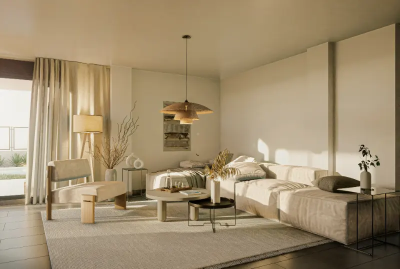
The quiet drama of sand and beige
Beige has a public relations problem. For years it has been shorthand for the generic rental, the "landlord special" wall that exists mostly to offend no one. Yet when you walk into a genuinely luxurious space, it is often built on the same family of sand, stone and camel tones. The difference is not the color itself but how intelligently it is used.Neutral palettes are like whispering; you notice every nuance. With fewer distractions, your eye registers the temperature of a beige, the depth of a shadow, the grain in a piece of oak. Get those nuances wrong and the room feels flat. Get them right and the space takes on what designers call "quiet luxury"—a sense that everything has been considered, but nothing is shouting.
Luxury in a neutral room rarely comes from adding more things. It comes from precision. The particular warmth of a sand tone that flatters natural light; the decision to make trim and walls nearly the same shade, so edges blur; the way a linen sofa and a wool rug in almost identical beiges create a soft topography of texture rather than a single note of color. When you begin to treat beige less like a default and more like a material—something as specific as oak or marble—you unlock its richness.
The first step is to understand what kind of sand you are working with. Not the vague "greige" on the paint chip, but the undertone, the way it behaves in your actual light, and the role it is meant to play in the room. From there, you can start building a palette that feels like a considered landscape rather than a paint store aisle.
Choosing the right sand: undertones, contrast and light
Every beige leans somewhere. Some carry a yellow or honey undertone, which reads sunny and informal. Others shift pink or peach, which can give warmth to north light but turns saccharine under certain bulbs. There are cool beiges with a gray cast, which can feel architectural and calm but easily tip into drab on an overcast day. Luxury is rarely about the most expensive option; it is about the version that is precisely right for the context.Think first about your daylight. In a north facing room, colors already skew cooler. A sandy beige with a whisper of warmth can counterbalance that and keep the room from feeling like a waiting room. In a south facing room, sunlight is generous and a touch golden, so a more neutral or slightly gray beige can keep everything from drifting into sepia. East light is crisp and flattering in the morning but flat later; west light can be harsh and orange at sunset. In both, you can often get away with subtler undertones, because the personality of the light will be doing a lot of work.
Then consider what your beige is sitting next to. Put a sample next to your flooring, not just your white paper trim. A sandy beige with a green undertone might look sophisticated alone and suddenly sickly alongside an orange oak floor. Luxury arrives in the moment you notice that misalignment before you commit, and adjust the undertone so wall and floor feel like they are part of the same story.
Contrast is the other tool that prevents a sand palette from sliding into monotony. If everything in the room is the same mid tone beige, nothing has hierarchy. Luxury spaces tend to layer a spectrum of values: pale almond walls against a deeper caramel sofa, a stone colored rug under a slightly darker oak coffee table, a rich camel throw that anchors the bed. You are still working within sand and beige, but you are building in depth the way a painter adds shadows and highlights.
Even your whites deserve scrutiny. A stark cool white trim can make an elegant beige look dingy by comparison. Many high end interiors deliberately choose a warmer, softer white for ceilings and moldings so the transition between colors feels blurred, like a filter over the whole space. The room reads cohesive and gentle rather than chopped up by bright outlines.
Layering materials, texture and detail so beige feels expensive
Once your undertones and contrasts are sorted, the work becomes more tactile. If color is relatively quiet, everything else has to speak a little louder. Texture is where sand and beige palettes become indulgent rather than austere.Imagine a living room where the walls are a warm limestone beige. The sofa is upholstered in a nubby linen not far from the wall color, so it feels calm rather than high contrast. On the floor, a wool rug in a slightly cooler stone tone adds a denser softness underfoot. A suede pillow in a richer camel anchors one corner of the sofa; another in a fine ribbed velvet catches the light. None of these elements are far apart on the color wheel, but the differing textures ask to be touched. That sensory invitation is a hallmark of luxury.
Materials with a natural origin tend to make beige feel intentional. Pale oak, travertine, jute, linen, wool, clay, even limewashed walls, all carry slight variations and imperfections that keep a neutral room from feeling synthetic. When you repeat those materials in different forms—a limestone lamp base echoing the tone of a ceramic bowl on a sand colored sideboard—you create a kind of visual rhythm. The room feels curated rather than matched.
Metal finishes do quietly theatrical work in a sand palette. The right brass, especially when it is brushed or aged rather than mirror bright, reads like jewelry against beige. It warms without adding another color, and its reflectivity plays with whatever light the room has, creating tiny moving highlights on handles, lamp stems and table edges. Black metal, used sparingly in picture frames or a floor lamp, can add the slightest graphic outline so the room does not dissolve into softness. The key is restraint; too much black and the eye clings to it instead of drifting through the beiges.
Art and objects become even more important when color is dialed down. In a sand and beige space, one well chosen ceramic with an irregular glaze on a console can do more atmospheric work than a dozen mass produced accessories. A large scale photograph in muted tones can provide an anchor without disturbing the calm. When you do introduce stronger color—a single deep indigo cushion, a sprig of greenery in a stone vase—the impact is heightened against the otherwise neutral field. The room feels composed rather than timid.
The final layer is how you use light itself as a material. Overhead lighting alone tends to flatten beige, making it look like background. Multiple low and mid level lamps, with warm bulbs and soft shades, turn sand tones into something closer to candlelight. Light grazes across textured plaster, catches the pile of a wool rug, and creates gentle shadows in linen drapery. In that glow, beige stops being a compromise choice and becomes the medium that holds the atmosphere together.
In the end, making sand and beige feel luxurious is an exercise in paying attention. To undertones, to neighboring materials, to the way light moves during the day. Neutrals reveal both laziness and care with equal clarity. When you give them the latter, they reward you with a home that feels composed, calm and quietly expensive, even if the ingredients are simple.










