The Quiet Logic Behind Scandinavian Warmth
Scandinavian decor is often summarized as "white walls, wood floors, and a sheepskin thrown over a chair." That shorthand misses the deeper logic of a style shaped by geography, darkness, and a culture that takes everyday life seriously. The north spends long months in low light, so interiors are treated as emotional infrastructure. A room is not just seen, it is lived in for many hours of the day. Design is expected to work like good winter clothing, wrapping people in a layer of practical calm.At its core, Scandinavian design is about reducing visual noise so that human presence becomes the focal point. That is why surfaces are usually clear, colors are quiet, and objects earn their place. The goal is not minimalism in a gallery sense, but a kind of domestic editing. You keep what supports comfort, light, and connection, and let the rest fall away. In this way, the decor becomes a background hum that steadies the mood rather than pulling at your attention all day.
This approach has a psychological effect. Fewer competing colors and shapes make it easier for the eye to rest, which subtly nudges the nervous system toward ease. You might not notice this immediately, but you feel it when you come home on a gray evening and the space does not shout. Scandinavian decor is less about impressing visitors and more about quietly looking after the people who live there every day.
Understanding that emotional intent is the first step to applying the style at home. Before you think about what to buy, notice how your rooms currently make you feel at different times of day. Does a corner feel agitated because every surface is carrying an object? Does a wall feel oddly flat because it has nothing that reflects your taste or memories? Scandinavian design would treat those reactions as valid information, clues that help you edit the room toward a calmer baseline.
Color, Light, and the Art of Calm Contrast
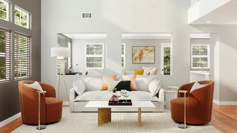
In Scandinavian decor, color is handled almost like lighting: carefully, sparingly, and with attention to how it shifts over the day. White or very pale walls are common not for fashion but for function. They bounce scarce daylight around a room, softening edges and making interiors feel a little less at the mercy of the northern winter. Even in sunnier climates, this strategy can turn a small or shaded room into a more expansive, breathable space.The palette usually begins with a foundation of neutrals: white, off white, soft gray, and natural wood tones. This base acts like silence in music, a background that lets every other note register more clearly. Within that quiet field, color becomes more intentional. A single dusty blue throw or a muted rust colored cushion reads as an event rather than one more item in a chaotic chorus. That contrast, between calm ground and focused accent, is one of the defining moves in Scandinavian interiors.
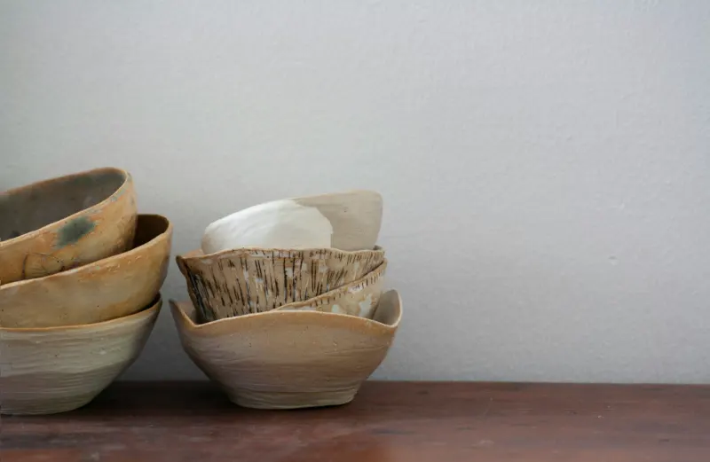
Material color plays an equally important role. Blond woods such as birch, ash, or oak bring a gentle warmth that offsets all the pale walls. Linen, wool, and ceramics have their own subtle hues, slightly irregular and therefore human. The combination prevents the room from feeling sterile. Smooth surfaces like glass or lacquer are usually balanced with something tactile, such as a wool rug or woven basket, so that the eye and hand both find something to rest on.
Art slips into this color story with quiet confidence. Scandinavian decor rarely treats walls as blank backdrops for dramatic statements. Instead, pieces are chosen with a sense of rhythm and mood. A landscape in soft grays and blues can echo the light outside the window. A simple line drawing in black on white can act as a visual pause in a room of soft tone on tone textures. Even bolder abstract works are often limited to a few colors, allowing them to energize the space without overwhelming it.
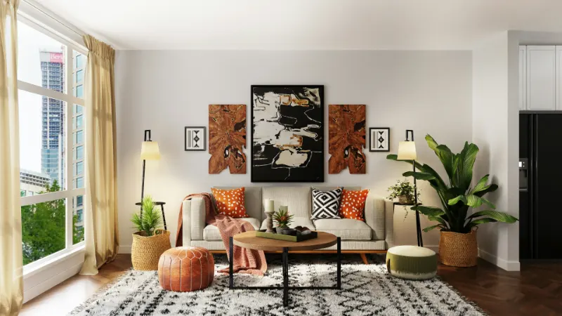
Scale and placement are part of the mood making. Hanging one large, calm piece above a sofa can anchor a living room much more effectively than scattering many small frames around the space. Similarly, a small artwork placed low above a reading chair can invite you closer and subtly mark that area as a retreat. Scandinavian decor uses these moves to guide how you move, sit, and linger, almost like gentle choreography written in color and line.
Designing Rooms That Feel Like They Breathe
A Scandinavian interior succeeds when it feels like it can inhale and exhale. That sense of breath comes from how space, objects, and light relate. One of the simplest techniques is to introduce intentional empty areas. Leaving a section of wall bare next to a gallery of prints or keeping the top of a cabinet largely clear creates a visual exhale. Those spaces of "nothing" allow the "something" nearby, whether a ceramic vase or a framed print, to feel meaningful rather than lost in clutter.Furniture arrangement also contributes to the mood. Pieces are usually pulled slightly away from walls, with clear pathways that do not require zigzagging around obstacles. This openness changes how the room feels at floor level, especially important in a style that encourages sitting low on rugs, cushions, or simple lounge chairs. A compact sofa with slender legs and a light wood frame visually occupies less weight than a bulky, overstuffed piece, letting light circulate beneath and around it.
Light itself is layered. Overhead fixtures are often simple, even understated, but they are supported by table lamps, floor lamps, and candles that create pockets of glow. Rather than flooding the room with a single bright source, multiple softer lights shape zones: a warm circle around a reading chair, a gentle pool over a dining table, a low flicker on a windowsill in the evening. This is how the abstract idea of "hygge" becomes tangible, not through accessories alone but through how light touches surfaces and faces.
As you work toward a Scandinavian inspired space, notice how small adjustments shift the emotional temperature. Removing one piece of furniture might make a corner suddenly usable. Swapping a busy rug for a quieter one could let the artwork above it speak more clearly. Adding a single plant in a simple pot might be enough to bridge the indoor world with whatever landscape lies beyond the window. The style is not a fixed set of rules but an ongoing tuning process.
In the end, Scandinavian decor is less about copying a look from a photograph and more about adopting its priorities. It asks you to value light, comfort, and clarity, to choose colors that keep you steady, and to live with art that can hold your gaze on an overcast afternoon. When you treat your home as a place that should genuinely support your days rather than just decorate them, you are already thinking like the designers who shaped this quiet, enduring approach to living.