The quiet logic behind Scandinavian interiors
Scandinavian interior style did not begin as an Instagram trend. It grew out of a simple problem: long, dark winters in small homes where every square foot had to work hard. The result is a design language that feels both calm and intensely practical, a way of arranging space so light, air and everyday objects all share equal importance.At its core, Scandinavian style is about stripping away visual noise so that the ordinary becomes quietly beautiful. A plain ceramic cup on a pale wood table, a wool throw over a clean-lined sofa, a shaft of afternoon light against a white wall: these small scenes matter as much as any statement piece. When you design with this kind of attention, home becomes less about decorating and more about orchestrating how you want to live.
Function sits at the center. Furniture is chosen not just for aesthetics but for what it allows you to do more easily, whether that is reading, gathering, working or resting. Yet the spaces rarely feel hard or clinical. Warmth comes from texture, from natural materials, from the soft edges of a sheepskin or the hand of linen under your palm. The restraint in form is what allows those tactile notes to speak more loudly.
To begin thinking in this way, imagine reducing every room to what you truly use and love. Then ask what can be simplified. Handles become linear, storage becomes integrated, surfaces clear. Instead of filling empty corners, you protect negative space as part of the composition. That empty stretch of floor or blank wall is not something missing; it is a pause in the visual rhythm of the room, a place for the eye to rest.
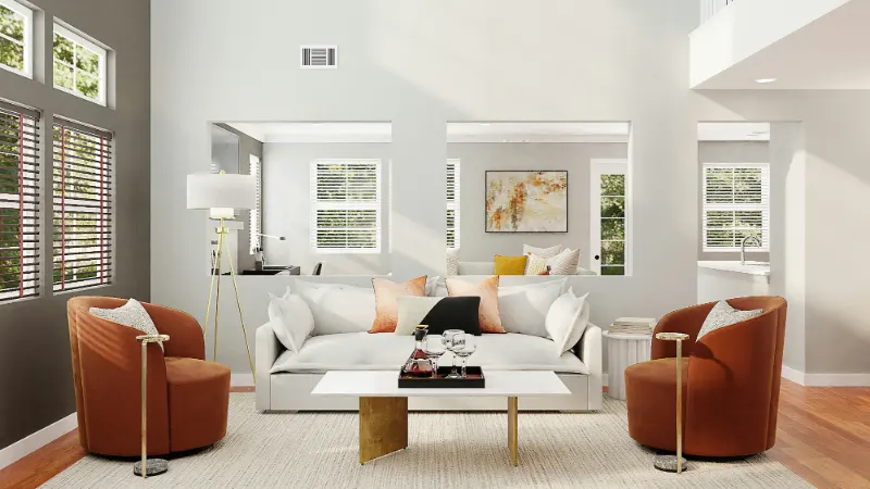
Light is treated as a material. With limited daylight in Scandinavian latitudes, interiors were historically designed to catch and bounce every possible ray. That is why you see pale floors, white or near white walls and low, wide furniture that does not block windows. In your own home, even if the climate is different, you can borrow this priority by asking how each piece either frees or obstructs light. A glass-topped table, a leggy chair instead of a skirted one, a curtain that filters instead of smothers: each decision opens the room further.
There is also a quiet democracy in the style. High design coexists with simple, accessible pieces. A classic chair might share the room with a basic pine stool; a sleek sofa might sit beside a rough woven basket. The harmony comes from shared honesty of material and clarity of line, not from price. In a sense, Scandinavian interiors invite you to care less about status and more about whether an object earns its place by being both useful and beautiful.
Key elements you can actually live with
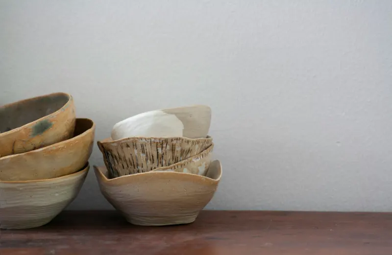
Several recurring elements define Scandinavian interiors, not as rigid rules but as a toolkit you can adapt. The first is clean, unfussy furniture with evident structure. Legs are visible; shapes are often rectangular or gently rounded; ornament is minimal. Instead of hiding how something is built, the joinery and proportions are allowed to show. When choosing pieces, look for those that feel visually light, as if air can move around and under them.The second element is natural material, especially pale woods such as ash, birch and light oak. These woods are often left with a matte or soaped finish, so the grain remains visible and the surface feels soft rather than glossy. Introducing even one such piece, like a light wood dining table or a simple bench, can shift the entire tone of a room toward Scandinavian calm. Layer it with other honest materials: wool, cotton, linen, leather and unglazed ceramics. The idea is to let touch enrich what the eye already understands.
Clutter control forms another pillar of the style, but it is less about strict minimalism and more about editing. Everyday objects are either tucked into unobtrusive storage or displayed in deliberate, small constellations. A single shelf might hold a short stack of books, a bowl and a plant, spaced so that each item can breathe. The gaps are as important as the objects. To apply this, experiment with removing half of what currently sits on your surfaces and notice how the remaining pieces gain presence.
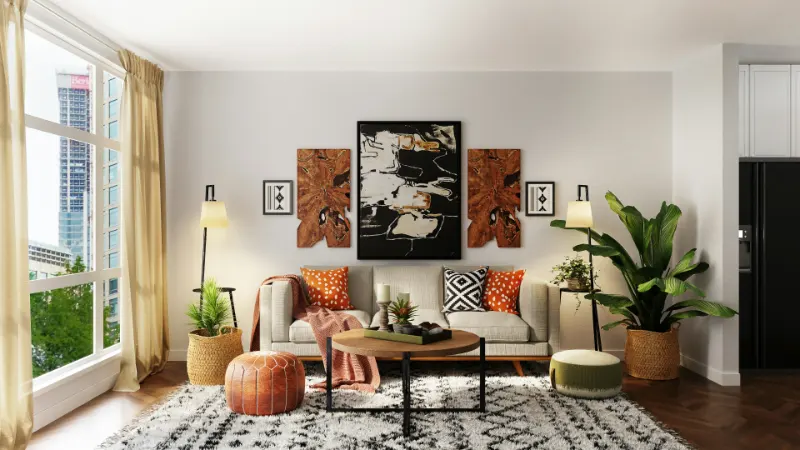
Pattern and decoration do appear, but they take a measured role. Small-scale geometrics, subtle stripes and nature-inspired prints tend to dominate, usually in a narrow palette. A cushion with a simple graphic motif or a rug with soft, repeating lines can add character without overwhelming the room. The patterns often echo the logic of the architecture: linear floorboards, rectangular windows, the rhythm of ceiling beams. This repetition keeps the eye moving gently rather than bouncing in all directions.
Plants provide a necessary sense of life. A single tree in a pot, a trailing vine, a glass jar with a single branch all introduce organic shapes that contrast with the rectilinear furniture. Instead of filling every sill, choose a few generous gestures. One small tree by a window can shift the whole mood of a room, especially when its leaves catch the light and cast moving shadows over the very stillness that Scandinavian interiors prize.
Finally, textiles perform quiet but crucial work. A wool rug underfoot, a sheepskin draped on a hard chair, linen curtains that glow when the sun passes through: these elements slow you down. They invite the body to relax and keep the room from sliding into austerity. If your space currently feels cold, introduce one rich, tactile textile at a time and allow it to anchor a corner or conversation area.
The Scandinavian color palette as atmosphere
The color palette that supports Scandinavian interior style is often described as neutral, but that word can be misleading. These are not anonymous colors; they are carefully tuned to capture light, to flatter natural materials and to create a lasting sense of calm. Think of the palette less as a set of paint chips and more as an atmosphere you are composing.Walls usually sit in the realm of white, off white or very soft gray. The point is not starkness but reflectivity. A warm white with a hint of beige can make a north facing room feel gentler, while a cooler white can keep a sunny space from feeling too yellow. When you choose a wall color, test it at different times of day and ask whether it still feels soft when the light is weakest. That is the true test of a Scandinavian friendly hue.
The base of the palette extends through pale wood tones and light stone. Floors are often in blond wood, which bounces light upward and visually expands the room. If you have dark floors you cannot change, you can still borrow the effect by using large, pale rugs to create islands of brightness. Around this base, grays, taupes and soft browns provide gentle contrast, echoing stones, bark and earth rather than urban concrete.
Color accents tend to be muted rather than saturated: dusty blues, blue grays, soft greens, rose beige and the occasional mustard or clay. These colors appear in textiles, art and small objects rather than wide swaths of wall. Notice how many of them draw from nature: the gray of a sea horizon, the green of moss, the pink of late afternoon light on a building. This link to the outdoors helps the interior feel grounded instead of purely styled.
Black or very dark tones have a specific role: they provide structure and punctuation. The thin black line of a lamp, a dark picture frame or a charcoal metal chair leg can keep a room of pale tones from floating away. The key is moderation. Think of these dark notes as the visual equivalent of ink on a page: they outline and clarify but do not dominate. A single dark object in each view is often enough to create balance.
When composing your own Scandinavian palette, start from what you already own. A light wood table, a gray sofa, a collection of white dishes: these can all form a quiet foundation. Then choose one or two accent colors you genuinely enjoy living with and repeat them across the room in different textures rather than introducing a new hue for every object. A soft green cushion, a similar green in a print on the wall and a plant in that same color family will feel cohesive without shouting. Over time, you can continue to edit, slowly guiding your home toward a place where color supports rather than competes with the calm, functional beauty at the heart of Scandinavian interior style.