Why Seasons Belong Inside Your Home
Color in a home behaves a bit like weather: always present, quietly shaping how you move, think and rest. When you borrow from the rhythm of the seasons, you gain a subtle but reliable framework for choosing hues, editing decor and knowing when a room is asking for more light or more depth. Seasonal color palettes are less a strict rulebook than a way of noticing. They invite you to ask what the world outside your windows is doing, and to echo that feeling indoors in a way that fits your own temperament and architecture.
Designers have long used the language of spring, summer, autumn and winter to organize color. Each season has recurring visual cues: the soft greens of new growth, the hazy blues of high heat, the burnished golds of falling leaves, the sharp contrasts of winter light. Translating those cues into paint, textiles and objects is not about copying nature literally but distilling its atmosphere. You are trying to bottle what it feels like to walk through a park in April, sit on a porch in August, crunch through leaves in October or watch snow reflect the late afternoon sun.
The first step is to notice how color interacts with orientation and light in your home. North-facing rooms tend to read cooler and flatter, welcoming warmer undertones from spring and autumn palettes. South-facing rooms flood colors with brightness, which can be balanced by the restrained sophistication of summer and winter schemes. Morning light makes yellows and soft greens feel buoyant, while late afternoon sun deepens terracottas and burgundies. Instead of choosing colors in isolation, you are in quiet collaboration with the sun’s path.
There is also the reality of longevity. Most people do not repaint four times a year, and they do not need to. The seasonal approach works best when you make a few stable decisions, such as wall colors and large furniture, and then layer in movable accents that can shift as the calendar does. Think of it as building a neutral musical score and improvising seasonal notes on top. The walls and big pieces remain the steady rhythm section; textiles, art and small objects create the changing melody that suggests spring freshness or winter calm.
Crucially, a seasonal palette is not a costume. A home that slavishly imitates the clichés of each season tends to feel more like a themed hotel than a place you inhabit daily. Instead, work with what you already own and what you are emotionally drawn to. If you naturally love cool blues, you can still evoke autumn by pairing them with inky browns and brass rather than forcing yourself into pumpkin orange. The point is to understand why certain combinations feel right at certain times, then adapt them to your own visual DNA.
Reading Each Season as a Palette
Spring, in color language, is about clarity and lightness. Think of tender greens, soft yellows, coral pinks and milky whites. These hues have a touch of warmth and a sense of air between them, which makes them ideal for waking up spaces that feel heavy after winter. You do not need to lean into sugary pastels; even a bowl of green pears on a pale wood table, or a linen throw in a muted blush, can bring that sense of new growth. In rooms where the light is scarce, spring tones can help surfaces feel less dense and more breathing. They carry a psychological suggestion of possibility, which is powerful after months of grey.
Summer palettes, by contrast, are more diffused. Colors seem slightly faded by the sun: think of sea glass blues, soft khaki, sandy beige, shell white and the deep green of mature foliage. There is a comfortable softness to this season’s palette, as if edges have been sanded down by heat and time. Bringing summer inside often means lowering visual contrast and letting adjacent colors sit closer in value, which creates a calm, expansive feeling. In a bright living room, for instance, a combination of chalky white walls, washed linen sofa covers and a single deep blue rug can feel like a long exhale. The room does not shout; it hums.
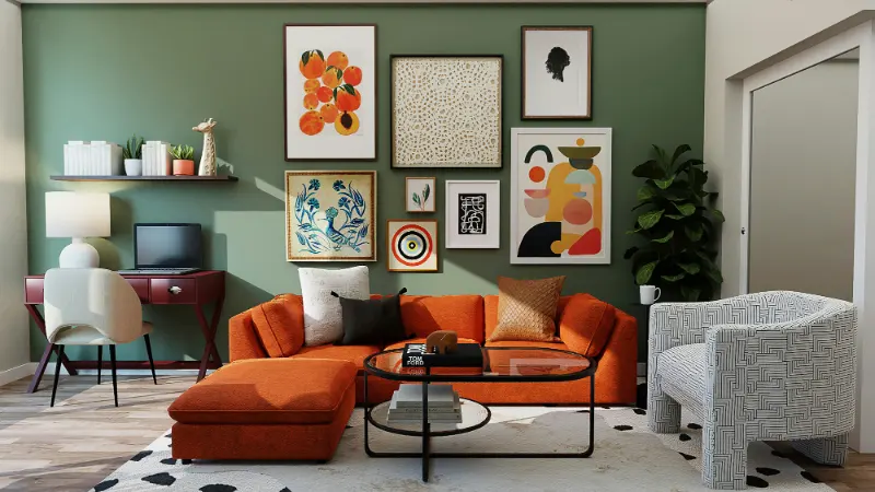
Autumn’s palette grows richer and more saturated. Here you see ochre, rust, moss, aubergine, inky navy and deep teal, often paired with warm neutrals like caramel or mushroom. The shared trait is a presence of brown or grey in the undertone, which grounds the color and suggests maturity. Introducing autumn into a home is less about covering surfaces in orange and more about embracing complexity. A velvet cushion in a wine hue, a ceramic lamp base the color of wet soil or a woven throw that layers mustard with charcoal can tip a room into a more introspective register. These colors absorb light in a way that encourages slower evenings and a sense of enclosure when the days shorten.
Winter palettes tend to be either dramatically minimal or quietly crystalline. On one side you have high contrast combinations like black and white, midnight blue with pale ice grey, or charcoal against sharp ivory. On the other, you find the soft blues, silvers and pale taupes that mirror low winter skies and frosted glass. The common element is clarity. Edges feel bolder, surfaces cleaner. In interiors, winter color is a chance to edit. Removing a few competing hues and letting one or two strong tones anchor a room can produce a surprising sense of quiet. A simple wool rug in a deep, almost-black navy against white walls can make even a tiny bedroom feel intentional rather than cramped.
Designing Rooms That Shift with the Year
To make seasons work at home, imagine your palette in layers. The background layer includes walls, large rugs and the biggest furniture pieces. Choose these in neutrals that can host all four seasons without resistance: warm greys, soft whites, gentle greige, muted stone shades. These colors act as a canvas that feels compatible with both the clear tones of spring and the heavy notes of winter. Aim for neutrals with a subtle complexity, where you cannot immediately say if they are more beige or grey, because that ambiguity allows them to adapt to different accents gracefully.
On top of this base, your mid layer might include secondary furniture, such as side chairs, ottomans or bookcases, and fixed textiles like curtains. This layer can lean slightly toward your favorite season. If you know you come alive in summer, a sea glass blue accent chair or soft olive drapery can establish that preference without overpowering other moods. These pieces give your rooms a personality backbone, which you will then tilt warmer or cooler as the months roll.
The top layer is where true seasonality happens. Textiles, art, small ceramics, candles, throws and even the spines of books can all be rotated or regrouped to echo what is happening outdoors. In spring, lighter cushions, pale ceramics and fresh greenery can move forward. In summer, perhaps woven baskets, pale woods and washed blues take center stage. Autumn might see the return of wool blankets, deeper-toned pottery and amber glass. Winter could lean into fewer, more graphic pieces, with strong contrasts or crystalline neutrals. You are not reinventing the room each time; you are merely changing which objects are in conversation with one another.
Storage becomes part of the design strategy. A simple linen box under the bed or a high shelf in a closet can hold out-of-season pillow covers and table linens. Rotating these pieces becomes a ritual that marks time, much like swapping coats in and out of the front hall. There is a quiet psychological benefit in acknowledging change in this way. The home becomes less a static container and more a responsive companion, helping you lean into each phase of the year with intention instead of resistance.
As you experiment, notice your own responses. Some people find the drama of a winter palette deeply soothing year-round; others crave perpetual spring lightness. The most livable interiors rarely follow the seasons literally. Instead, they select one or two seasonal languages as a base and borrow accents from the others as needed. A room that feels like late summer most of the time can borrow a winter black-and-ivory throw to sharpen its edges in January, then trade it for a moss green cushion when autumn arrives again. Over time, you learn that color is not just about matching; it is about timing, attention and the subtle art of making the inside and outside of your life feel like they are in quiet, reassuring conversation.