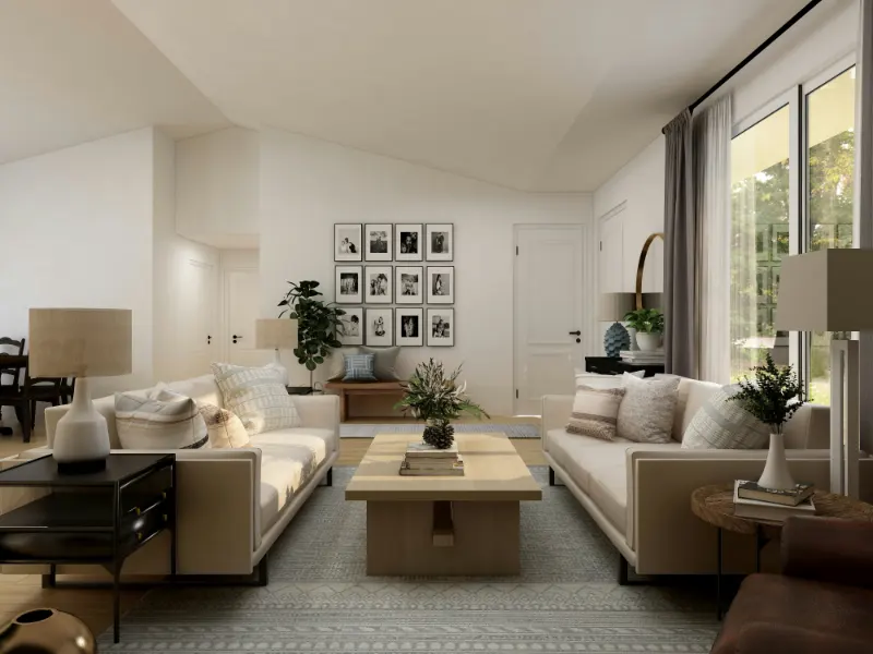
The Myth of the Perfect White
Soft white paint is often sold as a shortcut to calm: "Just pick a white and everything will look clean and modern." In practice, choosing the right white is closer to choosing a soundtrack for your home. The color may be quiet, but it sets the emotional volume of every object, shadow and surface.
Walk into a gallery and you notice that the white on the walls is specific. It is tuned to the art, the light and even the floor. Your living room deserves the same level of intention. The good news: you do not need a designer’s eye, just a way to think about undertones, light and context so you can decode what the paint chip is not telling you.
The first mental shift is to stop thinking of white as a single point on the spectrum. Soft white is an entire neighborhood of hues that lean warm or cool, gray or creamy, pink or green. Two whites that appear nearly identical on a screen can feel radically different once they cover 200 square feet of wall. One will make your sofa feel inviting; the other will make it look a little tired or strangely yellow.
Instead of asking "Which white is best?" start asking "What do I want this white to do for the room?" Do you want it to embrace existing wood tones or cool them down? Do you want morning light to feel like a soft fog or like a bright, clear day? Thinking about function this way transforms the choice from an abstract color puzzle into a practical design decision.
Reading Undertones: Warm, Cool and the Neutrals in Between
Undertone is the quiet color hiding inside the white. You rarely notice it on a small card under fluorescent lights, but once the paint is on all four walls, that whisper becomes a steady, room-defining hum. The soft white that looked neutral in the store might suddenly read yellow at noon or slightly pink at sunset.
Warm whites carry soft notes of yellow, red or brown. They echo candlelight, linen and old plaster. If you have honey oak floors, beige or taupe furniture, brass hardware or a lot of woven textures, warm white will usually make everything feel cohesive. This is the white of slow Sunday mornings, of pages in well-thumbed books. It flattens some harsh shadows and can make north-facing or shaded rooms feel less chilly.
Cool whites lean blue, green or gray. Their energy is freshly laundered rather than nostalgic. In rooms with a lot of daylight or big south-facing windows, cool whites can keep things from feeling overexposed or sleepy. They sharpen the lines of black metal, chrome finishes and crisp cotton. Think galleries, lofts and spaces where you want clarity rather than coziness.
The trickier territory lies with whites that mix warm and cool undertones or that sit very close to greige. These soft whites can be magical when they bridge elements that do not naturally agree, like a cool gray sofa and warm wood floors. But they are also the ones most likely to surprise you, shifting from balanced at midday to noticeably pink or green at night.
Undertones also interact with what is already in the room. A white with a faint green cast will become more obvious next to red-toned wood, because those colors push against each other. A slightly pinkish white might look neutral until you place it beside a crisp, blue-based trim. When you see a white suddenly look wrong, you are usually seeing a clash of undertones rather than a bad color in isolation.
To read undertones, compare. Do not look at one white alone. Line up three or four candidates against a sheet of plain printer paper, then hold them near your existing floor, trim or sofa. Against the neutral paper, the shifts become clearer: one card will look creamier, another slightly grayer, a third unexpectedly peach. You are not hunting for the “pure” white; you are looking for the undertone that flatters what you already own.
Testing Whites in Real Light and Real Life
Soft white paint choices live or die in your particular light. The same white can feel like a quiet cloud in a north-facing bedroom and like a sterile hallway in a sun-blasted kitchen. Before you commit, you want to stage a small, controlled rehearsal.
Start with a short list based on undertone: perhaps two warm whites and one that is more neutral. Order samples or peel-and-stick swatches in the actual finishes you will use. Paint or place large patches on at least two walls in the same room. A single square behind the sofa will not tell you how the color behaves on the wall that receives late afternoon light.
Now watch. Visit those swatches in the morning, at midday and at night with the lamps on. In the morning, you might like the white that feels radiant, but notice whether it becomes yellowed by late afternoon. Another might seem dull at first light but turns quietly elegant and soft as the sun moves. Pay attention not only to the color itself but how it affects nearby objects. Does your favorite rug feel richer or more washed out? Do your countertops look calmer or busier?
Artificial light is the third actor on stage. Warmer bulbs, often labeled around 2700K, deepen the yellow or cream in warm whites and can make cool whites feel slightly muddy. Cooler bulbs, around 4000K, can neutralize some yellow but may push cool whites into a blue, clinical territory. If your goal is a soft white that feels gentle at night, test it under the bulbs you actually plan to use, not just daylight.
There is also the question of finish. Matte or flat finishes tend to soften imperfections and give white a velvety quality that absorbs a bit of glare. Eggshell or satin reflects more light, which can make the same white feel brighter and slightly cooler. On trim and doors, a semi-gloss or satin version of your wall color will read a bit crisper, even if it is technically the same shade.
The last step is emotional: notice how you feel in the room with each candidate. Does one white tempt you to linger, to read, to cook, to invite people over? Another might be technically correct for your undertones yet feel strangely tense. Your nervous system keeps its own color memory, shaped by spaces you have loved or avoided. Allow that quiet record to play. The right soft white will not only flatter your furniture; it will settle gently into the background, letting your life become the subject of the room rather than the paint itself.