Why Texture Matters More Than You Think
Walk into a beautifully designed room and what you notice first might be the colors or the furniture. But what you feel, often before you can name it, is texture. It is the reason a space can share a palette and layout with a catalog photo yet still feel either inviting or oddly flat. Texture is the quality of surfaces, the contrast between smooth and rough, matte and glossy, tightly woven and loosely knit. It is the difference between a room that looks good in photos and one that feels good in person.
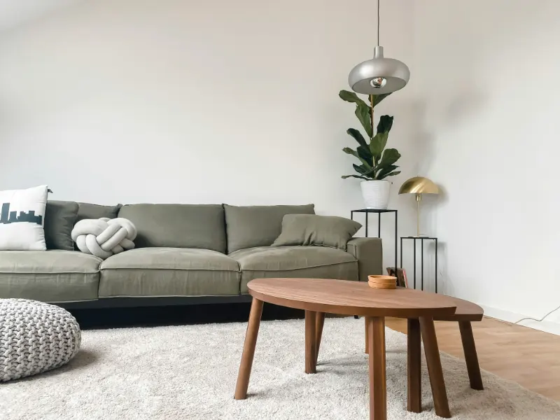
Designers often talk about texture as a kind of visual and tactile rhythm. A polished stone countertop next to a rough linen curtain, a sleek metal lamp against a nubby wool rug: these contrasts keep the eye moving and the body engaged. Texture gives depth to neutrals, quiets loud colors, and can nudge a room toward calm, warmth or cool sophistication without changing a single wall color.
At its core, texture in interior design has two faces. There is actual texture, what you feel when you run your hand across a surface. Then there is visual texture, what your eye reads as rough, soft or glossy even from a distance. A velvet sofa has both; a wallpaper that mimics plaster has mostly visual texture. When you understand how these two work together, you can begin to compose a room that feels layered rather than cluttered, serene rather than sterile.
Texture also shapes how we experience space psychologically. A room full of hard, shiny surfaces can feel larger but also colder and more formal. Add a shaggy rug, a woven basket and a knitted throw, and the same room shrinks in the best way, becoming more intimate and forgiving. This is not an accident; our brains read soft, irregular, touchable surfaces as safe and human, a counterweight to all the glass, metal and screens in contemporary life. Texture, in that sense, is an everyday form of comfort design.
For a beginner, the trap is usually one of two extremes. On one hand, the room where everything feels similar: matte walls, flat cabinet doors, the same kind of wood repeated everywhere. It is orderly but dull, like a sentence with no punctuation. On the other hand, the overcorrected room: every corner stuffed with fringe, faux fur, carved wood, patterned cushions and ornate rugs, all fighting for attention. Both are symptoms of not yet seeing texture as a composition rather than a collection. The goal is not more, but balance and pace.
Texture also interacts with light. A glossy tile will bounce daylight around a small kitchen, amplifying brightness; a chalky limewash wall will absorb light softly, creating a cocooning effect. Even within a single color, varying the way surfaces accept or reject light can give you a kind of quiet complexity that paint chips alone never promise. If color is the soundtrack of a room, texture is the acoustics, shaping how that music actually lands in your body.
How to Read and Layer Texture at Home
Begin by walking through your space as if it were a gallery of surfaces. Ignore color for a moment. What do you touch first when you enter? A cool metal doorknob, a smooth painted wall, a soft rug, the back of a chair. This sequence already creates a textural narrative. Notice where it is monotonous. Perhaps everything within reach feels hard and flat. Or perhaps every surface within arm’s length is soft, leaving nothing to anchor the room. Your first task is not to buy anything new but to understand the existing mix.
Think in broad categories. Hard textures: stone, metal, glass, lacquered wood. Soft textures: wool, cotton, linen, velvet, boucle. Then there are organic textures that sit somewhere in between, like rattan, wicker, cork and unfinished wood. A balanced room usually holds all three, in proportions that reflect how you want to live there. A living room meant for quiet evenings might lean into soft and organic textures with a few hard accents. A kitchen, by contrast, often starts with hard textures and needs deliberate softening.
Look at the largest surfaces first. Floors, walls and big upholstered pieces set the stage. A glossy floor benefits from a matte, tactile rug. A flat painted wall might come alive next to a gently slubbed linen curtain. If your sofa is smooth leather, let the coffee table or side chairs bring more visible weave or grain. These big moves establish the main rhythm, so you can be more subtle with smaller objects.
Then consider the distance at which texture operates. From across the room, you see visual texture: the way a woven chair back catches light, the irregularity of a plastered wall, the depth of a patterned rug. Up close, at arm’s length on a sofa or chair, you encounter actual texture under your fingertips. Both are important. A room with only close-up texture looks dull in photos and from the doorway; a room with only visual texture can feel disappointing once you sit down. When you add something new, ask yourself whether it will matter from afar, up close, or ideally both.
There is also the question of contrast. Textural contrast is what keeps your eye from skimming across a room and forgetting it immediately. If you have a very smooth dining table, choose chairs with a more pronounced grain or woven seats. If your bedroom is full of crisp cotton and clean-lined furniture, let the headboard be upholstered in a richer, touchable fabric, or add a handwoven throw that looks just a bit imperfect. Each contrast is a small moment of friction for the eye, in the healthiest sense, a way of waking up to your own surroundings.
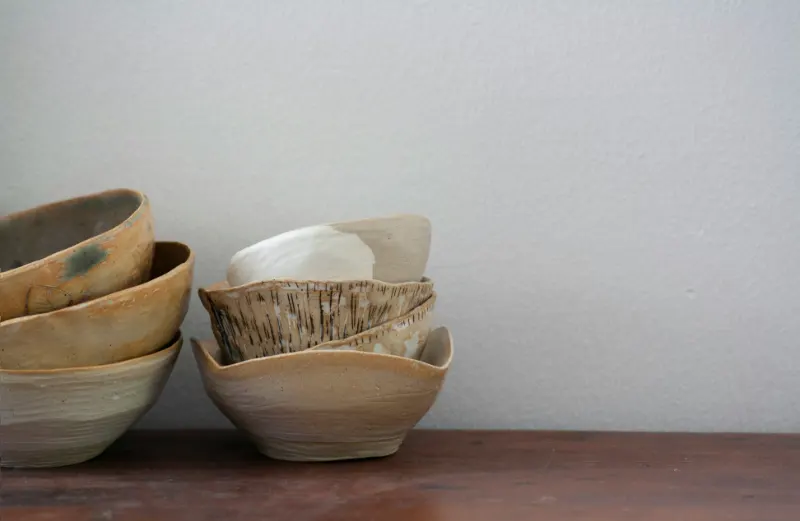
Finally, allow texture to express something about your rhythms and rituals. A thick, forgiving rug where you meditate or stretch turns a corner into a small sanctuary. A rough ceramic cup left on a side table can quietly anchor a reading chair, its chalky surface a relief from the smoothness of the book in your hand. Over time, these choices accumulate into a kind of tactile biography of your home, a record not only of what you own, but of how you inhabit it.
Designing with texture is less about memorizing rules and more about noticing. The more you pay attention to the way materials feel and behave in light, the easier it becomes to edit and layer them. You begin to see that a serene room is rarely minimal in texture; it is minimal in noise. The surfaces are considered, the contrasts gentle but intentional. Texture does not demand your attention so much as reward it, turning your home into a place that feels as good to the hand as it looks to the eye.